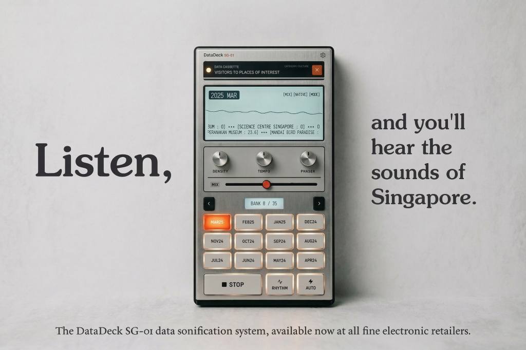
Introducing the DataDeck SG-01.
Turn on, tune in, and nerd out at datadeck.app.
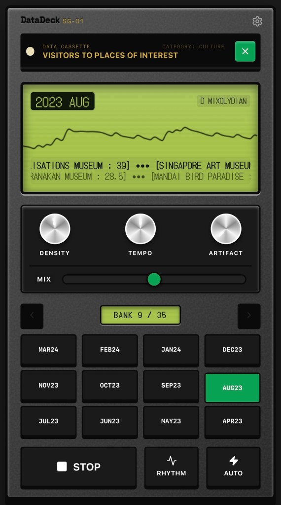
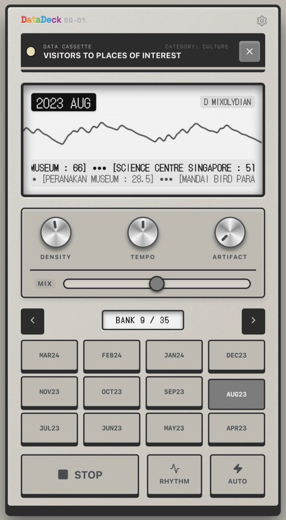
Singapore generates (and publishes) an extraordinary amount of data about itself — temperatures, taxi coordinates, dengue clusters, carpark availability, ticket sales at major attractions. Numbers that civil servants read in spreadsheets and the rest of us ignore entirely. The DataDeck asks, “but what does it sound like?”
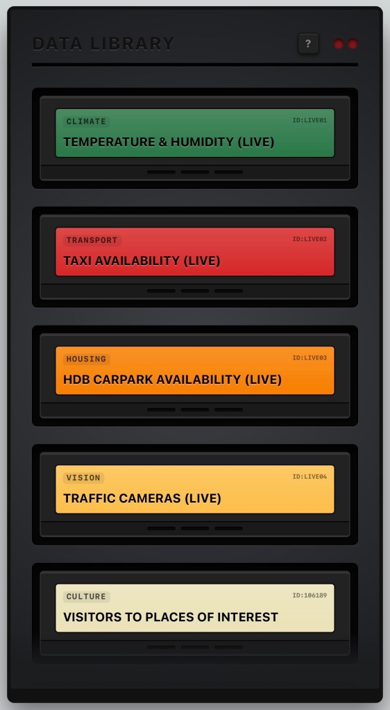
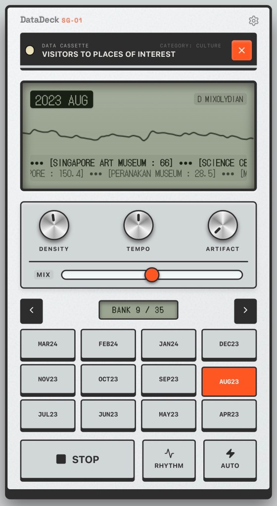
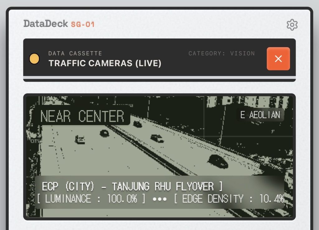
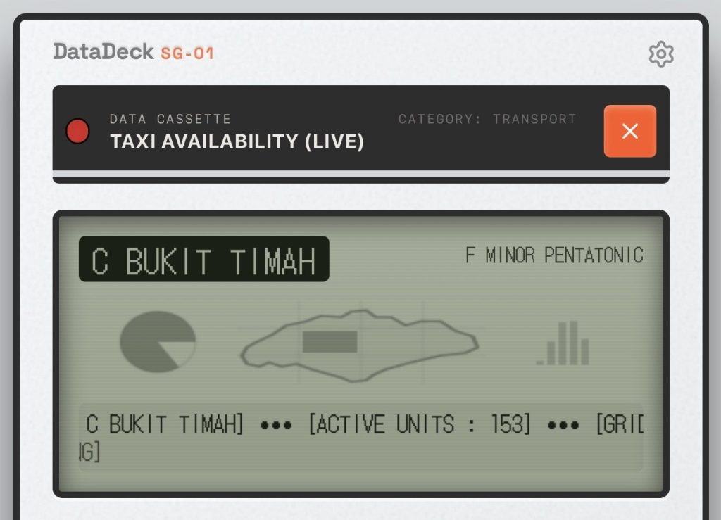
Each Data Cassette draws live government feeds from data.gov.sg and renders them as distinct genres. There are ten cassettes in all, each with their own acoustic logic and ways of interpreting the city.
The Climate cassette pulls real-time NEA temperature and humidity readings across 12 geographic sectors and converts them into lo-fi hip-hop — with chords deepening as humidity climbs, and the scale drifting toward Lydian as the heat rises. The Transport cassette tracks unoccupied taxis plying the streets and generates a relentless 303-style midnight techno. HDB carparks become polyrhythmic Afrobeat, and the movements of the stock exchange drive a satisfying hip-hop groove. Get money y’all! Check out the sound of visitor arrivals during the COVID years: like musical crickets.
The controls? Three knobs shape density, tempo, and atmosphere. A mix fader redistributes the instrument balance. AUTO mode hands navigation back to the machine. There’s a user manual built in, should you get lost.
It’s a music player with no music files. It’s a data dashboard you can close your eyes to. It’s Singapore, rendered in sound. Put your headphones on, and press play.
Pro tip: If you really love DataDeck, you can save it to your phone’s Home Screen, which gets you a nice icon and a full-screen mode that shows the whole device at once without distractions.
Disclaimer: I made this with the help of Gemini 3.1 Pro because I’m just an old designer who hasn’t coded stuff since GeoCities. I take no responsibility for any damage you cause yourself or others with this. Thank you.
Related blog post: Week 13.26