
Lots of portfolio tools advertise the ability to create a gorgeous website online within minutes, but how many are suited to showcasing a copywriter’s work? This post covers getting a basic presence up for a handful of your projects. More comprehensive site builders are only briefly mentioned.
It’s often said that people only look into their CVs between jobs, but taking stock of what you’ve accomplished on a regular basis is a really good practice. But with a standard resumé, updating a paragraph about your current employment several times a year isn’t attractive. Fortunately for people in the creative industries, there’s the portfolio, which can be very satisfying to compile, if only to remind ourselves how little victories on a project tend to make up a bigger result.
Not Your Creative Director’s Portfolio
Over the last few years, I’ve seen a fair few creative portfolios, and increasingly, when one asks to see some work, a URL gets sent instead of a PDF. When I was starting out in advertising about 8 years ago, we routinely brought physical folders of printouts to interviews. If you wanted the job, you might make an extra copy to leave behind. If you’ve heard some creatives calling their folios “books”, it’s because that’s what they really were.
Another thing that’s changed since the mid-noughties is how the presentation of a copywriter’s work has gone from showing a few ads and/or documents with long-form writing samples, to being very close to how the art guys do it. Big, colorful pictures that would reel even an illiterate eye in. Some writers’ books now haven’t got a word in them.

Most of the people I’ve met showed off work on portfolio cum social networking sites for creatives. Places with start-uppy Web 2.x names like Carbonmade, Krop, the Behance Network, Cargo, Coroflot, and to some extent, Dribbble. Some respectable, shirt-wearing creatives had portfolio sites on their own domains, and the ones who didn’t return their pencils used blogging services like Tumblr.
What I’ve noticed is that very few of these solutions are suited to the needs of creatives who self-identify as copywriters.
Copywriters Are A Needy Bunch
Designers, illustrators, and art directors are well served by the many visual portfolio tools out there. Flip through a few examples and you’ll notice a tendency to not explain the images — when it comes to showing off craft, the work often speaks for itself. Maybe it’s because most tools just don’t allow text at all, but I’ll come to that later.
I think a writer needs a little room to take his viewer through the work. So much of what we do is problem solving and just not visible in the finished consumer-facing work (nor should it be). Some of the things a writer could supply to complement a piece of work are: some background info, a project or team story, the strategic line between proposition and product, an elucidation of the idea (if one exists), how the piece works with a wider campaign or positioning that the brand has pursued, and any measured results that came out of it. Touching on just a little of the above, versus a caption reading “Banner Execution #2” on a photo of a toothpaste tube telling a joke, can help explain yourself come Judgement Day.
Five Steps to Happier Portfolioing
The more I saw, the more I started to wonder, where should a copywriter put their work online? To answer that question, I signed up for a bunch and put them through their paces, and also asked colleagues and industry friends for their (possibly subjective) opinions on the leading ones. Here’s what I know, filtered through what I didn’t like.
1. Keep Good Company
Maybe this won’t apply where you are, but Cargo (or CargoCollective) ostensibly carries a reputation for being full of student work. I don’t know where that comes from; too many cans of Heinz baked beans styled like Warhol prints? That said, there’s probably nothing wrong with using Cargo if you ARE a student. Coroflot seems to be another good place for junior creatives to get their work in front of recruiters and large brands. DeviantArt was ranked below the two, because your application will disappear into an HR drawer labeled ‘Slashfic Writers’.

For professionalism, I was advised to try Krop. It charges a not-insignificant monthly price of US$10, in the league of premium site-building services like Squarespace. I didn’t see anything that justified the price against Krop’s drawbacks. Amongst those I asked, Behance enjoys a neutral to positive reputation that will not stand in the way of your looking righteous.
As far as domains and URLs are concerned, it’s also about the right associations. If you’re on a site built for creative work, then piggybacking on their domain isn’t an issue. For example, having “behance.net/name” is okay, but “name.tumblr.com” looks like a collection of meme gifs. Using a “name.com” is great as long it’s not the “best-name-online.com” that GoDaddy recommends when your name of choice is taken.
2. Know the Tools You’ll Need
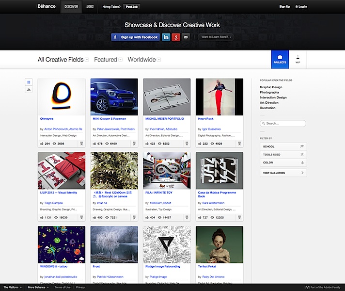
Plenty of sites simply don’t let you annotate or supply a paragraph of text beside your large and beautiful images. It’s practically textist. Krop is a major offender. And since we’re talking your garden-variety copywriter here, and not those mystical hybrid writer-designers who can tastefully superimpose text within their images, an ideal tool would allow writers to enter text on the page itself. In that regard, Behance trumps Krop, which only allows a short caption for each image. Not only is Behance free, it allows the mixing of as many images, embedded videos, and text blocks on a project page as needed.
Most importantly, if you’re going to be uploading work where you’re especially proud of the writing, make sure it can be read! Being able to click and zoom in (or load the original image) is table stakes, but plenty of sites I’ve seen don’t do it. This is the point where your portfolio’s tab gets closed and your reader goes back to a ‘Hunger Games Wedding Ideas’ board on Pinterest.
For this reason, I do not recommend using ‘free’ services that reserve this ability for paying customers, e.g. Carbonmade. Behance won’t zoom either, but you can at least reproduce your copy on the page using a text block.
3. Create a Gallery, Not a Blog

When a portfolio site is built on a blogging CMS, and looks like a linear blog, expectations are set for a diary of constantly evolving works-in-progress. Visitors will be less impressed by your last post being 18 months old, even if it was ahead of its time.
Of the sites I’ve seen built on simplistic platforms like Posterous, Tumblr, Blogger, Pinterest (you gotta see this Hunger Games wedding), too few employ themes with a static front page serving as a table of contents. If your platform of choice doesn’t let you do that, find a new one. A scrolling page of entries without proper navigation is counterintuitive to your purpose: showing your recent work at a glance, and putting more details one click away.
Some sites will also format and present a version of your resumé in addition to your portfolio. Behance and Coroflot are two that stood out for me.
4. Decide If You Want Feedback with That
Socially enabled sites like Behance are proud of their communities. You can follow people doing interesting work, and browse a stream of their recent work right from your front page. Gold stars, comments, resharing; all that stuff. But there’s a real need for portfolios that don’t talk back, and if you’re familiar with the teen movie trope of parents embarrassing their sons with baby stories whenever a girl comes over, you’ll understand not letting a potential mentor or employer see the “helpful” suggestions you’ve been given by others. Or your witty mom-centric replies.
Moreover, as we’ve already covered, many of these sites are for designers and not copywriters. I’ve heard this sentiment several times: “Designers have Dribbble, but where do copywriters go to share their work and get constructive feedback from peers?” It’s a gap that no one has filled. Until then, my advice would be to keep the two as separate as you can. Find an avenue for copy feedback that works for you, and display your work on a pedestal where it belongs.
5. Keep Open Secrets
Another feature that’s rather important but not always available: the ability to secure projects with a password. Some client work can never be fully public, but if there’s a story in there worth telling, you might open it up to select viewers. Please don’t set your password to “password” or your first name, or have no password at all and instruct the HR person to ‘just press Enter’, because that just makes it look like passwords are a new concept to you.
Choose Your Own Ad Venture
The first conclusion I drew is that you’ll want to spend some money to get this right, although it doesn’t have to be a lot. Whatever your choice, make sure it looks good on mobile devices and doesn’t rely on Flash.
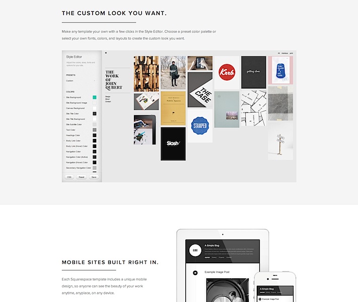
My preferred solution has always been to create pages on a personal site, using whatever CMS you’re comfortable with, but that involves a fair amount of set-up and manual work. In contrast, the allure of these modern portfolio services is undeniable. Most come with the promise of page views from fellow creatives baked in, and who doesn’t like getting ‘Liked’? The drag-and-drop features and professionally designed templates are also particularly good for copywriters. Uploading a bunch of comps and artwork almost always results in a presentable page.
Of all these services I evaluated, the only free one that would meet the needs outlined was Behance. Their paid option is called ProSite, but its fancy templates frustratingly strip away the extra text that makes their free pages compelling for writers. If that gets fixed, it would be a complete winner.
If you’re willing to get your hands a little dirty, then Squarespace, Breezi, Virb, and WordPress are sound bets. The first two have no free options and start at around $8/mo for a standards-compliant, responsive design site. With templates as starting points and pixel-level control over every detail, they are suited to people with knowledge of web design but who don’t want to code.

Virb is another all-in-one hosted site & blog solution that costs the same as Krop ($10/mo) but lets you do more. There are templates that let you bundle images and text together quite simply and beautifully.
The open-source WordPress.org software is pretty much the gold standard for consumer CMS on the web, and if you don’t want the hassle of installing it on your own servers, WordPress.com has an ad-supported “hosted service” that takes care of everything for you, with few compromises. A number of portfolio-ready themes are available, but do pay for the domain mapping upgrade, because “name.wordpress.com” looks almost as bad as it would if it said Tumblr. Almost.


