Tag: Social

  • Week 32.24

    Week 32.24

    It was Kim’s birthday and to celebrate, we went out for some great yakiniku at a place called Yakiniquest (the name gets points for trying, I guess) where the service was great but the food was incredible. It was probably one of my Top 3 wagyu experiences, along with Matsusaka beef in Kyoto (we walked into an acclaimed, booked-out restaurant and were given a table that had just no-showed), and of course, Kobe beef in the delightful, jazz-adopting city of the same name.

    As an extra surprise, I orchestrated Cameo shoutouts from celebrities on two of the reality shows we unapologetically enjoy bingeing together: Below Deck Down Under, and Gogglebox. I put them on our media server and turned the TV on in the morning, telling her new special episodes had just dropped overnight. She bought it, and it was a fun moment.

    The rest of the week was spent in the tight embrace of the Apple Vision Pro’s dual loop band. One of the things I hoped to get out of being an early adopter of the AVP (both the product and the platform) was a closeness to this new spatial computing form as it germinates, to have a sense of “spatial nativeness” develop in my brain. A sense of its conventions and limits that would help me intuit how to navigate and create new experiences for it, should I ever want to. Which means always being on the lookout for new apps (both programs and applications) and trying them out.

    This week I spent time in a social app called inSpaze, built exclusively for the Vision Pro. As a result of that positioning, and the lack of current competition on the App Store, it’s become the de facto place to hang out and meet other Vision Pro owners to swap stories and recommendations. Try to imagine a cuter, visual Clubhouse, where you spend time in virtual living rooms you can decorate and personalize. In addition to chatting, you can look at photos and 3D models together, listen to music, and play card/board games.

    It’s worth pointing out that you don’t get a normal webcam view of each person, because you’re all wearing Vision Pros. So like all videoconferencing apps on the system, it uses Apple’s Personas: photorealistic avatars based on face scans you do when setting up your Vision Pro, that use its many sensors and cameras to mirror what your real eyes and face are doing.

    If joining a roomful of random strangers from around the world and jumping into whatever conversations they’ve got going on sounds like an introvert’s worst nightmare, that’s because it probably is. I did it anyway, and found it slightly thrilling but also chiller than expected. For one, the use of Personas creates psychological distance; it’s you, but it’s also more a puppet that looks like you. I commented on this and others agreed it made them feel safer.

    What struck me most, though, was how nice and welcoming the community feels, because we’re all early adopter nerds enthused to be sharing this novel experience. It reminds me of the internet when I was a teenager, where the thrill of meeting someone from across the world was pure and untainted by the danger and cynicism that later crept into online spaces. And of course, there’s the fact that a community gated behind a S$5,299 purchase is more likely to be well behaved.

    One nice touch that allows truly cross-border communications is the real-time translation that puts subtitles under each person speaking. In the daytime here, I’ve met a lot of Chinese speakers, and this feature has helped me to follow some conversations I otherwise wouldn’t have.

    It was during one of these afternoon sessions that I met one of the key people behind the app, and we got to talking about their opportunity, business model, and product that got me thinking more about the challenges that smaller developers are facing with this new platform. It’s a well-reported fact by now that AVP sales are low by Apple’s standards. While that’s easily explained by the steep entry price and the challenge of defining a new product category, it still poses a chicken/egg dilemma for creators.

    Solo developers and very small teams doing this on the side can probably justify toying with small apps and selling them for a few dollars, but anyone building something ambitious on the level of a social network or massively multiplayer game, for a total addressable market in the low six-figures — AND having to bankroll it for the next couple of years while Apple works on the cheaper model and second generation Pro — is being asked to take on more risk.

    I have no doubt that Apple will persevere and iterate until this category succeeds, like they always do, so it’s not a question of whether Apple Vision has a future. It just needs to convince developers and their investors to stay faithful, and seed the demand. It’s going to be tricky, and I’d like to see Apple advertising hard for the next 18 months to keep spatial computing visible and galvanize the ecosystem. Even if people can’t find the means to buy the product, they should want to.

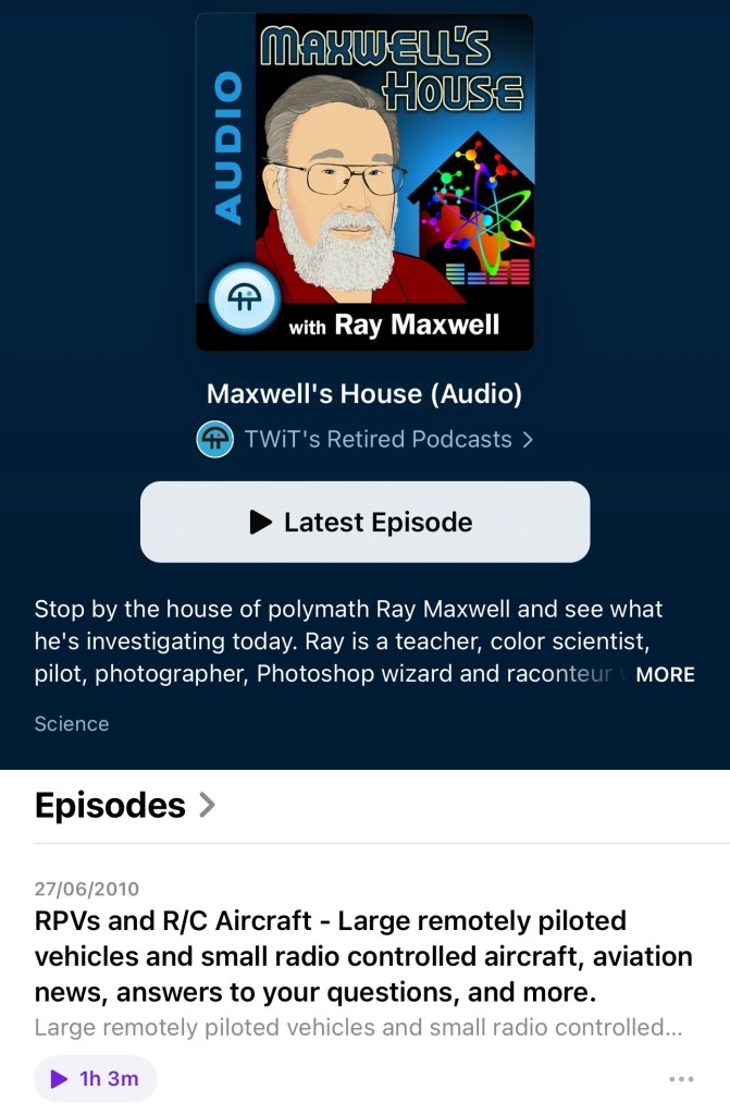
    As further proof of the magical, early-internet vibe, I logged into inSpaze early one morning and met a varied group of American users, including a hospital administrator and VR-obsessed truck driver. After many in the room logged off, I found myself speaking with a Canadian man who casually mentioned working with tech podcasting luminary Leo Laporte over a decade ago. As he continued, it dawned on me that he was Ray Maxwell, an 80-year-old polymath whose name I would often hear on Leo’s This Week in Tech (TWiT) network, where he once had his own podcast about aviation and various science topics.

    As a one-time avid listener of TWiT, I can’t overstate how starstruck I felt as Ray told me stories from his expansive career: time spent at McDonnell Aircraft in the 60s, adjacent to where the Gemini space capsules were being built; color science engineering at a company later acquired by Kodak, recommending SF stories by his friend (two-time Hugo award-winning author!?!?) Spider Robinson; and how he’s recently been into capturing spatial video for the Vision Pro.

    I recognize that the early days of any new frontier, team, or relationship are a special thrill that can’t be expected to last, so it’s up to us to maximize and enjoy every moment. Feel free to reach out if you’re getting into spatial computing and want to swap notes!

    ===

    Music

    It must be the peak of the summer release schedule, because so much new music has come out this week.

    The new Glass Animals album is one of those that starts with a banger and keeps the energy going until you’re five songs in and picking up your phone to check the tracklist in disbelief. It’s called I Love You So F*ing Much and it’s soaked through with space beats, vocoders, and addictive melodies.

    I knew they had a cult following before 2020’s Dreamland introduced them to everyone, but I foolishly never got deep into it because the phenomenally successful Heat Waves overshadowed every other song. On hindsight, that tune would have done the same on 99% of albums — it’s the longest charting song in the history of the Billboard Hot 100. Now I’m excited to soon experience their two older albums for the first time, ZABA and How to Be a Human Being.

    ROLE MODEL is back and he’s shed his hipster-emo guise for a cowboy hat after breaking up with Emma Chamberlain (I just found out). Kansas Anymore is filled with the same lite and lovable pop earworms that I enjoyed on his last album, just a lil’ bit twangier.

    beabadoobee’s This Is How Tomorrow Moves is finally out, and I’ll admit that while I’ve liked all her past releases, none of them have ever made it into heavy rotation for me. I think this will be the one that does it. Early singles Ever Seen and Take A Bite were strong songs in her usual nostalgic 90s alt-rock style (with charming videos by her boyfriend, Jake Erland), but the newest one Beaches is perfect! In any of the last three decades, Beaches would have been an instant classic. She made it while working with Rick Rubin at his ‘Shangri-La’ studio in Malibu.

    Rick Rubin continues to fascinate me as a kind of guru or shaman of the music industry, somehow wielding enormous influence without any formal musical ability himself. He’s somehow able to hypnotize or imbue artists with the confidence to create their best work, just by sitting with them and giving feedback. He wrote a book about his creative process that some reviews call an essential bible, while others say it’s a collection of trite cliches. I suppose I’ll have to read it for myself soon.

    I also found myself enthusiastically nodding along to Killer Mike’s new album, entitled Songs For Sinners And Saints by “Michael & The Mighty Midnight Revival”. It’s loaded with funky beats, soulful playing, gospel choirs, and some very sharp rapping.

    It’s safe to come out now. The Smashing Pumpkins have finished releasing their three-part concept rock opera, whatever it was called. They’re now back with a proper album that promises the good old guitar-driven songs they were loved for back in the day. It’s called… er, Aghori Mhori Mei, a title that doesn’t inspire any confidence that Billy Corgan is back on his meds. My god, the edgelordism is only accelerating with age! Here are some lyrics chosen at random: “Milk such blood / To fare thee lost from all but way / And awaken the sea I light / Our slumbers save the sleep / Wherefore we climb…” Kerrang has given it 4/5, at least. I kinda enjoyed it on a musical level but wasn’t listening closely. I’ll keep trying.

    Vultures 2 came out and I didn’t even know. I think I tapped through to Kanye’s artist page in Apple Music just on a whim and was surprised to see it at the top. Nobody wants to support him anymore with all the shit he pulls, but he’s probably better off with no one knowing about this album, if my two playthroughs so far are any indication. It’s a shoddy mess, with some songs having the seeds of greatness in them, but just withered and stunted on the vine. North West features on one song again: the awful “Bomb”, which has her repeating level 1 Duolingo Japanese phrases like “ohaiyo gozaimasu, konnichiwa” over a truly busted beat. According to one recent IG post, he’s still ‘updating it daily’ on streaming platforms so maybe check back in a few months to hear the album’s final form. Or don’t.

  • Week 4.23

    Week 4.23

    After a couple of Chinese New Year-related family activities in the first half of week, I took the remaining days off work. I’d hoped for it to feel long and restful, and to basically do nothing except play games and plug into new music and movies, but as you’ll know things rarely work out that way. I took way more time off work last year to do that and it still didn’t feel like enough.

    We did some research for our trip to Japan later this year, and got hotel bookings in at last — everything is selling out fast, and you may get stuck with small smoking rooms or extravagantly expensive suites if you don’t hurry. Currently, the plan is to spend about a week in Tokyo followed by Kobe and Hiroshima, two places we’ve never been. Next, we’ll have to think about restaurant reservations, although it’s likely too late for anything super fancy or exclusive, if we even wanted that. If you have any recommendations for things to do or eat in those cities, please drop me a note on Mastodon, email, comments, whatever!

    On food, I’ve eaten pretty well and badly this week. After chancing upon a new Chinese docuseries on Netflix (The Hot Life) about various regional hot pot cultures across China, I got the yearnings and we went and spent too much at the irritatingly named Beauty In The Pot, which I suppose is my second-favorite local Chinese hot pot chain. I’m no connoisseur but I’ve been to the Cou Cou at Jewel Changi Airport exactly once and it was the best I’ve had (small sample size, current definitive experience = Wu Lao in Taipei, where they infinitely refill the tofu in your steaming vessel for no charge). Oh yeah, there were also two big beef-centered meals of yakiniku and Texas-style barbecue. And a visit to Shake Shack which gave me my first taste of their local exclusive “Pandan Shake”, only like five years after they opened here and introduced it.

    We also spent a day with two of our nieces and a nephew, taking them out to McDonald’s and then back to ours for videogames. I did a fresh reset of an old iPad (the last generation of 9.7” iPad Pros, which feels pretty sluggish now just scrolling around in iPadOS 16), filling it up with kid-friendly games from Apple Arcade like Sneaky Sasquatch, Fruit Ninja, Sonic Racing, Cooking Mama. I think they could easily have played on it until the battery died.

    We also got on the Switch a bit, where I discovered Mario Battle Strikers is pretty hard at normal difficulty for a 9-year-old (and anyone on their team), and that Untitled Goose Game truly is a masterpiece of game design. The quirky concept just sucks everyone in, and it builds on the brilliant insight that mischief is a universal language.

    On my own, I played and completed Death Come True on the Switch, although it’s also available on iOS. It’s a Japanese FMV game (that’s Full Motion Video for you kids who didn’t live through the CD-ROM era) where you watch what is essentially a Japanese network TV drama production and make a few choices that influence what happens next. The plot involves murder, amnesia, and some SF elements. It came out two or three years ago and has been on my to-do list since. I can recommend it if any of the above sounds good to you, whenever it’s on sale.

    Another game crossed off my very long list is Kathy Rain: The Director’s Cut, which too is also on iOS. It’s a point-and-click adventure game in the style of Lucasarts and Sierra titles from the 90s. The artwork is on point, but I can’t say I enjoyed the whole experience. The story goes in a direction that didn’t work for me, and requires too much suspension of disbelief. Pity, I really wanted to like a detective mystery starring a motorcycle-riding woman in a leather jacket.

    At some point, I will get onto the latest installments of two other classic point-and-click adventure series that are now also on the Switch (with modern graphics): Leisure Suit Larry and Monkey Island.

    I also gave Borderlands 2 a go for the second time (I played it briefly on the Mac many years ago) but it didn’t take after a few hours. Between it and Doom Eternal, I was beginning to think I can’t play FPS games on the Switch; something just doesn’t feel right, even after tweaking the controller sensitivity. Is it the low framerate? Input lag? Maybe I hate the Switch’s Pro Controller? I can play these sorts of games fine on my PS4 and elsewhere, but moving and aiming feels so off here. But then I installed Crysis Remastered and it doesn’t seem so bad! Will give it a few more hours.

    ===

    Since I wasn’t in the middle of a book but didn’t have the energy to choose a “proper” one, I started on the next Jack Reacher installment, Personal (#19), and it was as easy as falling back into bed after brushing your teeth. Pulp fiction, it’s how you meet your Goodreads goals.

    We saw two films this week, Arbitrage (2012) and Three Thousand Years of Longing (2022). I’d say they were 3.5 and 4 stars respectively. The former feels a little like David Finch’s The Game in datedness, despite being much newer. Perhaps it’s because the hedge fund guys are old and not finance bros, and Richard Gere keeps conspicuously thumbing his at his BlackBerry? No one in his rich circle uses an iPhone in 2012! The latter is a sumptuous fantasy with the kind of precision and quirkiness that you’d expect from George Miller, but it doesn’t leave enough of an imprint to be a classic.

    Shrinking on Apple TV+ came out, and is very much worth watching. It’s apparently Harrison Ford’s first television role, and although he plays the same grumpy old man type he’s inhabited for the last few decades, he’s not phoning it in like his recent films work. You get the sense he cares here and there’s some nicely played emotional depth.

    ===

    Ivory came out of beta, and everyone says it’s probably the best Mastodon mobile app out there, so give it a try. It’s built on the solid bones of the now-retired Tweetbot for Twitter, and Tapbots have been making fluid and beautiful apps since the early days of the App Store.

    I’m also beta testing another classic app I won’t name that is experimenting with a new feature: they’re adding an Instagram-like social network feed to what was previously a standalone camera app. I believe it’s something they actually tried before but it didn’t take off then, and I’m not sure why it would now. Which is a pity because the core app is getting slicker and more usable, but this network is probably something they need to prove value to investors?

    There’s clearly a movement or at a least growing interest in decentralized, federated social networking models over the centralized ones of the past, as Mastodon’s rise is showing. And now some people are attempting to build the next Instagram using the same open ActivityPub protocol that powers Mastodon. Pixelfed is one I’ve seen, and is also in beta now. I joined its TestFlight through the site above, and you probably can too.

    I got stuck at the stage of picking the server I wanted to join for quite awhile. That, to me, is the big UX challenge federated networks face in gaining mainstream adoption. Choosing the right local server for your account is hard. Will it go down someday and lose all your posts? Will unacceptable behavior on the part of its operators someday cause you to be cut off from the wider network? I don’t know how we make this more approachable for more people.

    And then I start to wonder if these experiments will ever be successful in overthrowing Instagram. After all, cloning Instagram the app is doable, but building a user base as large as Instagram’s? Oof. Maybe we can fool Elon into buying it. Anyway metrics like engagement and MAU should probably be allowed to fall aside, as people seek more intimate networks (Path was too early, plus another one named Bondee was in the news this week) and products find other ways to pay for themselves. Would you use a photo-sharing network that had less to look at, and fewer (but more important) eyes seeing your posts? Hmm, maybe! I mean, I’m updating this site and you’re reading it.

    Processed with VSCO with kc25 preset

    I took one photo worth sharing this week as I was crossing a street in the Keong Saik area, after meeting some friends back in town for Chinese New Year. I saw the scene and fished my iPhone out of my pocket and fumbled with the camera left-swipe gesture that never seems to work when you need it, and just grabbed the wide shot (12mp HEIC) while moving.

    Later, I cropped it, increased the resolution using Pixelmator Photo’s AI-assisted upsampling feature, and edited it for color and emphasis with VSCO and Darkroom. It would have been less trouble and probably less processed looking if I’d shot a 48mp RAW file, but it turned out okay. Between the improved sensor, ISP, and the A16’s Neural Engine, this year’s model was able to get a shot that I don’t think was possible on an iPhone just a couple of years ago.

    Since you made it to the end, you deserve these Midjourney images of the The Golden Girls playing in a jazz band.

  • An Old Man Tries Snapchat

    If you have even a passing interest in social media and haven’t seen Casey Neistat’s video on how “Snapchat Murders Facebook”, you should.

    Like my friend Vicki notes in this post, Snapchat wasn’t something that I immediately saw any value in. I installed it once ages ago, didn’t have any friends on it (a combination of age and geography), and promptly left. Then Instagram’s Bolt soft-launched in Singapore and got some interest going around ephemeral photo messaging, but it still isn’t something that friends in their 30s seem to want.

    We’re a generation of digital hoarders; the people who abandoned other providers for Gmail en masse because it promised never having to delete an email again. Cleaning out my harddrive the other day, I found a folder of interesting photos I’d saved off the net in the early 2000s: movie posters, album cover art, photos of global landmarks, and the like, simply because the sight of them were scarce and valuable pre-internet! You have to imagine what it was like to live in that time. I ended up deleting almost all of them because these days, if you can put a name to it, you can find it online.

    So behavior is changing slowly amongst older people, and much faster amongst those in their teens, but photo messaging still wasn’t something I needed Snapchat for. Every messaging app offers it now. The ephemeral twist is a footnote.

    Snapchat’s Stories feature changed the way I look at the product. It turns it into something of a lifelogging and broadcast platform. I can’t name another app (still) on the market that lets you grab video snippets of your life, and share them in a stream that your friends can tune in to. The fact that clips disappear after 24 hours is actually the part I like LEAST. It seems Vicki’s with me on this, as she’s set up a YouTube channel to archive these Stories to after they’ve been erased. I may soon do the same1.

    There are some other nascent thoughts I have on Snapchat’s bizarre UX; the more I think about it, the more brilliant it is — breaking many of the rules we use to design interfaces for users of all ages, in order to create an exclusive, obtuse, game-like experience (inviting the spreading of knowledge by word of mouth) that seems intended to make it a success with a younger crowd. I may be wrong, and it may simply be like this as a result of being designed by a younger team. Additionally, its overall visual clumsiness (check out that ghost icon) encourages you NOT to take it seriously, which makes it totally okay to fire off imperfect, portrait-oriented, poorly-shot, but authentic moments without too much thought.

    If you’d like to follow me, I’m on there as “sangsara”.


    1. Sharing these vertical videos on another platform poses a slight challenge. I tried every video editing app on my iPhone, and just about all of them failed to stitch the short clips together without cropping, unexpectedly rotating, or distorting the videos. Even Apple’s own iMovie produced only a black screen with audio playing, probably because Snapchat’s video encoding/metadata in non-standard in some way. Amusingly, the app that finally managed to do the job perfectly was YouTube’s own Capture app
  • LINE Pop-Up Store Singapore, May 2014

    LINE Pop-Up Store Singapore, May 2014

    Japanese-Korean messaging app LINE has opened their first pop-up store in Singapore, on a prominent stretch of the core shopping boulevard of Orchard Road. It will run for a month and reap immeasurable marketing value from the high visibility and sure-to-grow lines of fans eager to buy their cleverly designed character merchandise.1

    I dropped by on its first evening tonight with some colleagues, and we spent between $20–60 each. I would have spent $100, but put down a pack of 100 art postcards ($55) at the last minute. This is on top of the $40 I’ve spent on in-app purchase stickers over the last year or two of being on the platform. I don’t think any other messenger currently comes close in terms of having built brand loyalty or monetization potential that doesn’t involve serving ads or selling personal data.

    Standing outside and watching the crowd, I remarked to a UX designer colleague that no other messaging app could pull off something like this in the middle of town, not WhatsApp, not WeChat. He correctly observed that none of the others have strong IP from which to make their own merchandise to even sell in a store.

    “And it’s all this bloody kiddy stuff!”, I said, clutching a plastic bag filled with stickers and a pair of mugs that look like the faces of a bear and a bird. “It’s not kiddy,” he started to protest before going, “Oh alright, I guess it is.” Takeaway: “Kiddy” is largely irrelevant in Asia.


    18-to-29-year-old females are its “core target,” says (U.S. CEO Jeanie) Han, explaining that in Asia, once girls were using Line, boys followed – and then this young “hip” user base helped bring in older users “like a domino effect.”

    “People, especially young folks, are really adopting our stickers,” she says. “The ratio of people who are buying things online like our stickers is actually quite high in the U.S., as well as the people who are using our games inside our platform relative to the total number of users, so we’re quite optimistic in terms of our market in the U.S.” — Techcrunch, March 2013


    The crowd lining up tonight was about 2:1 female to male, which seems in line with LINE’s targeting strategy. There were a few people who definitely looked over 40, and everyone present was walking out with stuffed toys, diaries, notebooks, plastic folders, tote bags, mugs, badges and the like, all emblazoned with Brown, Cony, Moon, Leonard, Sally, James, and other characters I can name because I see and employ their images in chat conversations on a daily basis. LINE is lovable, obsessionable. Few others are by design.

    Against Facebook Messenger’s 200M monthly active users, LINE is said to have virtually the same MAU (out of 400M registered accounts). In comparison, WeChat (dominant in China) has 355M MAU, and WhatsApp has over 500M. I don’t consider WhatsApp and Facebook Messenger users to be the same thing2, and LINE has the greatest growth potential outside of its home country, especially in Asian countries with an affinity for Japanese culture, whereas the Chinese WeChat is likely to have a harder time. I’m pretty bullish about LINE’s success, even if their apps have a lot to improve on. For the record, LINE also reports significant revenues — $338M in 2013 — versus about $200M for KakaoTalk and $20M for WhatsApp.


    1. Within minutes of our arrival, I overheard a mom asking her two teenaged daughters, “What’s this about?”, to which they replied, “it’s kind of like WhatsApp.” 
    2. For one thing, WhatsApp is not functionally part of a platform, and probably won’t be merging with Facebook’s in the near future for various reasons. All the other messaging networks are at some stage of offering content, ecommerce, games, and enhanced communication services such as video-calling. 
  • Singapore’s Pacific Rim Jaeger: URBAN REDEVELOPMENT

    Singapore's Pacific Rim Jaeger: URBAN REDEVELOPMENT

    Pacific Rim has a load of digital marketing bits out online, some created by Qualcomm Snapdragon (official microprocessor of the film’s Jaeger robots) on their Facebook page. One of the best is this Jaeger Designer app, which lets you modify a Unity 3D model with different parts and colors, and then render a poster featuring your own country’s robot defender, which you can also name. I think Singapore’s Urban Redevelopment sits nicely alongside the U.S.’s Gipsy Danger and Japan’s Coyote Tango.

    Seeing the movie this Friday night in IMAX 3D and pretty damned excited.

  • One Week with the Jawbone UP: How its Design Inspires Behavioral Change

    up-by-jawbone-lowres-015

    I bought one of the newly revised Jawbone UP wristbands a week ago. For those not following the rise of wearable activity trackers such as the Nike+ FuelBand, they are essentially pedometers you put on your wrist as you go about your business each day (and wear to sleep at night, in some cases), that connect with your PC or smartphone to give you more insight into your health. The UP was one of the first products on the market, but suffered from design and manufacturing defects that led to a hasty recall and another year on the drawing board before it was finally re-released last Christmas.

    It all started with using the free Moves iPhone app (by the Finnish company ProtoGeo) for about a week, during which I got a taste for recording and quantifying my movements. When I saw the UP on sale locally, it was an easy purchase. It’s only been a week, but it has been a behavior-altering experience for me so far. Along with its companion app, the UP provides a couple of key features.

    • Activity reports
    • Food logging
    • Sleep quality tracking
    • Social network awareness
    • Fiddle-free design
    • Comfort and style

    Activity reports

    carousel-2-3

    Open up the app and you’ll see at a glance how you’re doing against your set objectives. A healthy target is 10,000 steps a day, but few sedentary workers can meet that. Because UP is an internet-connected service, it’s able to tell you what others like you (in age, gender, height, and weight) are averaging. In my case, the average most do is about 5,500 steps a day. I decided to set myself a high but achievable goal of 8,000 steps.

    What’s happened since? I’ve found myself striving to reach that by alighting one bus stop ahead of my destinations, taking the long way around the office, and going for more short walks whenever I can.

    It translates your activity into calories burnt, which it shows you alongside an estimate of how many calories you burn just resting, and a total for each day. Every now and then, the application shows you “Insights”; pre-written facts and advice tailored to your own performance. Examples include deciphering hidden patterns in your behavior and mood, and helping you understand terms like “you walked 8,000 steps” with statements such as “equivalent to walking across the Golden Gate Bridge and back”.

    Food logging

    This part is optional, but you can enter your meals (or just photos of them) to keep a record of what you’ve eaten. If they’re available in the online database, nutritional information is attached. It has the same effect as using an expense tracking app: it makes you acutely aware of every little bit you put into your body, and alerts your conscience to the unnecessary.

    In practice, having a vague idea of how many calories I’m consuming, coupled with the knowledge of how much I’m burning (or NOT burning, on idle days) has been powerful. If I know that I’ve only moved a minimal amount all afternoon, any random urge to snack quickly meets a mental roadblock — “Why would I need more calories?”

    Sleep quality tracking

    Like the popular Sleep Cycle app, the UP band can monitor your movements in the middle of the night, and map out your light vs. deep periods of sleep on a graph. And then at the best possible time close to your intended waking hour, it will silently vibrate in the morning.

    You are asked to set a sleep goal for yourself, and along with all the other data it collects, this is plotted over a timeline of days, weeks, and months, which illustrates how good you’ve been at getting the sleep and exercise you need.

    Social network awareness

    carousel-2-1
    This is easily one of the best features of the UP. Other people can be added as “teammates” and their activities populate your Home screen, turning it into an Instagram of physical activity. You’re encouraged to inspect their details, leave comments, or react with a small selection of emoticons. You might see that a friend had a healthier lunch, or walked far more than you, or slept better than you. These events nudge you into behavior change.

    When I started, one of the only people it found for me to add to my “team” was someone living in Japan that I only follow on Twitter and YouTube. I asked, she said ‘Sure’. I don’t know her personally at all, but I’ve found that reading UP’s activity feed is a unique interaction different from regular status updates. Being able to correlate your own physical state with another person’s through shared metrics, leads to a different sense of awareness; any encouragement you receive resonates that much more. Her most active day blew me away at over 24,000 steps, followed by 11 hours of sleep. It really spurred me on to try and find the time for activity. Multiply that by the number of people you follow, and the social features become an extremely compelling component.

    On my second day, two more people I interact with online bought their own. On the third, my girlfriend joined in.

    Fiddle-free Design

    While the UP is not designed to be worn and forgotten — its constant presence serves to remind you of your goals — it is designed to be worn and left alone. Its long battery life (about 7-10 days) is one of the ways in which this is obvious. Charging via USB only takes about 80 mins, which you can easily do while idle.

    In chasing this long battery life, the UP eschews Bluetooth syncing, which other products like the Fitbit and Nike+ FuelBand have. To sync the UP, one must remove it and plug one end into a smartphone’s headphone jack. Jawbone recommends doing this about twice a day to keep up with your own stats and update your team. On the other wristbands, one only has to start the app, and they sync wirelessly.

    I actually think this omission is a strength.

    Like how shooting on film frees you from constantly checking how the photo came out on the little digital screen, thereby letting you take more photos and experience the scene you’re in, not continuously syncing the UP creates mystery, anticipation, and actually lets you get on with it and not fiddle with tracking apparatus every spare minute.

    In his excellent essay about using a FitBit, Paris and the Data Mind, Craig Mod described looking at the LED display and seeing that he had climbed 96 flights of stairs one day. The next thing he did was walk halfway across the flat town of Palo Alto to the nearest flight of stairs he knew of, so that he could shift that number to read 100. It sounds like great exercise, but I don’t want to obsess over live numbers or end up conducting accuracy tests each day over how many steps it’s counting.

    The UP way, you’re wondering things like “will I break my record today?”, and if you’re extra competitive, “I hope I don’t lose to so-and-so,” as you go about your business. Sometimes, by not knowing, you exceed your targets. And then you sync at the end of the day, and it’s like waiting for lottery numbers to be called out. It’s its own kind of fun.

    Comfort and style

    up-by-jawbone-lowres-016

    The UP is available in 8 colors, of which 3 are available here in Singapore right now. I got the Black (sorry, Onyx), and it’s pretty nondescript and unlikely to draw attention. The brighter colors pop more, and show off a subtle zig-zag texture that identifies it as part of the company’s product range under design chief Yves Béhar. None of them are what you’d expect a “wearable computing device” to look like. The only button is cleverly hidden, looking like an integrated design feature. Two LED lights are embedded beneath the hypoallergenic rubber surface, and only visible when lit. It’s much thinner than the FuelBand, and could easily be mistaken for one of those Livestrong-type charity support wristbands from a few feet away.

    These things help with making the UP an invisible part of daily life, which gives it potential to succeed at being adopted by more. But as the wearer, I always feel its presence (at least in this first week). The routines I’m developing around the app, around thinking about moving more, burning more, eating less, around how my teammates improve themselves, are the very definition of behavior change.

    If having visualized, connected, and actionable data on your own body and movements sounds interesting to you, the UP will probably be a great addition to your life.

  • Finding a Home for Your Copywriting Portfolio or: How I Learned to Stop Channeling an Art Director and Love the Words

    Finding a Home for Your Copywriting Portfolio or: How I Learned to Stop Channeling an Art Director and Love the Words

    Lots of portfolio tools advertise the ability to create a gorgeous website online within minutes, but how many are suited to showcasing a copywriter’s work? This post covers getting a basic presence up for a handful of your projects. More comprehensive site builders are only briefly mentioned.

    It’s often said that people only look into their CVs between jobs, but taking stock of what you’ve accomplished on a regular basis is a really good practice. But with a standard resumé, updating a paragraph about your current employment several times a year isn’t attractive. Fortunately for people in the creative industries, there’s the portfolio, which can be very satisfying to compile, if only to remind ourselves how little victories on a project tend to make up a bigger result.

    Not Your Creative Director’s Portfolio

    Over the last few years, I’ve seen a fair few creative portfolios, and increasingly, when one asks to see some work, a URL gets sent instead of a PDF. When I was starting out in advertising about 8 years ago, we routinely brought physical folders of printouts to interviews. If you wanted the job, you might make an extra copy to leave behind. If you’ve heard some creatives calling their folios “books”, it’s because that’s what they really were.

    Another thing that’s changed since the mid-noughties is how the presentation of a copywriter’s work has gone from showing a few ads and/or documents with long-form writing samples, to being very close to how the art guys do it. Big, colorful pictures that would reel even an illiterate eye in. Some writers’ books now haven’t got a word in them.

    Carbonmade
    Carbonmade: Your online portfolio, the door to a bright future in children’s illustrations

    Most of the people I’ve met showed off work on portfolio cum social networking sites for creatives. Places with start-uppy Web 2.x names like Carbonmade, Krop, the Behance Network, Cargo, Coroflot, and to some extent, Dribbble. Some respectable, shirt-wearing creatives had portfolio sites on their own domains, and the ones who didn’t return their pencils used blogging services like Tumblr.

    What I’ve noticed is that very few of these solutions are suited to the needs of creatives who self-identify as copywriters.

    Copywriters Are A Needy Bunch

    Designers, illustrators, and art directors are well served by the many visual portfolio tools out there. Flip through a few examples and you’ll notice a tendency to not explain the images — when it comes to showing off craft, the work often speaks for itself. Maybe it’s because most tools just don’t allow text at all, but I’ll come to that later.

    I think a writer needs a little room to take his viewer through the work. So much of what we do is problem solving and just not visible in the finished consumer-facing work (nor should it be). Some of the things a writer could supply to complement a piece of work are: some background info, a project or team story, the strategic line between proposition and product, an elucidation of the idea (if one exists), how the piece works with a wider campaign or positioning that the brand has pursued, and any measured results that came out of it. Touching on just a little of the above, versus a caption reading “Banner Execution #2” on a photo of a toothpaste tube telling a joke, can help explain yourself come Judgement Day.

    Five Steps to Happier Portfolioing

    The more I saw, the more I started to wonder, where should a copywriter put their work online? To answer that question, I signed up for a bunch and put them through their paces, and also asked colleagues and industry friends for their (possibly subjective) opinions on the leading ones. Here’s what I know, filtered through what I didn’t like.

    1. Keep Good Company

    Maybe this won’t apply where you are, but Cargo (or CargoCollective) ostensibly carries a reputation for being full of student work. I don’t know where that comes from; too many cans of Heinz baked beans styled like Warhol prints? That said, there’s probably nothing wrong with using Cargo if you ARE a student. Coroflot seems to be another good place for junior creatives to get their work in front of recruiters and large brands. DeviantArt was ranked below the two, because your application will disappear into an HR drawer labeled ‘Slashfic Writers’.

    Krop
    Krop: Your killer headlines will need killer headlines

    For professionalism, I was advised to try Krop. It charges a not-insignificant monthly price of US$10, in the league of premium site-building services like Squarespace. I didn’t see anything that justified the price against Krop’s drawbacks. Amongst those I asked, Behance enjoys a neutral to positive reputation that will not stand in the way of your looking righteous.

    As far as domains and URLs are concerned, it’s also about the right associations. If you’re on a site built for creative work, then piggybacking on their domain isn’t an issue. For example, having “behance.net/name” is okay, but “name.tumblr.com” looks like a collection of meme gifs. Using a “name.com” is great as long it’s not the “best-name-online.com” that GoDaddy recommends when your name of choice is taken.

    2. Know the Tools You’ll Need

    Behance
    Behance: Owned by Adobe now, so you’ll have to hit refresh for minor HTML updates every 10 minutes

    Plenty of sites simply don’t let you annotate or supply a paragraph of text beside your large and beautiful images. It’s practically textist. Krop is a major offender. And since we’re talking your garden-variety copywriter here, and not those mystical hybrid writer-designers who can tastefully superimpose text within their images, an ideal tool would allow writers to enter text on the page itself. In that regard, Behance trumps Krop, which only allows a short caption for each image. Not only is Behance free, it allows the mixing of as many images, embedded videos, and text blocks on a project page as needed.

    Most importantly, if you’re going to be uploading work where you’re especially proud of the writing, make sure it can be read! Being able to click and zoom in (or load the original image) is table stakes, but plenty of sites I’ve seen don’t do it. This is the point where your portfolio’s tab gets closed and your reader goes back to a ‘Hunger Games Wedding Ideas’ board on Pinterest.

    For this reason, I do not recommend using ‘free’ services that reserve this ability for paying customers, e.g. Carbonmade. Behance won’t zoom either, but you can at least reproduce your copy on the page using a text block.

    3. Create a Gallery, Not a Blog

    Your Tumblr should look like this
    If you must Tumblr, your portfolio should look a lil’ sumthin like this wicka wicka

    When a portfolio site is built on a blogging CMS, and looks like a linear blog, expectations are set for a diary of constantly evolving works-in-progress. Visitors will be less impressed by your last post being 18 months old, even if it was ahead of its time.

    Of the sites I’ve seen built on simplistic platforms like Posterous, Tumblr, Blogger, Pinterest (you gotta see this Hunger Games wedding), too few employ themes with a static front page serving as a table of contents. If your platform of choice doesn’t let you do that, find a new one. A scrolling page of entries without proper navigation is counterintuitive to your purpose: showing your recent work at a glance, and putting more details one click away.

    Some sites will also format and present a version of your resumé in addition to your portfolio. Behance and Coroflot are two that stood out for me.

    4. Decide If You Want Feedback with That

    Socially enabled sites like Behance are proud of their communities. You can follow people doing interesting work, and browse a stream of their recent work right from your front page. Gold stars, comments, resharing; all that stuff. But there’s a real need for portfolios that don’t talk back, and if you’re familiar with the teen movie trope of parents embarrassing their sons with baby stories whenever a girl comes over, you’ll understand not letting a potential mentor or employer see the “helpful” suggestions you’ve been given by others. Or your witty mom-centric replies.

    Moreover, as we’ve already covered, many of these sites are for designers and not copywriters. I’ve heard this sentiment several times: “Designers have Dribbble, but where do copywriters go to share their work and get constructive feedback from peers?” It’s a gap that no one has filled. Until then, my advice would be to keep the two as separate as you can. Find an avenue for copy feedback that works for you, and display your work on a pedestal where it belongs.

    5. Keep Open Secrets

    Another feature that’s rather important but not always available: the ability to secure projects with a password. Some client work can never be fully public, but if there’s a story in there worth telling, you might open it up to select viewers. Please don’t set your password to “password” or your first name, or have no password at all and instruct the HR person to ‘just press Enter’, because that just makes it look like passwords are a new concept to you.

    Choose Your Own Ad Venture

    The first conclusion I drew is that you’ll want to spend some money to get this right, although it doesn’t have to be a lot. Whatever your choice, make sure it looks good on mobile devices and doesn’t rely on Flash.

    Squarespace theming
    Squarespace: Can you handle this much customization? Find out with a free 14-day trial.

    My preferred solution has always been to create pages on a personal site, using whatever CMS you’re comfortable with, but that involves a fair amount of set-up and manual work. In contrast, the allure of these modern portfolio services is undeniable. Most come with the promise of page views from fellow creatives baked in, and who doesn’t like getting ‘Liked’? The drag-and-drop features and professionally designed templates are also particularly good for copywriters. Uploading a bunch of comps and artwork almost always results in a presentable page.

    Of all these services I evaluated, the only free one that would meet the needs outlined was Behance. Their paid option is called ProSite, but its fancy templates frustratingly strip away the extra text that makes their free pages compelling for writers. If that gets fixed, it would be a complete winner.

    If you’re willing to get your hands a little dirty, then Squarespace, Breezi, Virb, and WordPress are sound bets. The first two have no free options and start at around $8/mo for a standards-compliant, responsive design site. With templates as starting points and pixel-level control over every detail, they are suited to people with knowledge of web design but who don’t want to code.

    Virb
    Virb: If it’s good enough for a coffee bar in Portland, why not your portfolio?

    Virb is another all-in-one hosted site & blog solution that costs the same as Krop ($10/mo) but lets you do more. There are templates that let you bundle images and text together quite simply and beautifully.

    The open-source WordPress.org software is pretty much the gold standard for consumer CMS on the web, and if you don’t want the hassle of installing it on your own servers, WordPress.com has an ad-supported “hosted service” that takes care of everything for you, with few compromises. A number of portfolio-ready themes are available, but do pay for the domain mapping upgrade, because “name.wordpress.com” looks almost as bad as it would if it said Tumblr. Almost.

  • Why Can’t Twitter Be Like Foursquare?

    Turf Geography Club

    I never thought little ol’ Foursquare could lead the way for Twitter, but their approach to the third-party access and monetization problem shows more class and understanding. For the past few weeks now, instead of investing in a user experience that users would choose, Twitter’s stated solution has been to make their apps the only ones in town.

    Thanks to a tweet from @tarngerine today, I discovered Turf Geography Club, a location-based iPhone game built atop Foursquare’s place database, with additional Monopoly-like mechanics for upgrading and defending your property. It stands out from all the other “check-in and own this location” type apps by taking a flat-out fun (as opposed to a utility) approach: retro 16-bit style graphics, a Wes Anderson-inspired aesthetic (evident in the name, video trailer, and writing), bears, compasses, illustrated logbooks, and nonsensical references to an eternal struggle between man and nature.

    What I liked was how I could suddenly start using Turf as my Foursquare client of choice, checking in as I usually do, but also playing this separate, app-specific metagame at the same time. Likewise, I can choose to use Path to document my movements with friends, and share a subset of those actions to Foursquare, for my other contacts to see them. Or I could document something private in Day One, the journaling app, and still check in to Foursquare from there where the location made sense (publicly, without sharing the contents of my journal entry).

    Whatever you think of Foursquare and the people who use it, you can’t deny that this is what everyone would love Twitter to continue being, and what the company seems bent on defying: a confident social platform open to innovative ways of being used.

    Foursquare recently updated their mobile apps in a big way, taking focus away from previous key features such as Mayorships, and emphasizing discovery and recommendations instead. The Foursquare app is now really good at showing you things of interest nearby, in categories such as food, shopping, and sightseeing, based on recommendations from other users. I can’t get those in Path or Turf, but my one-way actions in those apps feed back into the enrichment of Foursquare. That’s reason enough for me to keep the Foursquare app on my phone in addition to all the other ones that offer check-in functionality.

    Twitter’s mobile apps also do a couple of things that third-party apps aren’t allowed to. It shows interactions that your friends have had on the service: tweets they’ve liked, people they’ve recently started following, and it shows supposedly personalized things of interest: local trending topics, and popular links being shared. The latter is where their advertising monetization is meant to happen, and it’s something that no one loves because it’s often dead wrong about what we want to see.

    Imagine if Foursquare’s app showed you places you would never go, or check-ins from people you didn’t know or like. What would be the value in that? Instead, contextual intelligence and expert data mining help Foursquare stay valuable and interesting to users when they want to explore, while their availability to third party apps keeps users active and in the equation. The people at Twitter can’t go wrong throwing everything behind the creation of that value, in the interests of long-term viability, instead of shutting down the future of their service that may come from apps like Turf.