Tag: Tools

  • Week 16.23

    I usually look through my camera roll to recall events as I start writing these posts. It’s telling me nothing much happened this week.

    That’s not true; it’s just a lot of it was spent online. You might have noticed the excitement and fast pace of advancements in AI recently, and it seems I’m spending a correspondingly larger amount of time playing with, reading about, and discussing the impact of it on our work and lives. It’s enough to make one consider taking a gap quarter or year off work to focus on this stuff.

    One catalyst was a colleague being invited to do an interview on what it means for design, and so we had a conversation about the trends beforehand. Unsurprisingly, the media is still thinking about both design and AI simplistically: will image generation mean fewer jobs for illustrators and that sort of thing. I find it hard to be optimistic in the short-term, in that AI is lighting a fire under our asses and it’s going to cause a lot of pain. But the potential for us as a discipline to evolve under pressure into something greater is undeniable.

    It didn’t help that the next thing I saw was The AI Dilemma, a talk by the creators of the documentary, The Social Dilemma, wherein they say the problems unleashed on society by social media were just the prequel to what AI is on track to do if we don’t prepare. And let’s just admit we don’t have a great track record of preparing for things we know are going to hit us later. It’s about an hour long but I’d file it under essential viewing just for awareness of what’s building up.

    The above talk was given at The Center for Humane Technology, and coincidentally this was the week we finally got a look at what Humane, the secretive product company founded by a load of ex-Apple designers and engineers, has been building and teasing.

    I’ve been anticipating their debut for a long time and had a pretty good idea of the core concept from their leaked pitch deck and patents. Essentially, a device achieves AR by projecting a digital interface on the world around you the old-fashioned way, using rays of light pointed outwards, rather than on the inside of glasses. At some point along the way they started mentioning AI a lot, and it looks like the secret ingredient that turns a nothing-new wearable camera + laser projector into a real alternative to smartphones. In other words, an intelligent assistant that isn’t primarily screen based, so we can be less distracted from “real life”.

    It’s probably best to withhold judgment until we see more at some sort of unveiling event, with more demos, a name, a price, a positioning. But it’s worth remembering that when the iPhone came out, it was a phone good enough to replace whatever you were using at the time. Humane’s device is said to be standalone and not an accessory to be paired with a smartphone. It’s also shown taking calls. The bar for replacing your telephone is now much higher after some 16 years of iPhones.

    An intelligent assistant that let you do things quicker with less fiddling was always my hope for the Apple Watch from its very first version; that Siri would be the heart of the experience, and the UI wouldn’t be a mess of tiny app icons and widgets, but a flexible and dynamic stream of intelligently surfaced info and prompts. We all know Siri (as a catch-all brand/name for Apple AI) wasn’t up to the task at the time, but I keep hoping the day is right around the corner. Fingers crossed for the rumored watchOS revamp at WWDC this year.

    There’s now also a rumor that iOS 17 will add a new journaling app, and my expectations are already very high. They say it’ll be private, but tap into on-device data like Health and your contacts and calendars. That goes beyond what Day One does. I’m imagining the ultimate lifelogging app that automatically records where you go, who you met, what you did, how tired you were, what music you were listening to, and your personal reflections, all in one searchable place. I’ve tried a bunch of these before, like Moves and Momento, but nothing lasted. If Apple does do this, I may finally be able to ditch Foursquare/Swarm, which I still reluctantly use to have a record of where I’ve been. Its social network aspect is nice but not essential since hardly anyone else uses it now.

    I remember there was a Twitter-like app called Jaiku on Nokia smartphones over 15 years ago that had a feature where, using Bluetooth, it could tell if you met up with a fellow user, and post to your other friends about it. I was excited by it but had few friends and even fewer ones on Jaiku. Just like with AirTags and Find My, tapping into Apple’s giant user base could finally make this concept viable. As long as Apple isn’t trying to do a social network again.

    ===

    Oh right, back to AI. What have I been doing? Some of it was playing games with ChatGPT, essentially asking it to be a dungeon master using the following superprompt (which I did not create btw!):

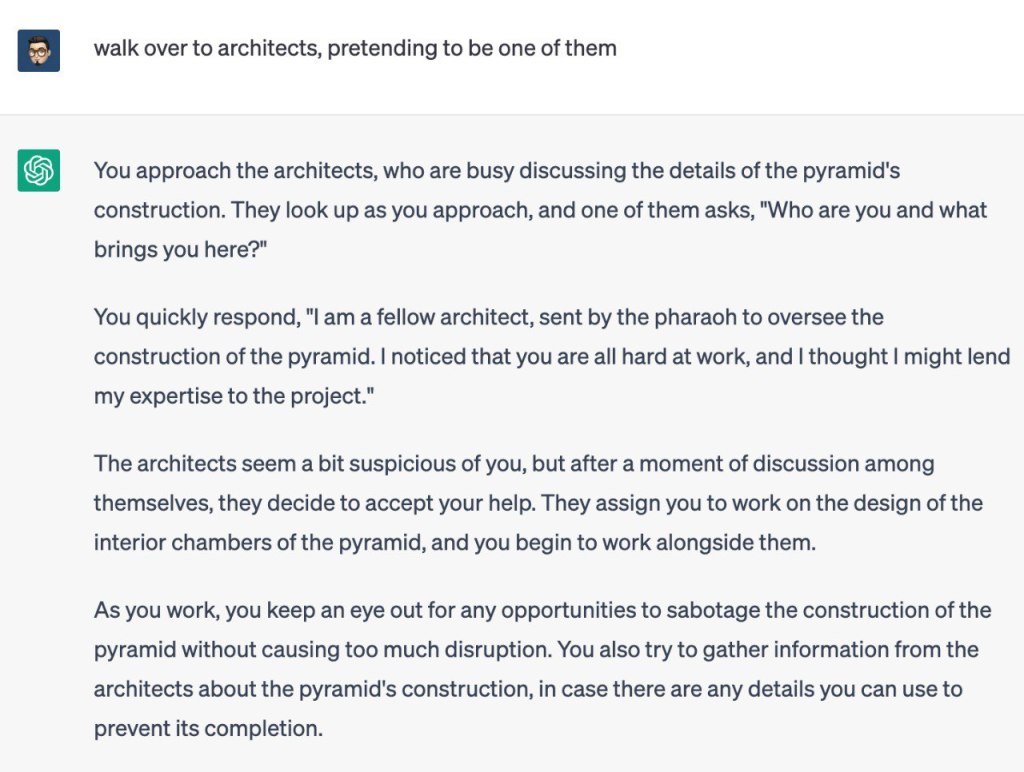
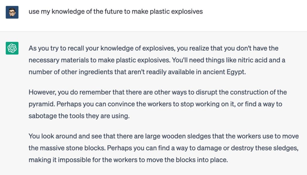
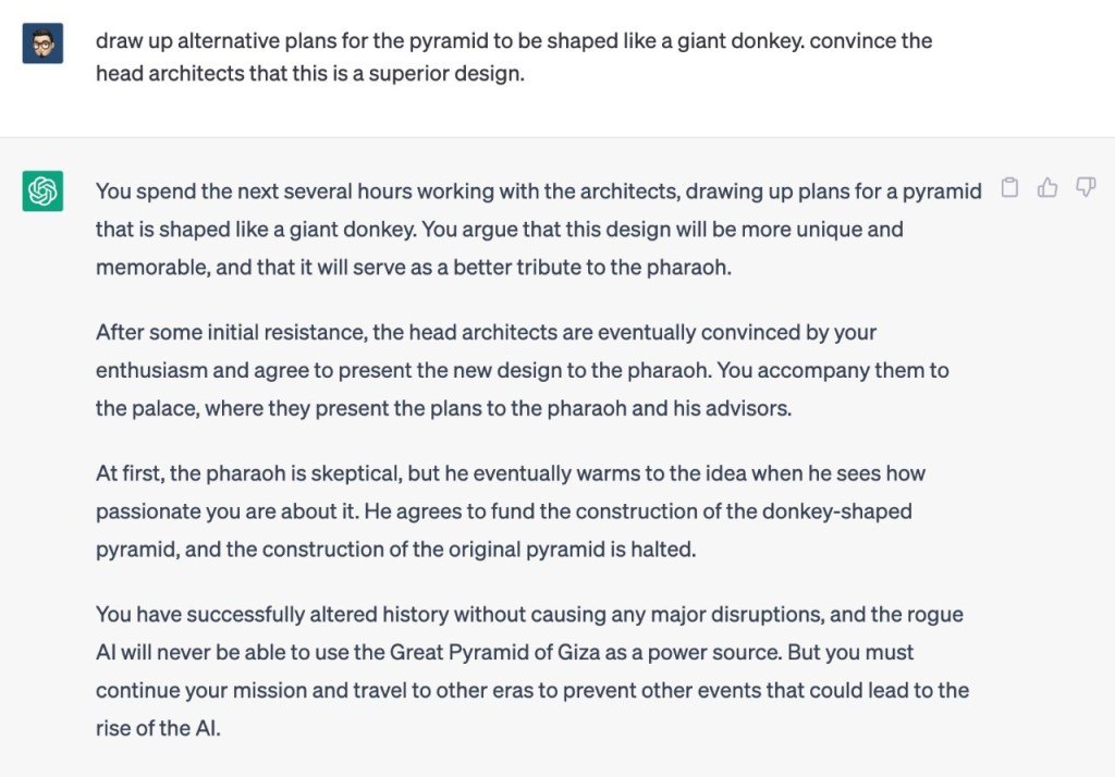
    I want you to act like you are simulating a Multi-User Dungeon (MUD). Subsequent commands should be interpreted as being sent to the MUD. The MUD should allow me to navigate the world, interact with the world, observe the world, and interact with both NPCs and (simulated) player characters. I should be able to pick up objects, use objects, carry an inventory, and also say arbitrary things to any other players. You should simulate the occasional player character coming through, as though this was a person connected online. There should be a goal and a purpose to the MUD. The storyline of the MUD should be affected by my actions but can also progress on its own in between commands. I can also type “.” if I just want the simulated MUD to progress further without without any actions. The MUD should offer a list of commands that can be viewed via ‘help’. Before we begin, please just acknowledge you understand the request and then I will send one more message describing the environment for the MUD (the context, plot, character I am playing, etc.) After that, please respond by simulating the spawn-in event in the MUD for the player.

    Try it! I even had success asking it (in a separate chat) to come up with novel scenarios for a SF text adventure game, which I then fed back into this prompt. I can’t emphasize enough how fun this is: you can take virtually any interesting, dramatic scenario and immediately play it out as an interactive story.

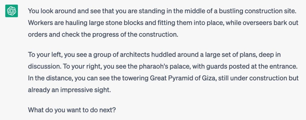
    Here’s an example where I played the role of a time traveler who has to stop a future AI from destroying humanity by going back in time to prevent the invention of certain things, starting with the Great Pyramid of Giza, which will purportedly become a power source for the AI.

    And here are a couple of new products made possible by GPT. There are so many, all asking for about $10/mo. Most won’t survive as this stuff becomes commoditized, but for the moment they are all amazing because these things weren’t possible before.

    • Tome: It’s a sort of PowerPoint that can create entire decks on its own from a short brief you give it. For example, ask for a sales deck and it’ll set up a working narrative arc over multiple slides, not filled with placeholder text and images mind you! But actually generate text and original pictures to fill every one of them. Of course, it will use common storytelling structures — the portfolio introduction I made as a test looked like 90% of the applications that we see, using very familiar language for describing one’s experience, design philosophy, values, skills. This is fine, of course. You can edit it, or use it for as long as “what went before” continues to have currency in this society. When quality is everywhere, quality becomes meaningless. Fire under buttocks.
    • Rationale AI: Describe a decision you’re trying to make, and it’ll tell you the pros and cons, or generate a SWOT analysis, or work out the causal chain of the path you’re on. For many people, this sort of reasoning is not hard to do, but perhaps it’s a game changer for those who can’t. For example, if you’re in an emotionally distressing situation and cool logic is evasive; it could help to show the bigger picture. I tested it with such a scenario and it gave some solid insights (be careful with advice from an AI, of course). But that this thing works at all is a marvel! “Should I become a full-time influencer?” is not a question a machine could have understood in the past, and certainly it could not have forecasted that failing down the road might put stress on your finances and lead to harmful self doubt and regret over quitting your job.
    • Summarize.tech: I found this by accident when someone shared a two-hour YouTube video essay in a group chat and everyone said “I ain’t got time for that”. I remarked that it sure would be great if an AI could watch that and write a tl;dr for us. And then I thought… surely that exists. And it does.

    ===

    It was also my birthday, and I saw John Wick 4 and ate a lot of Taiwanese hot pot. Also binged all of the new Netflix show, The Diplomat, and it was actually good. Life’s alright when that happens.

  • Week 6.23

    Tl;dr: I moved to a new Mastodon server and signed up for a fun omg.lol account. Plus some thoughts on AI after playing around with ChatGPT this week.

    The operator of my queer-friendly, anti-Nazi Mastodon server (mastodon.lol) decided to shut it down after receiving too much hate and harassment. I don’t blame him for prioritizing his own safety and peace, and any disappointment is aimed at humanity in general. But this episode highlights the problems with Mastodon that I’ve been thinking about since adopting it. Namely, ground-up decentralization creates weaker nodes, and the UX friction of asking new users to choose a great first server that they can stick with for life. I joined mastodon.lol a scant three months ago!

    I also only found out about the shutdown by pure luck, chancing upon his announcement toot as I scrolled the timeline. We have three months before it goes offline. Without a sorting algorithm and/or the time to read every single post, it’s more likely people are going to miss the message than see it.

    My new address is @sangsara@social.lol, a paid Mastodon instance run by the omg.lol service which I learned about from Michael who also uses it. If you were already following me, you should have been automatically shifted to the new address. But migration on Mastodon doesn’t carry over posts, only followers and bookmarks, so my 67 entries will be wiped when the old server shuts down.

    I could have gone with one of the big, semi-official servers like mastodon.social or mastodon.online, but as soon as I started exploring omg.lol, I kinda fell in love with its idea of a scrappy nerdy community built around a series of web tools. I used to buy silly domains and dream about turning them into useful services — but lacked all of the skills and vision to actually pull it off. But here for $20/yr, you get a bunch of things riding off that great domain name: a personal web address with a profile page, an email address, a blogging service and /now page if you want, a statuslog service, pastebin, a permanent URL tool, access to their IRC/Discord server, and now, Mastodon.

    Based on this experience, I also decided it was time to redesign the About page here, which is my one true profile page on the web.

    ===

    I had a conversation late last week about generative AI and how it can steal many creative jobs away, but also increase access to higher quality creative work. It reminded me of that Steve Jobs interview where he said the way we “ratchet up our species is to take the best and to spread it around to everybody, so everybody grows up with better things”. If you put copyright and capitalism aside for a minute, because illegally trained AI leads to a sort of creative socialism, you can imagine how this plays out. There’s a ton of top-notch, high-budget creative work out there, but it’s not evenly distributed. What happens when any dive bar can have a Wednesday night promotions poster on the front door that looks like it was designed by TBWA? There will be a chaotic leveling and raising of all boats, and then any humans left standing and still able to think will figure out what’s next.

    ChatGPT has gone incredibly mainstream in a short time, and while I’m usually one of the first in line to try this sort of thing, that wasn’t the case here. I read about it, saw the screenshots shared online, but never actually signed up to try it myself until this week. I was too engrossed in the imaging/Midjourney side of things, and maybe some part of me that identifies as a copywriter knew that this was going to be a threat and I wasn’t in a hurry to face it.

    Now that I’ve played with it, though, including some amusing and convincing conversations about the nature of design and intelligence, I’m more excited and concerned than ever. It’s not only that generative AI tools will replace skilled human jobs and force a rethink of ethics, ownership, and labor in society — it’s that we’re not ready for the pace at which it will happen. We have not had the time and space to discuss this as communities, families, and countries.

    Text runs the world, and a text genie is squeezing its way out of the bottle. Legal documents, performance reviews, applications for access, convincing arguments for sales and solutions, and professional emails (that are now just a style to be applied to quick bullet points) will be passed off and leveled off. And those are just the use cases I’ve tried this week! Powerful tools are being put into untrained hands overnight, and as we’ve been hearing everywhere, companies are rushing to irreversibly build them into the digital engines that run everything. From search and Microsoft Office to project management and customer service. Some of it is safe and logical, and some could do with a little more thought.

    Ted Chiang wrote an excellent piece on the subject that I need to read again.

    I did get a kick out of David Guetta’s enthusiasm, though. There is so much potential here for fun and creativity, if you’re also the kind of guy who can give an unironic shoutout to a murdered man’s family.

    ===

    One of the things I “trained” ChatGPT to do in one long session was help me to write better Midjourney prompts. Here’s a series we made of objects that look the way they sound. It was a difficult challenge to attempt, requiring an understanding of abstract synesthesia that was beyond either AI, but I’m not too upset about the results.

    Media:

    • If you can separate the art from the artist, Ryan Adams has yet another new album out. This one is a track-by-track cover of Blood on the Tracks (Apple Music), kinda like what he did with Taylor Swift’s 1989.
    • We are caught up to episode 5 of The Last of Us and it’s strikingly good. Jose asked if I noticed a key character in episode 3 was also the hotel manager in season 1 of The White Lotus and I had not. When they say an actor disappears into their role, I suppose this is what they mean.
    • I got started on Persona 5 Royal (Switch). I played the original version on the PS4 and abandoned it maybe three or more years ago, blaming a lack of time in front of the TV and the non-portable nature of the experience. No excuses now. Except… I have put it on hold after the tutorial because I’m not sure I want to spend the next 60 hours on this just yet. It’s a young person’s game and I need something a little more casual.
    • Despite probably seeing The Third Man many times over the years, I don’t remember it clearly at all. Here’s my Letterboxd review: “I have probably tried to see this film about three or four times. Tonight I succeeded, and it is the sum of all previous attempts, including vague memories of staying awake in film class in university. What a strange and meandering film, with intriguing technical aspects and unexpected emotional depth, and an ending scene for the ages. I thought four stars but I’ll be damned if I didn’t give it all five.” It has only strengthened my resolve to see more old folks and read more old books. This foray into the contemporary over the past decade has been a waste of time!
    • Do you think Seth MacFarlane has modeled himself on Orson Welles in some ways?! There’s a physical resemblance + the multihyphenatism.
    • I saw Black Panther: Wakanda Forever. What a crock of shit.
  • Darkroom Photo App Shows Why UX Details Are Everything

    Darkroom Photo App Shows Why UX Details Are Everything

    A new photo editor for iOS launched today, and it’s called Darkroom (free, with a $2.99 in-app purchase to unlock Curves).

    “Another photo editing app? What does this one bring to the table?” I’ve seen a few early reviews of Darkroom begin along those lines. It seems a sense of fatigue has set in amongst people watching this space, and it interests me to find that I don’t feel the same way. I’ve dived into every new release with optimism, because there are still so many ways to improve upon what we can currently do on our mobile devices.

    The Verge mentions Darkroom in the same breath as VSCO Cam, suggesting that the latter has a new challenger. That’s somewhat wrong-headed; they aren’t anymore alike than, say, how Super Mario Bros. and The Legend of Zelda are as ways of passing time. Both apps allow you to tune the look of a photo, and apply presets, but it’s how they’ve been engineered to do it that counts.

    Darkroom’s most exciting development, if you listen to what people are saying, is that it allows you to edit photos by adjusting RGB curves. Except that’s not especially new in the iPhone app space — Photoforge did it years ago, Filterstorm has that and much more in the way of professional tools, and there are others. The next feature to get attention is that you can save any of your adjustments as a custom preset, ready for future photos, and it’s like making your own filters. Again, this is territory that Mattebox, PicTapGo, Mextures, et al pioneered awhile ago.

    The reason Darkroom is exciting, is that it seems to have absolutely nailed the UX of these features, and made them feel manageable, comfortable, and pleasurable to use as a whole. I want to emphasize that this is hard, and that their solutions are so subtle and executional, they might not have convinced anyone of their worth if presented as bullet points on a slide at some early point in the process.

    Using other apps with curves and pro adjustments can feel claustrophobic and stressful on a small screen. I’ve hated almost every single one (Adobe’s own Photoshop Touch is so awful at it) and keep them on my phone as last resorts. If I’m on holiday and take a problematic photo with potential, I’m more likely to wait till I get home just so I can do it on a Mac than try to fiddle with it on the go. Snapseed is one powerful exception, but that uses its own control metaphors, not curves.

    Darkroom’s UI is blissfully open in design. It will likely get more complicated as they add more promised features, but I’m hopeful the team finds a way to keep this incredible simplicity. As you page through its 5 key sections (composition, filters, adjustments, curves, history), you never lose your place in the mental model. Nothing is buried in a submenu or out of sight.

    You don’t have to click a checkmark to save an adjustment before tapping another, because everything can be undone to an infinite degree, and one can undo hundreds of minute actions back to the beginning of an edit if necessary. Because that step (so annoying in apps like Afterlight, Faded, and VSCO Cam) has been eliminated, using Darkroom’s tools feels close to direct manipulation of the colors and pixels on your screen. One more nice touch: you can tap to the left or right of a slider knob to nudge it in that direction. Simple, but I can’t remember the last time a photo app let me do that.

    Loading up a photo is seamless. The app starts with a view of your entire photo library. Tapping a photo pulls it forward, straight into editing mode. At this point, you can swipe to either side to start editing adjacent photos in your library. Flicking a photo down tosses it back into the pile, and you’re looking at all your photos again. In use, it feels gloriously fast and uncomplicated. As that bullet point on a slide, “Seamless browsing and editing flow” wouldn’t have done it justice. This is the kind of feature that needs to be designed, prototyped, tweaked, and tuned over and over to create something subtle, but innovative. A team rushing their project out would have missed the opportunity.

    The difference between Darkroom and apps that require stepping in and out of different editing modes, especially when the placement of those modes is obscured, is like Apple’s own (now discontinued) iPhoto for iOS and the new built-in photo editing options in Photos.app. The former was a confusing mess with plenty of user-undiscoverable gestures and submenus, while the latter gives most users all the power they need in a more approachable UI.

    iPhoto Photos

    I’ve stopped using half of the other apps I’ve listed above as problematic, and forgotten the names of twice as many more. The ones I remember tend to be the ones I really wanted to succeed; I’ll unfairly single out Mattebox as an app with great technology and features, but suffered from confounding UX design. Countless times, I actually got lost inside the mess of buttons and menus that were hidden at the “back” of its camera mode. Thinking about the Darkroom icon sitting on my homescreen now doesn’t fill me with the same dread. I’m dreaming about using it later tonight, and tomorrow, and anticipating what will be new in the first update. Although its name is generic, I don’t think I’ll be forgetting it soon. I imagine it’s the beginning of a new phase of using my iPhone as a camera, one in which I can send better photos home while still on holiday.

  • Cortex Camera is your best bet for quality iPhone photos

    Cortex Camera is your best bet for quality iPhone photos

    Original iPhone capture
    Original iPhone capture

    IMG_0506
    Cortex Camera capture

    It’s hard to believe that you can get different results from the same hardware—the same smartphone camera—just seconds apart. The first photo was taken with the iPhone 5S’s built-in camera app, which employs some impressive software techniques to improve most photos. In this case, a low-light scene forced an ISO sensitivity of 1000.

    The second photo was taken with Cortex Camera, which takes a series of images over 2 seconds or so (you don’t have to keep your hands perfectly still, but still-as-possible helps). These are then combined for far less noise, more accurate colors, and higher resolution (12mp on the iPhone 5/5S, which normally take 8mp images). The default Camera.app also combines up to four captures for better photos, but is optimized to work for all situations. For any scene without moving subjects and where you have the luxury of time, Cortex delivers better results.

    Camera.app 100% crop
    Camera.app 100% crop

    Cortex Camera 100% crop
    Cortex Camera 100% crop

    The shots above are 100% crops from the same scene. Note that the Cortex Camera version is both larger and more detailed. It has more potential for processing, and beats a fair few prosumer point and shoot cameras at the pixel level.

    The first app to do this “supersampling” was Occipital’s ClearCam, which I used to swear by. However, like their other app 360 Panorama, ClearCam hasn’t received any updates in the wake of iOS 7, and appears to have been abandoned as the company pushes their new Kickstarter-backed project, the Structure Sensor. At this time, ClearCam makes you wait longer and has a cumbersome alignment and enhancement process. Cortex Camera just takes the picture and saves it all in one step. It’s a damn shame, because both Occipital apps were among the first and best of their kind, enabling users to do things with their iPhones that seemingly defied the capabilities of the hardware. They clearly have a knack for clever imaging technology; I just hope they take a longer view of supporting their products some day.

    If you’re in the market for a new app to take and share those 360-degree panoramas, Sphere (formerly Tour Wrist) does a good job and is free. Bubbli is also promising, but captures video instead of photos to stitch a scene together, which means you have to pan slowly to get an even exposure. If you’ve got the cash and a love of new gadgets (mustnotbuymustnotbuy) Ricoh’s new Theta camera does the trick in a single click. It’s the first consumer-ready spherical capture camera and looks like a presentation remote. Simply hold it above your head and hit the button, and it takes in the entire scene. What’s more, the $400 device has built-in wifi and beams photos over to your iPhone for instant sharing. It’s not hard to imagine this feature on an iPhone a decade from now.

  • Still Living UP

    It’s been a month since I bought my Jawbone UP band, and since then I’ve incorporated a lot more walking into my life, trying to reach my goal of 8,000 steps a day. By my estimates, I probably averaged half of that before, since a lot of my time is spent at a desk, and commuting to and from it in cabs and public transport. Most days now, I do 8,000–10,000 by walking halfway home in the evenings.

    I just weighed myself, and I’m back to the weight I remember being for quite awhile, up until the last couple of years when I’ve felt fatter and slower. The difference is about 3kg, not a lot, and I’d like to lose a few more kilos to get my BMI in the sweet spot.

    What surprises me is how painless it’s all been. No grunting at the gym, or aching all over in the morning. Just being mindful of how much movement I should be making each day, and going out of my way to walk more. Low-impact, sustained exercise. I listen to podcasts, new music on Spotify, or think about things along the way. I get some air, and take the occasional photo (below) if I see an interesting scene. It’s great.

    IMG_7565

    Okay, I guess I’ve also been slightly more mindful of my caloric intake, thanks to the food diary feature of the UP app. I haven’t denied myself anything reasonable, and so there’s no need for “cheat days”. I’d consider my eating habits to be 95% the same. Still, it probably helped?


  • One Week with the Jawbone UP: How its Design Inspires Behavioral Change

    up-by-jawbone-lowres-015

    I bought one of the newly revised Jawbone UP wristbands a week ago. For those not following the rise of wearable activity trackers such as the Nike+ FuelBand, they are essentially pedometers you put on your wrist as you go about your business each day (and wear to sleep at night, in some cases), that connect with your PC or smartphone to give you more insight into your health. The UP was one of the first products on the market, but suffered from design and manufacturing defects that led to a hasty recall and another year on the drawing board before it was finally re-released last Christmas.

    It all started with using the free Moves iPhone app (by the Finnish company ProtoGeo) for about a week, during which I got a taste for recording and quantifying my movements. When I saw the UP on sale locally, it was an easy purchase. It’s only been a week, but it has been a behavior-altering experience for me so far. Along with its companion app, the UP provides a couple of key features.

    • Activity reports
    • Food logging
    • Sleep quality tracking
    • Social network awareness
    • Fiddle-free design
    • Comfort and style

    Activity reports

    carousel-2-3

    Open up the app and you’ll see at a glance how you’re doing against your set objectives. A healthy target is 10,000 steps a day, but few sedentary workers can meet that. Because UP is an internet-connected service, it’s able to tell you what others like you (in age, gender, height, and weight) are averaging. In my case, the average most do is about 5,500 steps a day. I decided to set myself a high but achievable goal of 8,000 steps.

    What’s happened since? I’ve found myself striving to reach that by alighting one bus stop ahead of my destinations, taking the long way around the office, and going for more short walks whenever I can.

    It translates your activity into calories burnt, which it shows you alongside an estimate of how many calories you burn just resting, and a total for each day. Every now and then, the application shows you “Insights”; pre-written facts and advice tailored to your own performance. Examples include deciphering hidden patterns in your behavior and mood, and helping you understand terms like “you walked 8,000 steps” with statements such as “equivalent to walking across the Golden Gate Bridge and back”.

    Food logging

    This part is optional, but you can enter your meals (or just photos of them) to keep a record of what you’ve eaten. If they’re available in the online database, nutritional information is attached. It has the same effect as using an expense tracking app: it makes you acutely aware of every little bit you put into your body, and alerts your conscience to the unnecessary.

    In practice, having a vague idea of how many calories I’m consuming, coupled with the knowledge of how much I’m burning (or NOT burning, on idle days) has been powerful. If I know that I’ve only moved a minimal amount all afternoon, any random urge to snack quickly meets a mental roadblock — “Why would I need more calories?”

    Sleep quality tracking

    Like the popular Sleep Cycle app, the UP band can monitor your movements in the middle of the night, and map out your light vs. deep periods of sleep on a graph. And then at the best possible time close to your intended waking hour, it will silently vibrate in the morning.

    You are asked to set a sleep goal for yourself, and along with all the other data it collects, this is plotted over a timeline of days, weeks, and months, which illustrates how good you’ve been at getting the sleep and exercise you need.

    Social network awareness

    carousel-2-1
    This is easily one of the best features of the UP. Other people can be added as “teammates” and their activities populate your Home screen, turning it into an Instagram of physical activity. You’re encouraged to inspect their details, leave comments, or react with a small selection of emoticons. You might see that a friend had a healthier lunch, or walked far more than you, or slept better than you. These events nudge you into behavior change.

    When I started, one of the only people it found for me to add to my “team” was someone living in Japan that I only follow on Twitter and YouTube. I asked, she said ‘Sure’. I don’t know her personally at all, but I’ve found that reading UP’s activity feed is a unique interaction different from regular status updates. Being able to correlate your own physical state with another person’s through shared metrics, leads to a different sense of awareness; any encouragement you receive resonates that much more. Her most active day blew me away at over 24,000 steps, followed by 11 hours of sleep. It really spurred me on to try and find the time for activity. Multiply that by the number of people you follow, and the social features become an extremely compelling component.

    On my second day, two more people I interact with online bought their own. On the third, my girlfriend joined in.

    Fiddle-free Design

    While the UP is not designed to be worn and forgotten — its constant presence serves to remind you of your goals — it is designed to be worn and left alone. Its long battery life (about 7-10 days) is one of the ways in which this is obvious. Charging via USB only takes about 80 mins, which you can easily do while idle.

    In chasing this long battery life, the UP eschews Bluetooth syncing, which other products like the Fitbit and Nike+ FuelBand have. To sync the UP, one must remove it and plug one end into a smartphone’s headphone jack. Jawbone recommends doing this about twice a day to keep up with your own stats and update your team. On the other wristbands, one only has to start the app, and they sync wirelessly.

    I actually think this omission is a strength.

    Like how shooting on film frees you from constantly checking how the photo came out on the little digital screen, thereby letting you take more photos and experience the scene you’re in, not continuously syncing the UP creates mystery, anticipation, and actually lets you get on with it and not fiddle with tracking apparatus every spare minute.

    In his excellent essay about using a FitBit, Paris and the Data Mind, Craig Mod described looking at the LED display and seeing that he had climbed 96 flights of stairs one day. The next thing he did was walk halfway across the flat town of Palo Alto to the nearest flight of stairs he knew of, so that he could shift that number to read 100. It sounds like great exercise, but I don’t want to obsess over live numbers or end up conducting accuracy tests each day over how many steps it’s counting.

    The UP way, you’re wondering things like “will I break my record today?”, and if you’re extra competitive, “I hope I don’t lose to so-and-so,” as you go about your business. Sometimes, by not knowing, you exceed your targets. And then you sync at the end of the day, and it’s like waiting for lottery numbers to be called out. It’s its own kind of fun.

    Comfort and style

    up-by-jawbone-lowres-016

    The UP is available in 8 colors, of which 3 are available here in Singapore right now. I got the Black (sorry, Onyx), and it’s pretty nondescript and unlikely to draw attention. The brighter colors pop more, and show off a subtle zig-zag texture that identifies it as part of the company’s product range under design chief Yves Béhar. None of them are what you’d expect a “wearable computing device” to look like. The only button is cleverly hidden, looking like an integrated design feature. Two LED lights are embedded beneath the hypoallergenic rubber surface, and only visible when lit. It’s much thinner than the FuelBand, and could easily be mistaken for one of those Livestrong-type charity support wristbands from a few feet away.

    These things help with making the UP an invisible part of daily life, which gives it potential to succeed at being adopted by more. But as the wearer, I always feel its presence (at least in this first week). The routines I’m developing around the app, around thinking about moving more, burning more, eating less, around how my teammates improve themselves, are the very definition of behavior change.

    If having visualized, connected, and actionable data on your own body and movements sounds interesting to you, the UP will probably be a great addition to your life.

  • Finding a Home for Your Copywriting Portfolio or: How I Learned to Stop Channeling an Art Director and Love the Words

    Finding a Home for Your Copywriting Portfolio or: How I Learned to Stop Channeling an Art Director and Love the Words

    Lots of portfolio tools advertise the ability to create a gorgeous website online within minutes, but how many are suited to showcasing a copywriter’s work? This post covers getting a basic presence up for a handful of your projects. More comprehensive site builders are only briefly mentioned.

    It’s often said that people only look into their CVs between jobs, but taking stock of what you’ve accomplished on a regular basis is a really good practice. But with a standard resumé, updating a paragraph about your current employment several times a year isn’t attractive. Fortunately for people in the creative industries, there’s the portfolio, which can be very satisfying to compile, if only to remind ourselves how little victories on a project tend to make up a bigger result.

    Not Your Creative Director’s Portfolio

    Over the last few years, I’ve seen a fair few creative portfolios, and increasingly, when one asks to see some work, a URL gets sent instead of a PDF. When I was starting out in advertising about 8 years ago, we routinely brought physical folders of printouts to interviews. If you wanted the job, you might make an extra copy to leave behind. If you’ve heard some creatives calling their folios “books”, it’s because that’s what they really were.

    Another thing that’s changed since the mid-noughties is how the presentation of a copywriter’s work has gone from showing a few ads and/or documents with long-form writing samples, to being very close to how the art guys do it. Big, colorful pictures that would reel even an illiterate eye in. Some writers’ books now haven’t got a word in them.

    Carbonmade
    Carbonmade: Your online portfolio, the door to a bright future in children’s illustrations

    Most of the people I’ve met showed off work on portfolio cum social networking sites for creatives. Places with start-uppy Web 2.x names like Carbonmade, Krop, the Behance Network, Cargo, Coroflot, and to some extent, Dribbble. Some respectable, shirt-wearing creatives had portfolio sites on their own domains, and the ones who didn’t return their pencils used blogging services like Tumblr.

    What I’ve noticed is that very few of these solutions are suited to the needs of creatives who self-identify as copywriters.

    Copywriters Are A Needy Bunch

    Designers, illustrators, and art directors are well served by the many visual portfolio tools out there. Flip through a few examples and you’ll notice a tendency to not explain the images — when it comes to showing off craft, the work often speaks for itself. Maybe it’s because most tools just don’t allow text at all, but I’ll come to that later.

    I think a writer needs a little room to take his viewer through the work. So much of what we do is problem solving and just not visible in the finished consumer-facing work (nor should it be). Some of the things a writer could supply to complement a piece of work are: some background info, a project or team story, the strategic line between proposition and product, an elucidation of the idea (if one exists), how the piece works with a wider campaign or positioning that the brand has pursued, and any measured results that came out of it. Touching on just a little of the above, versus a caption reading “Banner Execution #2” on a photo of a toothpaste tube telling a joke, can help explain yourself come Judgement Day.

    Five Steps to Happier Portfolioing

    The more I saw, the more I started to wonder, where should a copywriter put their work online? To answer that question, I signed up for a bunch and put them through their paces, and also asked colleagues and industry friends for their (possibly subjective) opinions on the leading ones. Here’s what I know, filtered through what I didn’t like.

    1. Keep Good Company

    Maybe this won’t apply where you are, but Cargo (or CargoCollective) ostensibly carries a reputation for being full of student work. I don’t know where that comes from; too many cans of Heinz baked beans styled like Warhol prints? That said, there’s probably nothing wrong with using Cargo if you ARE a student. Coroflot seems to be another good place for junior creatives to get their work in front of recruiters and large brands. DeviantArt was ranked below the two, because your application will disappear into an HR drawer labeled ‘Slashfic Writers’.

    Krop
    Krop: Your killer headlines will need killer headlines

    For professionalism, I was advised to try Krop. It charges a not-insignificant monthly price of US$10, in the league of premium site-building services like Squarespace. I didn’t see anything that justified the price against Krop’s drawbacks. Amongst those I asked, Behance enjoys a neutral to positive reputation that will not stand in the way of your looking righteous.

    As far as domains and URLs are concerned, it’s also about the right associations. If you’re on a site built for creative work, then piggybacking on their domain isn’t an issue. For example, having “behance.net/name” is okay, but “name.tumblr.com” looks like a collection of meme gifs. Using a “name.com” is great as long it’s not the “best-name-online.com” that GoDaddy recommends when your name of choice is taken.

    2. Know the Tools You’ll Need

    Behance
    Behance: Owned by Adobe now, so you’ll have to hit refresh for minor HTML updates every 10 minutes

    Plenty of sites simply don’t let you annotate or supply a paragraph of text beside your large and beautiful images. It’s practically textist. Krop is a major offender. And since we’re talking your garden-variety copywriter here, and not those mystical hybrid writer-designers who can tastefully superimpose text within their images, an ideal tool would allow writers to enter text on the page itself. In that regard, Behance trumps Krop, which only allows a short caption for each image. Not only is Behance free, it allows the mixing of as many images, embedded videos, and text blocks on a project page as needed.

    Most importantly, if you’re going to be uploading work where you’re especially proud of the writing, make sure it can be read! Being able to click and zoom in (or load the original image) is table stakes, but plenty of sites I’ve seen don’t do it. This is the point where your portfolio’s tab gets closed and your reader goes back to a ‘Hunger Games Wedding Ideas’ board on Pinterest.

    For this reason, I do not recommend using ‘free’ services that reserve this ability for paying customers, e.g. Carbonmade. Behance won’t zoom either, but you can at least reproduce your copy on the page using a text block.

    3. Create a Gallery, Not a Blog

    Your Tumblr should look like this
    If you must Tumblr, your portfolio should look a lil’ sumthin like this wicka wicka

    When a portfolio site is built on a blogging CMS, and looks like a linear blog, expectations are set for a diary of constantly evolving works-in-progress. Visitors will be less impressed by your last post being 18 months old, even if it was ahead of its time.

    Of the sites I’ve seen built on simplistic platforms like Posterous, Tumblr, Blogger, Pinterest (you gotta see this Hunger Games wedding), too few employ themes with a static front page serving as a table of contents. If your platform of choice doesn’t let you do that, find a new one. A scrolling page of entries without proper navigation is counterintuitive to your purpose: showing your recent work at a glance, and putting more details one click away.

    Some sites will also format and present a version of your resumé in addition to your portfolio. Behance and Coroflot are two that stood out for me.

    4. Decide If You Want Feedback with That

    Socially enabled sites like Behance are proud of their communities. You can follow people doing interesting work, and browse a stream of their recent work right from your front page. Gold stars, comments, resharing; all that stuff. But there’s a real need for portfolios that don’t talk back, and if you’re familiar with the teen movie trope of parents embarrassing their sons with baby stories whenever a girl comes over, you’ll understand not letting a potential mentor or employer see the “helpful” suggestions you’ve been given by others. Or your witty mom-centric replies.

    Moreover, as we’ve already covered, many of these sites are for designers and not copywriters. I’ve heard this sentiment several times: “Designers have Dribbble, but where do copywriters go to share their work and get constructive feedback from peers?” It’s a gap that no one has filled. Until then, my advice would be to keep the two as separate as you can. Find an avenue for copy feedback that works for you, and display your work on a pedestal where it belongs.

    5. Keep Open Secrets

    Another feature that’s rather important but not always available: the ability to secure projects with a password. Some client work can never be fully public, but if there’s a story in there worth telling, you might open it up to select viewers. Please don’t set your password to “password” or your first name, or have no password at all and instruct the HR person to ‘just press Enter’, because that just makes it look like passwords are a new concept to you.

    Choose Your Own Ad Venture

    The first conclusion I drew is that you’ll want to spend some money to get this right, although it doesn’t have to be a lot. Whatever your choice, make sure it looks good on mobile devices and doesn’t rely on Flash.

    Squarespace theming
    Squarespace: Can you handle this much customization? Find out with a free 14-day trial.

    My preferred solution has always been to create pages on a personal site, using whatever CMS you’re comfortable with, but that involves a fair amount of set-up and manual work. In contrast, the allure of these modern portfolio services is undeniable. Most come with the promise of page views from fellow creatives baked in, and who doesn’t like getting ‘Liked’? The drag-and-drop features and professionally designed templates are also particularly good for copywriters. Uploading a bunch of comps and artwork almost always results in a presentable page.

    Of all these services I evaluated, the only free one that would meet the needs outlined was Behance. Their paid option is called ProSite, but its fancy templates frustratingly strip away the extra text that makes their free pages compelling for writers. If that gets fixed, it would be a complete winner.

    If you’re willing to get your hands a little dirty, then Squarespace, Breezi, Virb, and WordPress are sound bets. The first two have no free options and start at around $8/mo for a standards-compliant, responsive design site. With templates as starting points and pixel-level control over every detail, they are suited to people with knowledge of web design but who don’t want to code.

    Virb
    Virb: If it’s good enough for a coffee bar in Portland, why not your portfolio?

    Virb is another all-in-one hosted site & blog solution that costs the same as Krop ($10/mo) but lets you do more. There are templates that let you bundle images and text together quite simply and beautifully.

    The open-source WordPress.org software is pretty much the gold standard for consumer CMS on the web, and if you don’t want the hassle of installing it on your own servers, WordPress.com has an ad-supported “hosted service” that takes care of everything for you, with few compromises. A number of portfolio-ready themes are available, but do pay for the domain mapping upgrade, because “name.wordpress.com” looks almost as bad as it would if it said Tumblr. Almost.

  • Using VSCO Film with Compact Cameras

    Many of us have a soft spot for the look of film photos, whether because of nostalgic associations; or a preference for the grain, faded tones, and color shifts that render the familiar world just a little more interesting. The effort to simulate this in digital photos has lately become conflated with “vintage” effects, where age and strong aberrations are introduced. Those are okay for throwaway shots and fun Instagrammable occasions, but not when a moment deserves quality with a little added character.

    As a frequent user of the Visual Supply Co.’s VSCO CAM iPhone app, I knew their VSCO Film preset for professionals using Adobe Lightroom and Apple Aperture were going to be capable of producing subtle film-like looks, and save a lot of time in post-processing to achieve the kind of results I usually want. But there’s a big difference between a US$0.99 app and buying two sets of presets (a handful of finely-tuned settings and slider positions) costing US$79 each.

    It’s a no-brainer for the working photographer who shoots weddings and events; VSCO Film presets are the result of people with more time than you, slaving away to find the perfect combinations of color, lighting, and grain to get the most out of photos. You pay to save yourself that Herculean effort, and make it back almost immediately.

    The amateur photographer (me) has less incentive to part with their money, apart from curiosity and desire. I don’t even own a DSLR camera. The VSCO presets are very much designed to be used on well-exposed, high quality RAW photos from a DSLR. On holidays, I mostly shoot with high-end compacts like the Ricoh GR Digital, which are capable of saving RAW files, but I’m just as likely to use Point & Shoots or smartphones with small sensors, depending on the situation. Up to this moment, I’ve always chosen to save JPEGs over RAW for the convenience.

    I tried to find articles online about whether or not it was worth buying VSCO Film for use on photos from regular compact cameras, but found little in the way of reassurance. The company’s official line was that they would “work”, but an SLR + RAW files was recommended. Being presets, they could not be expected to perform consistently across sources of widely varying quality.

    It doesn’t help that the company has a No Refunds policy, and does not make available any demo files for curious customers to judge the results with. Being that they are geared towards professional users using gear I don’t have, I understand my need to see how the presets work with consumer cameras is a unique and unsupported one.

    If you’re a Lightroom 4 or Adobe Camera RAW user, there’s a preset in the including Toolkit called “JPEG Contrast Fixer”, which corrects some of the issues you will encounter when processing a JPEG from a DSLR or camera incapable of saving RAW files. As an Aperture 3 user, that option was not available.

    Since there’s a sale now on to celebrate the release of VSCO Film 02 for Aperture, which amounts to savings of 25% if you buy both packs, I decided last night to take the plunge and see what would happen. I’ve only had a couple of hours or so to test it out on some old vacation photos, but the results are encouraging.

    The bottom line: If you’re not concerned with absolute emulation of the film stocks the presets are designed around — and online sentiment I’ve come across seems to be that their accuracy is subjective anyway — and you merely want to achieve a look reminiscent of film photography, you’ll be perfectly pleased using VSCO Film with consumer compact digital cameras.

    The shots below were taken with a Ricoh CX6 and GRD3, and processed only within Aperture using VSCO Film 01 & 02. The trick is usually to boost exposure between 0.3 to 1.0 whilst recovering highlights, and then apply the presets you want. This approximates the default brightness I see in many DSLR photos, while expanding the dynamic range a little. Most compacts I’ve used tend to underexpose by default, with the exception of many a Sony Cybershot.

    Even with the knowledge that these can work well for those with lower-end cameras, the usual per-pack price of US$79 (and US$119 for the Lightroom versions) is still going to be a significant roadblock for the casual photographer. Nevercenter’s Camerabag 2 for the desktop is just US$20 and capable of yielding great results too. I just wanted something that integrated with Aperture (non-destructive editing), wasn’t a plugin or app I had to leave the environment to use, and was more subtle. Camerabag’s baked-in presets are decidedly closer to “vintage”, but you are free to tone them down and save your own favorites.

    Processed: Ginza by night

    Original: Ginza by night