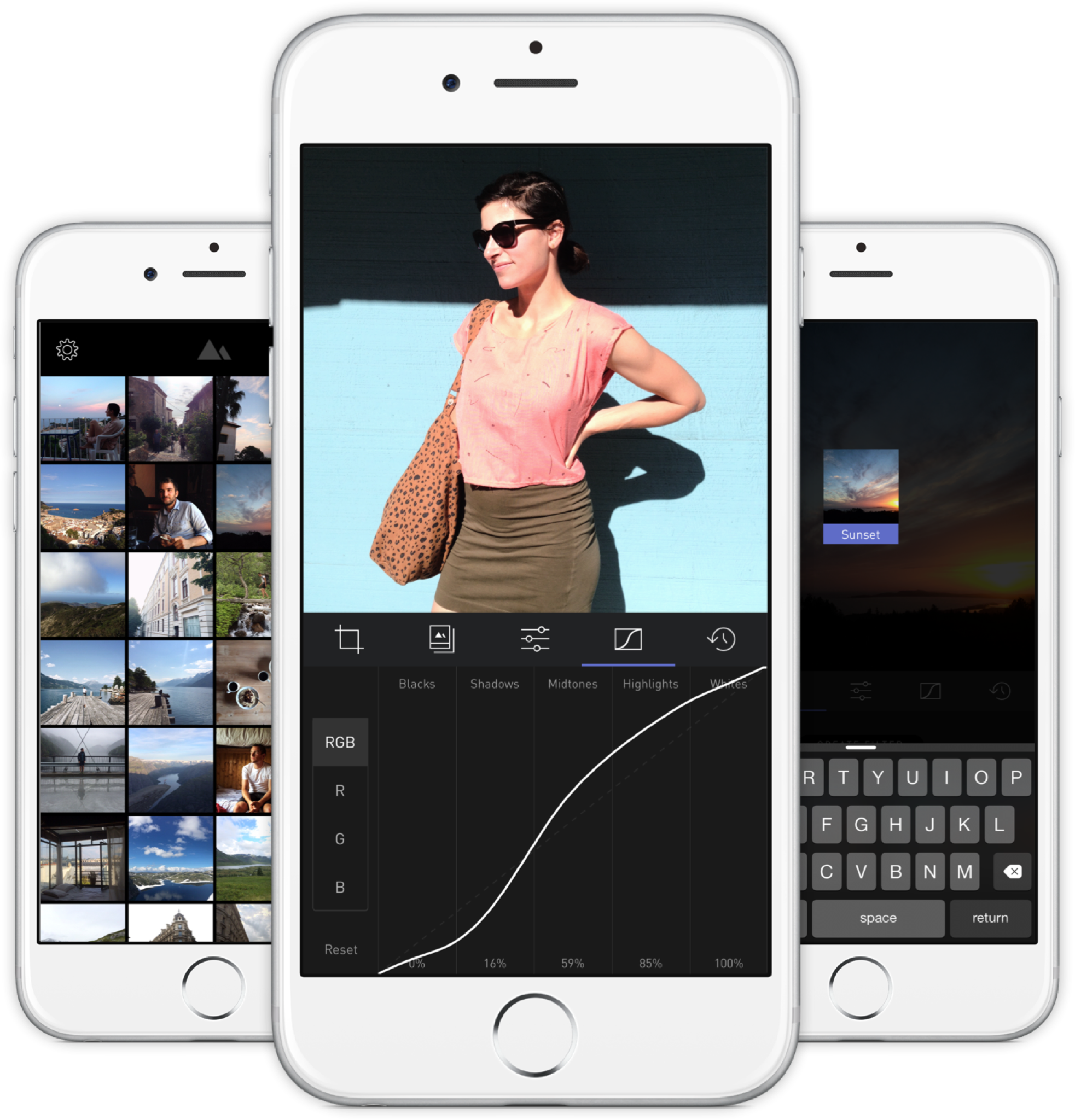
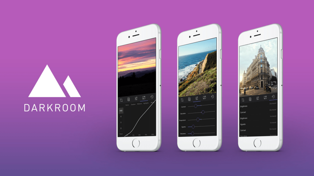
A new photo editor for iOS launched today, and it’s called Darkroom (free, with a $2.99 in-app purchase to unlock Curves).
“Another photo editing app? What does this one bring to the table?” I’ve seen a few early reviews of Darkroom begin along those lines. It seems a sense of fatigue has set in amongst people watching this space, and it interests me to find that I don’t feel the same way. I’ve dived into every new release with optimism, because there are still so many ways to improve upon what we can currently do on our mobile devices.
The Verge mentions Darkroom in the same breath as VSCO Cam, suggesting that the latter has a new challenger. That’s somewhat wrong-headed; they aren’t anymore alike than, say, how Super Mario Bros. and The Legend of Zelda are as ways of passing time. Both apps allow you to tune the look of a photo, and apply presets, but it’s how they’ve been engineered to do it that counts.
Darkroom’s most exciting development, if you listen to what people are saying, is that it allows you to edit photos by adjusting RGB curves. Except that’s not especially new in the iPhone app space — Photoforge did it years ago, Filterstorm has that and much more in the way of professional tools, and there are others. The next feature to get attention is that you can save any of your adjustments as a custom preset, ready for future photos, and it’s like making your own filters. Again, this is territory that Mattebox, PicTapGo, Mextures, et al pioneered awhile ago.
The reason Darkroom is exciting, is that it seems to have absolutely nailed the UX of these features, and made them feel manageable, comfortable, and pleasurable to use as a whole. I want to emphasize that this is hard, and that their solutions are so subtle and executional, they might not have convinced anyone of their worth if presented as bullet points on a slide at some early point in the process.
Using other apps with curves and pro adjustments can feel claustrophobic and stressful on a small screen. I’ve hated almost every single one (Adobe’s own Photoshop Touch is so awful at it) and keep them on my phone as last resorts. If I’m on holiday and take a problematic photo with potential, I’m more likely to wait till I get home just so I can do it on a Mac than try to fiddle with it on the go. Snapseed is one powerful exception, but that uses its own control metaphors, not curves.

Darkroom’s UI is blissfully open in design. It will likely get more complicated as they add more promised features, but I’m hopeful the team finds a way to keep this incredible simplicity. As you page through its 5 key sections (composition, filters, adjustments, curves, history), you never lose your place in the mental model. Nothing is buried in a submenu or out of sight.
You don’t have to click a checkmark to save an adjustment before tapping another, because everything can be undone to an infinite degree, and one can undo hundreds of minute actions back to the beginning of an edit if necessary. Because that step (so annoying in apps like Afterlight, Faded, and VSCO Cam) has been eliminated, using Darkroom’s tools feels close to direct manipulation of the colors and pixels on your screen. One more nice touch: you can tap to the left or right of a slider knob to nudge it in that direction. Simple, but I can’t remember the last time a photo app let me do that.
Loading up a photo is seamless. The app starts with a view of your entire photo library. Tapping a photo pulls it forward, straight into editing mode. At this point, you can swipe to either side to start editing adjacent photos in your library. Flicking a photo down tosses it back into the pile, and you’re looking at all your photos again. In use, it feels gloriously fast and uncomplicated. As that bullet point on a slide, “Seamless browsing and editing flow” wouldn’t have done it justice. This is the kind of feature that needs to be designed, prototyped, tweaked, and tuned over and over to create something subtle, but innovative. A team rushing their project out would have missed the opportunity.
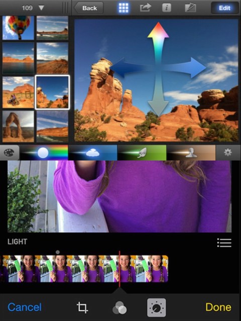
The difference between Darkroom and apps that require stepping in and out of different editing modes, especially when the placement of those modes is obscured, is like Apple’s own (now discontinued) iPhoto for iOS and the new built-in photo editing options in Photos.app. The former was a confusing mess with plenty of user-undiscoverable gestures and submenus, while the latter gives most users all the power they need in a more approachable UI.
I’ve stopped using half of the other apps I’ve listed above as problematic, and forgotten the names of twice as many more. The ones I remember tend to be the ones I really wanted to succeed; I’ll unfairly single out Mattebox as an app with great technology and features, but suffered from confounding UX design. Countless times, I actually got lost inside the mess of buttons and menus that were hidden at the “back” of its camera mode. Thinking about the Darkroom icon sitting on my homescreen now doesn’t fill me with the same dread. I’m dreaming about using it later tonight, and tomorrow, and anticipating what will be new in the first update. Although its name is generic, I don’t think I’ll be forgetting it soon. I imagine it’s the beginning of a new phase of using my iPhone as a camera, one in which I can send better photos home while still on holiday.


Comments
2 responses to “Darkroom Photo App Shows Why UX Details Are Everything”
[…] I think I even wrote some primitive thoughts on it way back when it first came out. Let me see… here we go, from seven years ago (ugh). They moved to a subscription model awhile back, as all good apps are […]
[…] (a photo editor I’ve used since it came out for iPhone — it now works as a universal app on iPad and Mac too) released their new update […]