Tag: UX

  • Week 50.23

    Week 50.23

    Christmas is creeping closer, but the Goodreads Challenge angel won’t be darkening my doorstep as I’ve redeemed myself with two weeks to go! James Hogan’s Thrice Upon A Time was the twelfth book of my year, and definitely one of the better ones. It’s a 1980s time travel story where no time travel takes place, but it grapples with ideas about how timelines are rewritten, plus some other global topics that seem quite prescient when read today. Stylistically, it’s aged, but in that classic sci-fi way I love, which takes me back to reading books in the library after school. I think those hours, that precious access back then to a ton of books I couldn’t wait to read, were the part of going to school I looked forward to most. Anyway I’ve started a dumb new book that I should be finishing this year for bonus credit: The Paris Apartment by Lucy Foley.

    If you’re looking for reading material, it may interest you to hear that I somehow managed to finish B’Fast, the AI-generated breakfast zine project I mentioned last week. The InstaZine GPT I made to create the content is also available through the same link (I updated the page with some additional usage tips today). Now that it’s done, I’m planning to make a companion breakfast-themed zine called “B’Fast (Brandon’s Version)” which will be made entirely by me, in a way that an AI presumably would not. But probably not straight away.

    ===

    Earlier this year, Hipstamatic redesigned and relaunched their Hipstamatic X app. The “X” was dropped, and they added a new social feed. It was the official replacement for their original app which became Hipstamatic Classic. Where the original was funded by in-app purchases for new filters (at a pace of roughly one new 99c release each month), the new Hipstamatic charges a $30/year subscription, doubling their income from faithful fans.

    I used the new app for some photos during my trip to Japan and mostly enjoyed the experience, but it was too buggy and the UI was still too cluttered and confusing (a longstanding problem with the original Hipstamatic app as well) for me to consider continuing with a paid subscription.

    Their main problem is that there are now over 300 filters in the forms of “films” and “lenses” and “flashes” that you can combine to make infinite looks, and no good way to make the attractive human-curated combinations they recommend accessible and discoverable. In the last version, they tried to give a few of these combinations the tangible metaphor of being unique “cameras”, each one with a different skeuomorphic body you picked off a shelf, but essentially they were presets you could call up. But you can keep, what, ten of these aside in a little drawer before you couldn’t tell them apart? And so many of the other combinations were left out of sight and out of mind.

    Now, after a week of teasing social media posts, wherein a “physical camera” was shown in videos — quite obviously a 3D model rendered in AR, but some people believed they were going to release a hardware product anyway — they’ve released a major update (v10) that tries to untangle the Gordian knot of their UX issues.
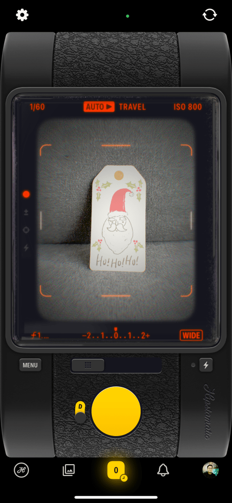
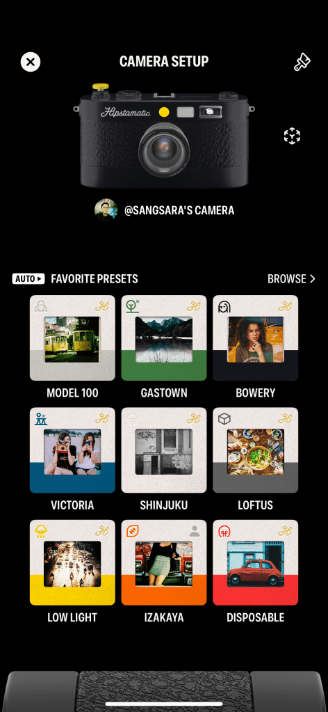
    In this new version, they’ve tried to marry what worked in the original app with a new info architecture and set of metaphors to manage the library of looks they’ve accumulated over the last 14 years. You get just ONE skeuomorphic camera to call your own and customize the look of, and this camera is capable of loading up many presets. You can either let the camera detect the scene and choose a suitable preset for it (Auto mode), or specify the preset yourself (Manual mode). There are 9 possible scenes, such as Travel, People, and Still Life, but in a puzzling and unfortunate move, when you start using the app, each of these scenes has just one or two associated presets. That means you’re going to see the same looks over and over, when there are over a hundred more hidden away in a long list. This was presumably done to allow you, the user, to customize your experience and assign your favorite presets to the scenes.

    There are two major problems at this point. One: leaving it up to the user to gain their own understanding of all the pre-existing “good combos” and assign them to 9 scene categories is insane. It’s a lot of work to hand off to a customer you hope will pay you money. The team should be doing the work of tagging each preset combo with a recommended use case, AND making it easy to assign them. It’s not currently easy. I had to move back and forth between two sections of the app looking at presets and memorizing their names to go assign to a scene, because these things aren’t placed together. Off the top of my head, it just needs an in-line list of suggested presets (from the aforementioned tagging exercise) on the same screen where you customize a scene’s presets. Perhaps this is coming. I’d argue it should have been in the MVP release of such a big redesign.

    Two: as I mentioned, there are infinite possible presets given the number of ingredients they’ve accumulated. You can make your own combos, but there’s no great way to experiment and do this — there should be a sandbox where you can explore each lens/film/flash’s characteristics and try them out in real time to find a good combo. There used to be a section of the app called the “Hipstamatic Supply Catalog” where you could browse all these effects (it was only like a static magazine, but they could have made it interactive), and this now seems to be gone or I can’t find it anymore in the maze of menus and buttons. Perhaps they’re okay with most users just using the curated “good presets” and never making their own, but it seems like a missed opportunity.

    I was feeling a mix of optimistic and bored, so I paid for an annual subscription anyway and will be trying to take lots of everyday silly snaps with this, and maybe even use it on my upcoming trip to Thailand. But if you know someone who works at Hipstamatic, please talk to them about taking on some external advice.

    ===

    • I finished watching Pluto on Netflix. It’s still a strong recommendation for me; a modern anime made with classic sensibilities and a story that really keeps you guessing. It’s also a very different Astro Boy story, suitable for people who hear “Astro Boy” and think it’s stuff for kids.
    • We started watching A Murder at the End of the World and I’m really liking it so far. Especially its star, Emma Corrin, who I’ve never seen in anything else before. They’ve got the most strikingly similar face to Jodie Foster, I was sure they were related.
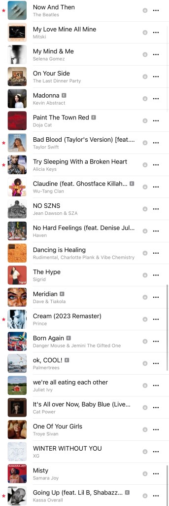
    • New playlist! BLixTape #3 is done, made up of mostly new songs that I’ve been listening to since mid-October. Add it here on Apple Music.
  • Week 43.23

    Week 43.23

    Bacheloring, breakdowns, and beverages

    Kim was away again for work most of the week. This effectively gave me the gift of freedom from our Beyond Deck addiction, cold turkey. So I played a little Super Mario Wonder, drank too much bourbon, watched Bitcoin YouTube, and lazed around unproductively on my iPhone.

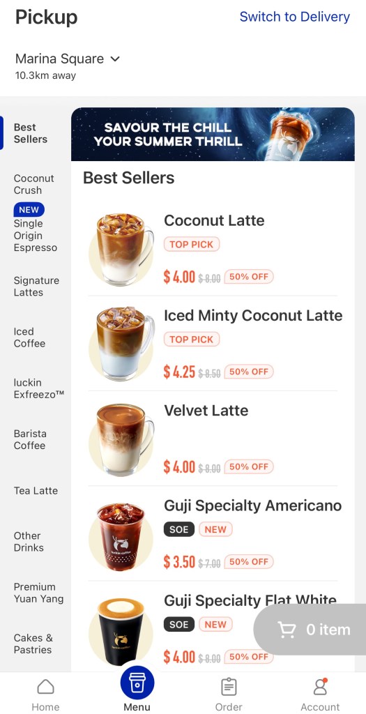
    And on the days I decided to work from the office, I was richly rewarded with elevator breakdowns, mall escalator maintenance, and other inconveniences that made me wish I’d stayed home. I don’t think I’ve mentioned my recent obsession with Luckin Coffee, the Chinese chain that’s been expanding nationwide, including an outlet in my office building. Bosses forcing a return to office take note, getting one of their iced coconut lattes in the morning is one of the reasons I head in. I was looking forward to my fix one of these cursed mornings but found the branch closed for upgrading.

    Luckin’s model is fully app-dependent and most branches are just pickup counters, with no seating. You order on your phone, pay via card or Apple Pay, and pick it up by scanning a QR code. You don’t interact with staff, and they don’t handle any filthy cash. For comparison, you can do the same thing with Starbucks’s app, as well as order in person like a boomer. To get you past the friction of downloading the app and setting up an account, your first drink at Luckin is just $0.99. Subsequently, you’ll get hit with a barrage of discount vouchers ranging from 35% to 60% off, so much so that I haven’t paid full price for a coffee yet.

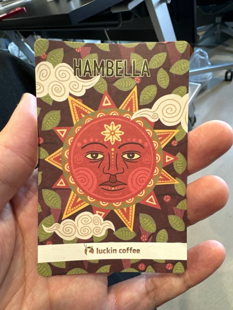
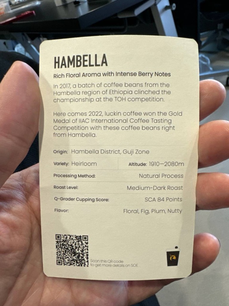
    For the record, their drinks are priced around $8 each, and they’re somewhere between a Starbucks tall and grande. The discounting is an aggressive acquisition play, of course, but I’ll take low margin coffees while they last, not least because they’re actually pretty tasty! Like Starbucks Reserve, they offer a range of single-origin specialty coffees, and even give you beautiful little info cards with tasting notes. The absurdity is not lost on me, given their quick-service image it’s like if McDonald’s gave you facts on the cow in your Quarter Pounder. Nevertheless, on that day my Luckin outlet was closed, I went to a Starbucks for the first time in quite a while, and it felt like comparatively much less value.

    ===

    From clicks to chats

    I went over a new trend report my company put out, and there’s a large focus on generative AI as one might expect, which led to a couple of interesting conversations about how much work is ahead of us when it comes to overhauling the touch points we use to deal with merchants, service providers, and even governments.

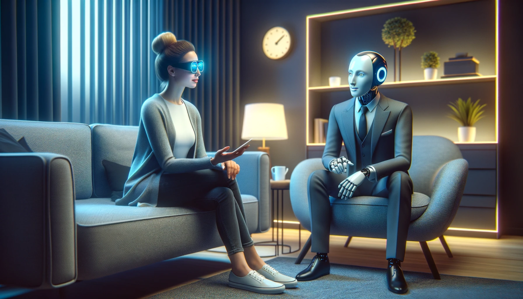
    In a way, the graphical interfaces we use today evolved as proxies for “natural” verbal and gestural communication. Similar to how we used mouse cursors because we couldn’t touch displays directly, we have menus and buttons and screens filled with data because we can’t directly ask computers for complex outcomes. The promise of large language models is that now we might.

    There have been think pieces this week about how Apple was “caught off guard” by this gen AI wave and is now scrambling to catch up. I think they have plenty of time; here’s why:

    What’s at stake isn’t smaller-scale improvements like the transformer-based autocorrect in iOS 17; it’s about whether gen AI can bring a more radical change in how we use computers. You can already see the hunger for this — the dream of J.A.R.V.I.S. — in a dozen half-baked AI-powered product announcements. We’re not far from Humane’s wearable phone alternative, Rewind’s Pendant which will process everything you say or hear, and Meta has great-looking new “smart” Ray-Bans which can put their new AI voice assistant(s) in your ear (US-only).

    The basic version of conversing with AI looks like a text chat, and on the other end of the spectrum is a “multimodal” natural chat that takes a user’s body language, tone, and facial expressions into account. Putting aside the fact that such a model hasn’t been trained yet, just the massive amount of personal data this would involve means only a company positioned to put privacy first might get any traction. And then there’s the staggering hardware requirements of doing this in real time. If only someone was working on a new kind of computer equipped with industry leading silicone, and biofeedback sensing that can even predict you’ll tap a button before you do it

    Assuming this is the right thing to do at all, the Apple Vision Pro with its microphones, retina scanners, and hand-tracking cameras should be well positioned for a future where you can simply sit down in front of an AI relationship manager from your bank, have a free-flowing discussion, and see the appropriate figures and charts pop up — instead of poking around a UI to find out how your money is doing. But the stated purpose of the Vision Pro is spatial computing, which is only a step towards natural computing.

    So like every other time in history, Apple will wait while others jump the shark first, and hopefully clean up after with a more sensible execution. They have the time; it’s just a shame for impatient people that the hardware looks so ready. But as a wise man once said: technology moves fast, while people change slowly.

    ===

    Pints and pop music

    Ex-colleague and friend Bert is back in town for the first time in over four years, so we met up twice to catch up and see some other faces we’ve missed in recent years. This meant many pints of Guinness (if ever I associated a person with one drink only, it’s Bert and Guinness), which compounded with the aforementioned bourbon and a gut-busting, sodium-loaded visit to Coucou hotpot for a physically taxing week. Every organ is straining to detoxify and I really felt the effects all weekend.

    • We watched half of the third season of Only Murders in the Building and I’m happy to report it’s much better than the second. I think there’s even a self-effacing joke at one point about how the first season of the in-show podcast was more likable than the second. It comes down to a clearer story with fewer detours, the kind I’ll probably remember a year from now unlike, say, season two’s.
    • Sigrid has a new four-song EP out: The Hype. It is extremely Gen-Z in that it has a shoddy photograph on the cover and looks like it was made in Canva. The music is much better, but she’s just doing more of the same, which I won’t complain about because if Coldplay just kept doing the same thing as in their early albums maybe they wouldn’t be so insufferable today.
    • Taylor Swift’s 1989 is finally out in (Taylor’s Version) form! I think this was the first album of hers to ditch the country pop style and just go straight pop? Did it have something to do with leaving Nashville for New York? In any case, it was the first album of hers I played for myself, and also the one Ryan Adams liked enough to cover I guess. I’ve been mostly playing both versions this weekend and came across a debate I never knew I needed: is 1989 a beach album about the Hamptons or a city album?
  • The Trouble with Instagram Stories

    I enjoyed reading this TechCrunch interview with Kevin Systrom where he openly gave credit to Snapchat for their ‘Stories’ feature, and talked about how copying it for Instagram inevitably created something different.

    What I’ve observed matches much of what’s been said: it gives most people a much larger starting audience compared to what a new Snapchat user has, which increases the likelihood of success; it’s really well implemented (I especially like that switching from one user’s Story to the next has a different transition animation than skipping a scene, making it much clearer that you’re on another person now); and it makes Instagram a more complete place to look into the two sides of a person’s life: the imperfect moment and the photograph worth sharing.

    BUT one early side effect has also materialized, and it’s already changing the way I use Instagram. In short: I don’t want to see many of these Stories! I follow a variety of different accounts, from brands, obvious social media influencers/shills, dogs, cats, interesting strangers, and friends. It’s Day 2 since the launch, and many of them have flooded my feed with too much uninteresting stuff. For many of these accounts, I want their photographs worth sharing, but not their imperfect moments. And there doesn’t seem to be a way to only follow one type of content on a per user basis.

    So I’ve started to unfollow people. Which I’m sure Instagram doesn’t want.

    In fact, the last major feature they added (an algorithmically sorted timeline) was probably aimed at getting people to follow more accounts. It let me add people without cluttering up my feed to the point where I’d miss posts from those I really really liked. For example, I could follow Canon cameras’ account for their occasional spectacular photos, but still see more personally interesting updates from my friends first. No problem. This morning, I unfollowed Canon because their chatty video Stories were getting in the way of my seeing life updates from friends.

    There isn’t this problem right now on Snapchat, which makes me think it might eventually win out if people want to keep these separate. I’m not sure how Instagram might resolve this, but there’s definitely a difference here. Namely, not all social content is created equal.


    The one other reason why I’ll continue to use Snapchat is their new Memories feature. Instagram Stories doesn’t let me do the same things.

  • iOS 10 Makes the Timeline UI a Reality

    Wired: Apple May Have Figured Out the iPhone’s Most Promising Feature

    3D Touch is instrumental to Apple’s newly rethought lock screen, in a way that could fundamentally change how you interact with your iPhone.

    But with iOS 10, you’ll use your home screen a whole lot less.

    This article from Wired today recalls the thinking of many UX designers who believe that homescreens tiled with app icons will soon give way to a new kind of smartphone UI: the timeline. Over the last few years, both iOS and Android have been making their notifications richer, with simple functions like deleting new emails, quickly replying to texts, or faving tweets, amongst others.

    lockscreenBut iOS 10 looks to be taking it to a whole new level. iPhones will light up when you raise them, and interactive notifications can expand into whole widget-like apps with live maps and data, and house more complex options than a dialog box or text input field can provide. And the best place for this new timeline UI to live is on the lock screen of your phone, the starting point of any interaction, and an arguably more valuable space for accomplishing tasks than the homescreen.
    And it’s 3D Touch, launched to public disinterest with last year’s iPhone 6S, that’s been the missing piece all along. Without pressure sensitivity and Apple’s Peek & Pop gestures, a self-activating lock screen might be a pretty bad place to have action buttons that can accidentally touched. I’d be interested to see how it works on phones without it, such as the new iPhone SE. Perhaps they just won’t have Raise to Wake.

    Also worth remembering that this new timeline of Things That Need Your Attention Most will live beside the Today screen of widgets (swipe to the right), which should do a lot for the idea that we’ll all be unlocking our iPhones a lot less and getting stuff done quicker later this September.

  • A UX design walkthrough of Feedly’s new Explore experience

    Eduardo Santos: Introducing feedly’s New Explore Experience

    I’m a pretty light user of Feedly these days, perhaps because RSS is just a chronologically ordered dump of too much information and I’ve grown to prefer a little machine intervention, but this detailed breakdown of a feature redesign is quite the pleasure to read.

    Feedly probably does have a bigger role to play in aiding content discovery (no one can get enough of it), but what’s interesting is that an RSS reader approaches it in a different way from others like Flipboard. It’s less about piecemeal articles, topics, or user-curated magazines. It’s sites! Boosting little known sites and blogs exhibiting consistent quality serves a much more important cause: feeding the cycle of good content creation and letting authors grow their follower base, not enjoying random hits of virality at the whim of algorithms and chance.

  • Darkroom Photo App Shows Why UX Details Are Everything

    Darkroom Photo App Shows Why UX Details Are Everything

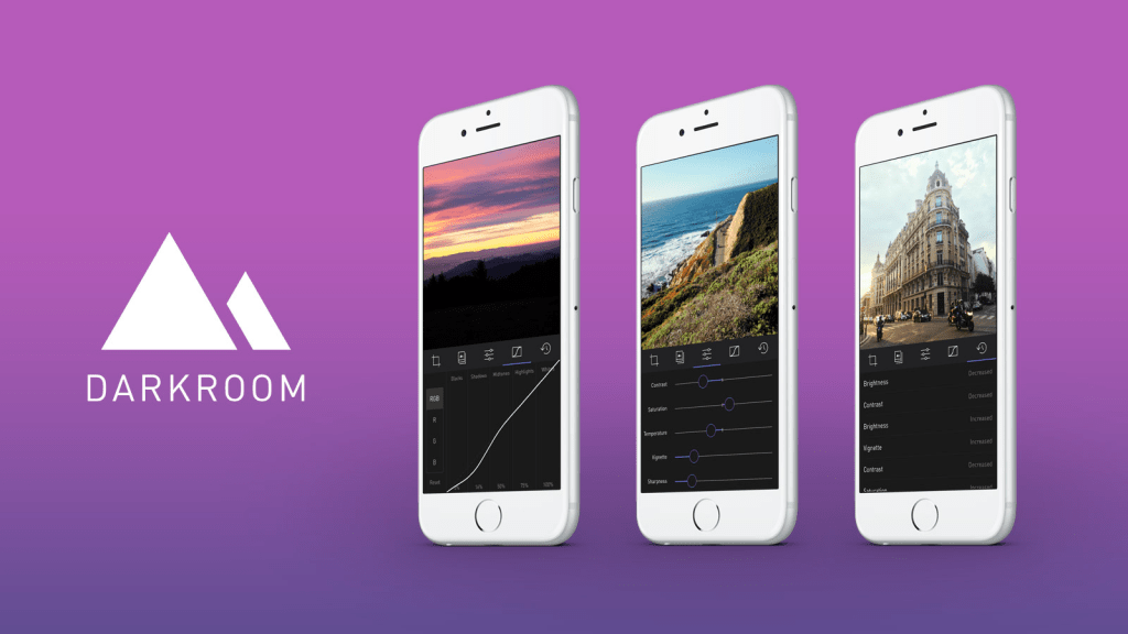
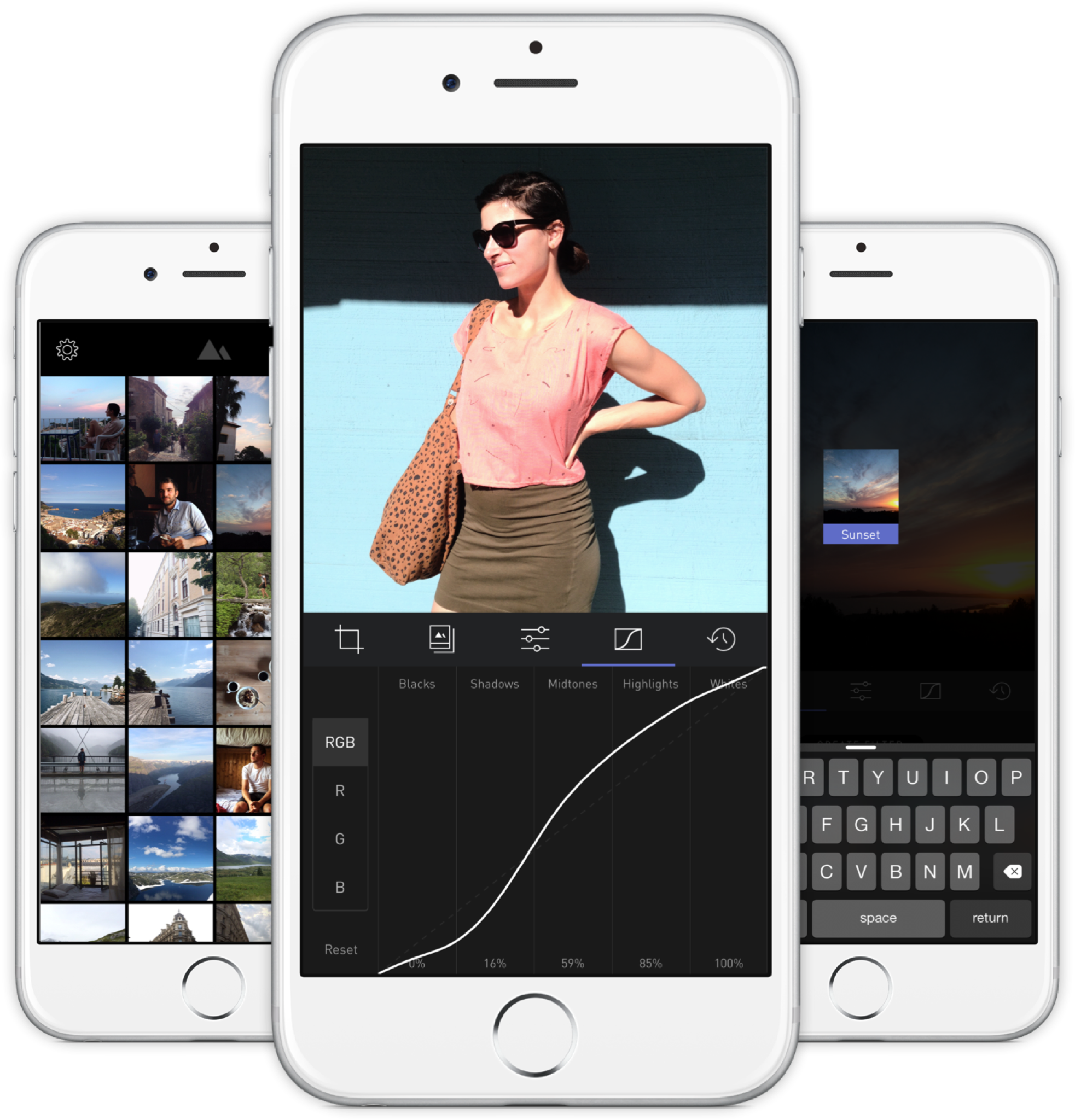
    A new photo editor for iOS launched today, and it’s called Darkroom (free, with a $2.99 in-app purchase to unlock Curves).

    “Another photo editing app? What does this one bring to the table?” I’ve seen a few early reviews of Darkroom begin along those lines. It seems a sense of fatigue has set in amongst people watching this space, and it interests me to find that I don’t feel the same way. I’ve dived into every new release with optimism, because there are still so many ways to improve upon what we can currently do on our mobile devices.

    The Verge mentions Darkroom in the same breath as VSCO Cam, suggesting that the latter has a new challenger. That’s somewhat wrong-headed; they aren’t anymore alike than, say, how Super Mario Bros. and The Legend of Zelda are as ways of passing time. Both apps allow you to tune the look of a photo, and apply presets, but it’s how they’ve been engineered to do it that counts.

    Darkroom’s most exciting development, if you listen to what people are saying, is that it allows you to edit photos by adjusting RGB curves. Except that’s not especially new in the iPhone app space — Photoforge did it years ago, Filterstorm has that and much more in the way of professional tools, and there are others. The next feature to get attention is that you can save any of your adjustments as a custom preset, ready for future photos, and it’s like making your own filters. Again, this is territory that Mattebox, PicTapGo, Mextures, et al pioneered awhile ago.

    The reason Darkroom is exciting, is that it seems to have absolutely nailed the UX of these features, and made them feel manageable, comfortable, and pleasurable to use as a whole. I want to emphasize that this is hard, and that their solutions are so subtle and executional, they might not have convinced anyone of their worth if presented as bullet points on a slide at some early point in the process.

    Using other apps with curves and pro adjustments can feel claustrophobic and stressful on a small screen. I’ve hated almost every single one (Adobe’s own Photoshop Touch is so awful at it) and keep them on my phone as last resorts. If I’m on holiday and take a problematic photo with potential, I’m more likely to wait till I get home just so I can do it on a Mac than try to fiddle with it on the go. Snapseed is one powerful exception, but that uses its own control metaphors, not curves.

    Darkroom’s UI is blissfully open in design. It will likely get more complicated as they add more promised features, but I’m hopeful the team finds a way to keep this incredible simplicity. As you page through its 5 key sections (composition, filters, adjustments, curves, history), you never lose your place in the mental model. Nothing is buried in a submenu or out of sight.

    You don’t have to click a checkmark to save an adjustment before tapping another, because everything can be undone to an infinite degree, and one can undo hundreds of minute actions back to the beginning of an edit if necessary. Because that step (so annoying in apps like Afterlight, Faded, and VSCO Cam) has been eliminated, using Darkroom’s tools feels close to direct manipulation of the colors and pixels on your screen. One more nice touch: you can tap to the left or right of a slider knob to nudge it in that direction. Simple, but I can’t remember the last time a photo app let me do that.

    Loading up a photo is seamless. The app starts with a view of your entire photo library. Tapping a photo pulls it forward, straight into editing mode. At this point, you can swipe to either side to start editing adjacent photos in your library. Flicking a photo down tosses it back into the pile, and you’re looking at all your photos again. In use, it feels gloriously fast and uncomplicated. As that bullet point on a slide, “Seamless browsing and editing flow” wouldn’t have done it justice. This is the kind of feature that needs to be designed, prototyped, tweaked, and tuned over and over to create something subtle, but innovative. A team rushing their project out would have missed the opportunity.

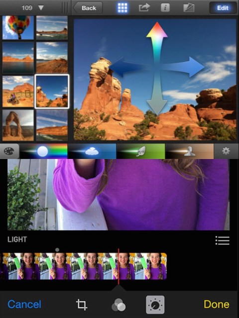
    The difference between Darkroom and apps that require stepping in and out of different editing modes, especially when the placement of those modes is obscured, is like Apple’s own (now discontinued) iPhoto for iOS and the new built-in photo editing options in Photos.app. The former was a confusing mess with plenty of user-undiscoverable gestures and submenus, while the latter gives most users all the power they need in a more approachable UI.

    iPhoto Photos

    I’ve stopped using half of the other apps I’ve listed above as problematic, and forgotten the names of twice as many more. The ones I remember tend to be the ones I really wanted to succeed; I’ll unfairly single out Mattebox as an app with great technology and features, but suffered from confounding UX design. Countless times, I actually got lost inside the mess of buttons and menus that were hidden at the “back” of its camera mode. Thinking about the Darkroom icon sitting on my homescreen now doesn’t fill me with the same dread. I’m dreaming about using it later tonight, and tomorrow, and anticipating what will be new in the first update. Although its name is generic, I don’t think I’ll be forgetting it soon. I imagine it’s the beginning of a new phase of using my iPhone as a camera, one in which I can send better photos home while still on holiday.

  • An Old Man Tries Snapchat

    If you have even a passing interest in social media and haven’t seen Casey Neistat’s video on how “Snapchat Murders Facebook”, you should.

    Like my friend Vicki notes in this post, Snapchat wasn’t something that I immediately saw any value in. I installed it once ages ago, didn’t have any friends on it (a combination of age and geography), and promptly left. Then Instagram’s Bolt soft-launched in Singapore and got some interest going around ephemeral photo messaging, but it still isn’t something that friends in their 30s seem to want.

    We’re a generation of digital hoarders; the people who abandoned other providers for Gmail en masse because it promised never having to delete an email again. Cleaning out my harddrive the other day, I found a folder of interesting photos I’d saved off the net in the early 2000s: movie posters, album cover art, photos of global landmarks, and the like, simply because the sight of them were scarce and valuable pre-internet! You have to imagine what it was like to live in that time. I ended up deleting almost all of them because these days, if you can put a name to it, you can find it online.

    So behavior is changing slowly amongst older people, and much faster amongst those in their teens, but photo messaging still wasn’t something I needed Snapchat for. Every messaging app offers it now. The ephemeral twist is a footnote.

    Snapchat’s Stories feature changed the way I look at the product. It turns it into something of a lifelogging and broadcast platform. I can’t name another app (still) on the market that lets you grab video snippets of your life, and share them in a stream that your friends can tune in to. The fact that clips disappear after 24 hours is actually the part I like LEAST. It seems Vicki’s with me on this, as she’s set up a YouTube channel to archive these Stories to after they’ve been erased. I may soon do the same1.

    There are some other nascent thoughts I have on Snapchat’s bizarre UX; the more I think about it, the more brilliant it is — breaking many of the rules we use to design interfaces for users of all ages, in order to create an exclusive, obtuse, game-like experience (inviting the spreading of knowledge by word of mouth) that seems intended to make it a success with a younger crowd. I may be wrong, and it may simply be like this as a result of being designed by a younger team. Additionally, its overall visual clumsiness (check out that ghost icon) encourages you NOT to take it seriously, which makes it totally okay to fire off imperfect, portrait-oriented, poorly-shot, but authentic moments without too much thought.

    If you’d like to follow me, I’m on there as “sangsara”.


    1. Sharing these vertical videos on another platform poses a slight challenge. I tried every video editing app on my iPhone, and just about all of them failed to stitch the short clips together without cropping, unexpectedly rotating, or distorting the videos. Even Apple’s own iMovie produced only a black screen with audio playing, probably because Snapchat’s video encoding/metadata in non-standard in some way. Amusingly, the app that finally managed to do the job perfectly was YouTube’s own Capture app
  • Ten Days with the iPhone 6 Plus

    Ten Days with the iPhone 6 Plus

    Moving from any of the earlier iPhones to the new 6 Plus is challenging, even if you’re acquainted with one of the larger smartphones on the market. In part, this is because it won’t feel like an iPhone when you first start. Of course, I’m talking about the larger screen and the digital gymnastics required to operate it, although the way it fits in your clothing (you actually notice it for once) will also give you pause. My first experience with a larger phone was in 2012 when I bought (and eventually sold off) a Samsung Galaxy S III.

    At the end of that 10-day experiment, I concluded:

    I don’t want to mess with battery settings and tweaks. I don’t want the ‘freedom’ to spend hours scouring the web for ways to make my phone better. I want a phone made by a solid company that I trust, optimized to the best of their ability in a combination of software and hardware design, so that I cannot possibly believe that I could do better myself. Because that frees me to do everything else. But I also want that phone to have a larger screen.

    I went back to my comparatively tiny 4S, and upgraded to the slightly better iPhone 5 when it came out. But now, with the new 2014 iPhones, I’ve finally gotten what I wished for: A great phone. A big screen. And not as two separate things.

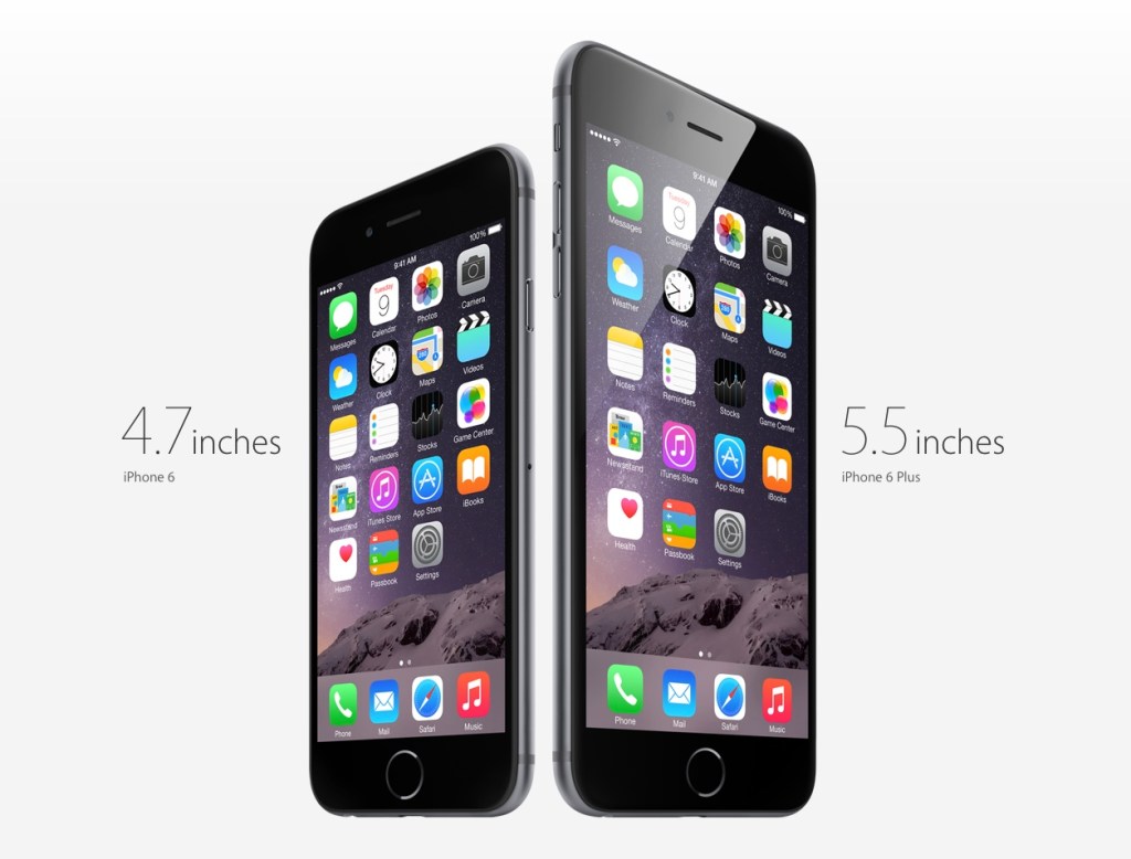
    Why the Plus and not the regular 6? Fear of missing out, really. It’s funny how the Samsung’s screen felt gigantic at 4.8” back then, but now Apple’s 4.7” seems so conservative; too small a leap for all the time I’ve waited for them to do this. The iPhone 6 was perfect for 2012, but we live in extreme times, us 2014-ers.

    Handling and Design

    So, the challenges. It’s been an uncertain 10 days. My theory is that the 6 Plus is a polarizing device if you are a smaller person/have smaller hands. You either know whether you’re okay with the compromises or not. I’ve spoken with women who use Galaxy Note phones, and a common sentiment has been “I can’t use most of the other large phones one-handed anyway (or put them in a pocket), so I just went for the biggest one”. It seems that if you have small hands, you either want a really small phone (iPhone 4-5 series), or go all the way with a 5”+ display and hold it all the time or stow it in a bag.

    But if you have larger hands like me (I can just about hold a basketball with one hand), you could technically use the thing one-handed, but that doesn’t mean you should. It’s still a dangerous balancing act each time, and I swear I’m using muscles I haven’t before, causing a slight ache in the forearms. I’ve read laments that you can’t use it one-handed while lying in bed. Untrue; I’ve done it for hours at a time, hence the pain. Deciding whether one should do all the things one technically could is the hard stuff life is made of. Most people aren’t ready for decisions like this until they’ve had a few kids.

    And remember how the iPhone 5 looked “terrible” when it first leaked online, and many wished it wasn’t real? The odd two-toned back, the suboptimal placement of the camera lens against the rounded corner and, later, the broken look of an inevitably dinged-up chamfered edge? Now those same people look back and consider it, all in all, a handsome design. I was one of those people, and this makes me feel unqualified to comment at length on the iPhone 6 family now. But damn if it ain’t ugly with that protruding camera module and those fat, rubbery antenna lines!

    But the phone’s roundness serves a functional purpose that I appreciate. Many sleek, obsidian phones appeal visually, but don’t feel right in the hands. Sony and other manufacturers have put out a bunch of very nice slabs, but nestle their bottom corners into the fleshy pad under your thumb for a 20-minute news reading session and you’ll see. The iPhone 4 was a similarly beautiful device. It felt pretty good too, but that design wouldn’t hold up when enlarged to accommodate a 5.5” screen. I’d say the iPhone 6 and 6 Plus are the “right” shape for what they need to do.

    Nevertheless, I very much disagree with the smoothness of its back, coupled with such a thin body. Once you add one of the Apple leather cases, it becomes much easier to pick up, hold securely, and use comfortably. It’s a case that fixes just about all of the phone’s superficial design flaws. Leather’s tactility and softness actually allows you to feel more of a connection to the device.

    Others have noted Apple’s adherence to the classic iPhone look for the 6 Plus, with thick top and bottom borders despite the larger screen. This of course allows for a large physical Home/TouchID button, and visual balance. Held in the hand, the phone seems comically tall, and if you can only grasp it below the midpoint, its weight distribution wants to tip itself forward and outward. But use the phone in landscape, and the need for symmetrical weight distribution is obvious. The same goes for the borders: many Android phones have a “right” way to hold them in landscape; merely touch the wrong edge and you’ve accidentally hit a hidden capacitive button that takes you back to the Home menu. I much prefer Apple’s grabbable safe zones.

    Give It Time

    In the first week, I was completely undecided. I looked at the smaller iPhones my friends and colleagues had ordered, and wondered if I’d made a mistake I would have to live with for a whole year. #Bendgate/#Bendghazi didn’t help, but that worry passed within a couple of days. It’s a strong phone, my tight jeans from Uniqlo have a bit of stretch to them, and most importantly, I have AppleCare+ and faith in their customer service.

    I found myself fondling other people’s iPhone 6s, and remembering the times when I could enclose an entire phone in my hand. They grow up so fast! And then at some point after the first week, it just clicked. Somewhat unbeknownst to my conscious brain, it became the perfect size for an iPhone. Later that day, I picked up a friend’s iPhone 6 and waited for the regret to kick in. Nada.

    Switching to an inherently inconvenient form factor that prevents you from carrying and interacting with your most-used computer in the ways that you’re accustomed to is bound to be uncomfortable. I figure even if you’ve made rational peace with all the factors you’re well informed about, it takes a little bit of time for the heart to come around. That’s a problem for Apple in the showroom. I wonder how many people immediately chose the 6 when they might have been happier with a 6 Plus. Next year’s 6S Plus sales will tell the story.

    Off-Screen Considerations

    Battery Life

    The second-biggest new feature for many is the 6 Plus’s enhanced battery life. During the final weeks of my old iPhone’s tenure, its inability to stay functional from morning to night was a bigger annoyance than the small screen. Finally, that problem has also been licked.

    So far, it’s been tremendous1. Also, if you imagine that you may someday be unhappy enough with the iPhone 6’s battery that you’ll buy a Mophie battery case or similar, remember that it will essentially make for an overall bigger and heavier device than the iPhone 6 Plus, which probably won’t need one. That makes for a pretty clear choice. My best example to recall is one particularly busy day with lots of messaging, photo sharing, a 20-minute phone call, GPS directions for a short trip, playing a 3D racing game for a bit, and streaming Spotify music at “Extreme” quality over 4G during my commute, and still making it home 12 hours later with 20% to spare.

    Gaming

    If you play games, you’ll find the 6 Plus an amazing machine. Its screen is bigger, brighter, and better than that of any portable on the market, including Sony’s PS Vita and Nintendo’s 3DS XL. There’s a common argument against the smartphone as a challenger to these systems, and it involves the lack of physical controls. I won’t get into that discussion here; suffice it to say I’ve played hours of Real Racing 3 (free) on my phone and never missed the joystick. Also, if you’ve ever squinted at tiny enemies in an FPS on your old iPhone, and struggled with having two thumbs blocking the action, you’ll recognize that the 6 Plus has the potential to help some genres take off on mobile. I’m planning to give X-COM another go now that everything will be more discernible, and keep in mind that was a console game ported over from the Xbox 360.

    As I understand it, iOS 8’s “Metal” graphics architecture also allows game developers to squeeze more of the kind of performance out of Apple’s chips that they’re able to on dedicated gaming machines, which don’t have to worry about accommodating many of the other features that a general purpose ~~phone~~ computer supports. Games are going to look ridiculously good.

    Photography

    It’s better. It’s astoundingly good for a smartphone. Yes, the optical image stabilization gives you an extra f-stop in low light when photographing still scenes, but you shouldn’t be using the default Camera.app for those anyway. The Cortex Camera app takes longer exposures with very good software stabilization, and supersamples/averages out sensor noise in dark scenes almost completely.

    Productivity

    Everybody talks about landscape mode, but the benefits are still questionable to me, 10 days in. Fire up Mail.app and you’ll see that it’s a little too cramped to be more useful. The information density improves if you turn your system-wide dynamic text size down to one of the lowest settings, which takes more advantage of the HD resolution and 400ppi display. But it’s not for everyone, and I suspect that for a good chunk of people (for example, those over 40), the 5.5” display is best employed as a big screen, not a dense screen.

    Typing is a mixed bag because I’d gotten really good at the old iOS keyboard. In apps that haven’t been updated for the new phones, the default keyboard appears larger, which messes with your muscle memory. Since iOS 8 launched, I’ve mostly used SwiftKey (it beat out Swype in accuracy). Its swipe mode helps with one-handed input when that’s necessary — having a thumb in continuous contact with the screen just feels more stable than lifting and tapping.

    I think the most productive thing about the bigger screen will be the ability to sketch things of moderate complexity. In the past, you might get some basic shapes down before having to pinch-zoom around a lot to create anything useful. Usually I’d feel stupid within 20 seconds of trying, and give up. Now, I think you might be able to sketch a decent wireframe on your phone. No more napkins.

    In particular, I can’t wait for a version of Paper by FiftyThree, or Penultimate, that takes advantage of the 6 Plus. I’d love to complement my Evernote and Moleskine notebooks with some quick and editable digital drawings. I have to mention that every time I’ve tried out a Galaxy Note and stylus, the software has been the most terrible part of the experience. Samsung bundles some in-house notes app with an incomprehensible and dated-looking UI when they really should have partnered with an established third-party app to provide one. I don’t know that there are any on Android, though. Seems like a real miss that they’ve had these larger devices on the market for so longer and didn’t nail the sketching use case.

    Conclusion

    After 10 days, I’m definitely bullish on this form factor. It took awhile to get over the hump, and if we enjoyed the generous return policies that customers in the U.S. seem to have, I might have been tempted to trade it in for the more familiar iPhone 6. But quite a few pundits have called the Plus a new kind of device (for Apple), one that asks you to reset your expectations of an iPhone in exchange for a more capable companion, and they’re quite right2.

    In the years between the iPhones 4 and 6, I was often beguiled by larger devices (in spite of the Android OS), and bought the Galaxy S III, Nexus 4, and XiaoMi RedMi and Mi3 phones for research/secondary phone purposes. Each time, I went back to the iPhone in relief — seeing its small screen as the weakest link in a strong Mac and iOS product ecosystem — and cursed the seeming necessity of compromise in every aspect of this mortal coil. Now at last, that itch is dead.


    1. Although iOS is meant to prevent apps from misbehaving and sucking your battery dry, there are exceptions. Some take every opportunity to wake up in the background, using location data for geofencing and refreshing streams. I’ve found Normal: Battery Analytics to be a useful app, even with iOS 8’s new ability to show which apps use the most power. Normal goes a step further, comparing your battery stats with other users to let you know if your problems are in the minority, and predicting how many hours of standby time you’d claw back by forcing those apps to quit instead of just leaving them in the background. I’d always believed that a backgrounded app couldn’t abuse your battery in iOS, but from the sounds of their literature, I might have been wrong. 
    2. Apart from sketching, writing and editing text on the 6 Plus is itself a very different experience. It’s liberating to see a taller expanse of your document rising above the keyboard, especially in full-screen capable apps like iA Writer Pro, which I used for this post, switching between Mac and iPhone. It feels less like you’re wrestling your phrases into place, and more like they can come out and lie anywhere they want on the floor and it’s exactly what you wanted.