With a brief followup on yesterday’s haul: the lobster flavored crisps were rubbish, and the Mt. Rainier coffee didn’t rot my teeth!
Reviews of products and services I probably paid for
With a brief followup on yesterday’s haul: the lobster flavored crisps were rubbish, and the Mt. Rainier coffee didn’t rot my teeth!

A little over a year ago, I was eating a KFC rice bucket (it’s popcorn chicken and a cream sauce over greasy Singaporean chicken rice for $4) when some friends on holiday sent photos of themselves by the pool looking trim and fit. Major mirror shame. That same day I started on a diet and ultimately lost about 10 kilos over the following months.
Not knowing anything, I did the most logical thing and went with calorie counting. Over a few weeks and several conversations, I worked out that it was far better to eat protein-rich salads, embrace fats, cut down on carbs, and eliminate unnecessary sugars. Only lately did I learn that eating like this continuously is the most important thing; if you’re only doing it every other day and not letting your body get into a rhythm of ignoring carbs and burning fat, it’s useless.
So lately I’ve been trying to get back into eating healthily because I’ve spent the last 4 months of this year being careless and having too many nasi lemak breakfasts near work. There’s a lot of salad in the CBD area, but it’s awfully generic, especially if you’re looking at the ones in hawker centers. Gotta break it up once in awhile. Which is why I’m really glad to have found Grain Traders at the new Capital Green building diagonally across from Lau Pa Sat.

I’m not sure how they describe their concept, but since I’m a copywriter I’m gonna go with “fancy ass salads made with freaking tasty shit”.
I dropped in in the morning for a cup of coffee and a takeaway bowl of roast pork brown rice porridge ($8) which was more pork than porridge. I tried to spoon some rice up for a photo but couldn’t get enough of it because of all the baby corn and avocado and egg in the way. That’s a really good problem to have. The boiled egg, by the way, was perfect: soft and runny in the center.
In our corner of the CBD, breakfast ranges from $2 for some plain fried beehoon to $15 for an expat-friendly wrap. As I ate the porridge, I couldn’t help but imagine how much some of the places around would charge for something like that. Not $8. Maybe $12? A bowl of tomato soup goes for $10 at one place!


People say I can get a bit obsessive, but if those jerks are too undisciplined to eat the same thing for 6 months straight, I don’t care what they think. So naturally I went back again a few hours later to check out the $16 bowls. You can get them on white sushi rice, brown rice, quinoa, salad leaves, soba, or bulgur wheat.


I’m impressed by the amount of care that seems to go into the individual components, like this “crunchy medley of greens” they put in some of the recipes; it’s conceptually one whole unit, but some vegetables in it just pop, like they were cooked and flavored in a separate process, and it elevates the whole thing with complexity. And that’s just one of the 6 or 7 things that was in my “Rooster’s Crow” quinoa bowl today, alongside chicken, roasted peppers, nuts, a mixed bean Pico de Gallo, basil dressing, and… leek?
Every ingredient has its own thing going on, which should justify the cost easily when compared to one of the popular salad chains nearby, which ungenerously spoons in pre-processed chopped olives and cold cherry tomatoes for nearly the same price. I read one comment on Facebook that said $16 was prohibitive and they’d maybe eat there once a month! Sadly, if you’re trying to eat low-carb, there’s no way around spending more since all the cheap stuff is rice and noodles with half a handful of deep-fried protein thrown in.
Anyway, I’ll be going back tomorrow to make sure it wasn’t a fluke, but damn I liked what I saw.


Update: Oatmeal with banana, apple, and cinnamon for breakfast the next day. Pretty good along with this bottled white cold brew.


As a user of the first-generation Pebble since last December, I eagerly ordered the new Time Steel model when it hit Kickstarter earlier this year. And then the Apple Watch went on sale in Singapore earlier than I’d expected it to, and that’s a whole other story about my irrational spending.
Fast forward to the present, and my new Pebble has arrived! But I’m probably selling it!

Let’s open this shipping box up.

There’s the Pebble Time Steel (which ships on a genuine Italian leather band, this one’s a gunmetal gray body, so the band is a matching gray/black), and a separate box containing the steel link bracelet in gunmetal. As a Kickstarter edition, it comes with both. With the retail model, the steel bracelet will be sold separately for US$50.

Previous Pebble watches have had pretty lackluster packaging, so this is quite a step up. Look at that display box; it’s good enough to be sold on the accessory shelves of an Apple Store, except they won’t be.

Here’s the back of the box with a list of standout features. Of course, the main improvement to the hardware is a new color e-ink/e-paper display. It’s always on, unlike the Apple Watch’s, so you can glance at it any time over the 10 DAYS that its battery will last, and know the time or your latest notification, without having to raise your wrist or press any buttons. It’s got a microphone now, which is useful for Android users who can dictate responses to messages and emails. It’s slightly less useful for iPhone users. And of course, it’s still waterproof to 30M. I don’t think anything else is.

Here it is next to my Apple Watch on the right. The watch case is very slightly smaller than the Apple one, and is also gently curved on the underside to sit neatly on your wrist. In that regard, it’s very nice and possibly more comfortable and natural looking on the wrist.

Here it is all set up and charging via a magnetic cable attached to the back. Nothing as sexy as Apple’s inductive charger; this one only uses magnets to draw two magnetic points to their respective spots. It works.
As you can see, the e-paper display shows colors even when not lit, although they’re not as vibrant as you’d see on a printed page. The sun icon has a mild yellow to it, and blue shows up very well. In direct sunlight, it looks crisp and strong, and is easy to read. Indoors, it can be a little muddy and dark, perhaps a touch dimmer looking than even the original Pebble. A backlight comes on when you press a button or flick your wrist. This also looks dimmer than I remember the original Pebble being, but perhaps I’ve just been spoilt by the Apple Watch’s super bright and colorful OLED display (which wantonly consumes more power in a day than the Pebble Time Steel does in 2 weeks).

Here’s what it looks like on the wrist (thanks to my dumb use of a wide-angle lens, the watch looks larger here than it is). I wear a 42mm Apple Watch and it looks smaller than this, and as shown above, the Pebble is even smaller than Apple’s. So if you normally wear a 38mm Apple Watch, this is probably what the Pebble Time Steel will look like on you.

Here’s a more accurate shot, this time with an imitation Casio watchface complete with Timex Indiglo color scheme. That statement alone tells you who the Pebble is aimed at; you have so much opportunity to customise the face of this. Many of the color faces I saw let you specify the color of every element and make your own themes. It strikes me as the sort of thing some people jailbreak iPhones or choose Android smartphones to be able to do. I’ve decided I’m not that person these days, so I’m probably going to sell it. But the build quality is solid and the leather strap is really quite soft and lovely. It’s a real improvement from Pebble, and if they can get the cost down, it might work out.
Oh, the new software works as advertised, but without using it for a few days, it’s hard to say how useful seeing your apps and events laid out on a timeline is. On paper it sounds like a great idea and it was one of the main reasons I ordered this at the time. Apple’s watchOS 2 is also going to have something along the same lines with its Time Travel feature, so I guess it doesn’t matter what platform you eventually choose — we will all soon be consuming time-sensitive content on our timepieces using contextual timeline interfaces.*
*Did it strike anyone else as odd that after Pebble showed their hand with Timeline on Kickstarter, Jonny Ive or someone on his team dropped a casual interview comment that they had tried a similar concept in an earlier prototype of the Apple Watch, but it didn’t work out? And then a few months later we see Time Travel as one of the key new features of the next watchOS?


I came across this app a couple of weeks ago but can’t remember how, and since then it’s struck me as somewhat criminal that more people aren’t talking about it. So this is just a quick post to help you, my reader, discover a new app that brings realistic analog film simulation to your iPhone photos.
Sure, we already have VSCO, Rebelsauce, Faded, Afterlight, Litely, Priime… but there’s always room for one more if it does the job really well; the job being accurate reproduction of film characteristics. Then it’s a much shorter list. Mattebox (when it was for sale and updated) did a marvellous job of handling exposure adjustments in a very film-like way, VSCO Film in their desktop products are designed to emulate certain classic stocks, and a couple others like PicTapGo come from companies that also produce pro-grade Lightroom presets for a day job.
RNI Films falls into this general category easily. Their Lightroom presets are based on close study of classic films, they use real film grain scans and simulate old lenses with blurring, individual packs retail for $49 each (there are 5?), and online chatter from professionals indicate that their work is well-regarded as being competitive with and maybe even better than VSCO Film, now the biggest player thanks to the profile of their iOS app.
Unlike VSCOcam, which intentionally avoids naming its iPhone filters to match/cannibalize their more expensive Lightroom presets, RNI’s new app offers the same film simulations by name: Kodak Gold 200, Fuji Velvia 100, etc. I haven’t compared them, but I’ll guess that the iOS app produces results very close to the desktop product, at a fraction of the cost. Perhaps they have been tuned to the qualities of the iPhone’s camera for best results. At about $3 per in-app purchase pack, they are more expensive than those in most other filter apps on smartphones, but come on. In comparison to $49, we’re talking about a near giveaway.
I’ve been very pleased with the presets, and they look the way I expect them to. The app could use a few more features and a streamlined editing UX that allows for people who’d want to save versions, for example, but as of right now it gets the basics done about as well as the earlier generations of iPhone filter apps. Load > Stage 1 Edits > Stage 2 Edits > Save as new copy. It’s still faster at this workflow than VSCOcam! Hopefully the team at RNI are still iterating on it right now, although I sort of doubt it.


RNI Films by RNI (Free, with IAP)
I haven’t made a video in ages and wasn’t planning to, but my colleague Jose suggested today that since I was about to open my new headphones, we make an unboxing video of it. The coolest thing was that I was able to make the whole thing from start to publish without leaving my iPhone 6 Plus (okay, I looked for music while on my MacBook Pro).
The headphones themselves sound about as good as my Beats Studio 2 (2013), which is to say good enough for daily listening and most modern music types. But they’re nowhere near as comfortable as those, which along with the Beoplay H6, are my favorite pair of headphones to wear for hours at a time. Granted, those are both over-ears, and I guess that’s my personal preference. Still, the clamping force is significant, and is probably best for smaller, non-glasses-wearing heads.
Disappointingly for the price these go for, my pair also has a defective hinge on one side, so I’ll be returning these to Apple next week. These new colorways are interesting though. It reminds me of Nintendo putting out new shades on an old handheld before they launch the next generation. Here’s hoping we’ll see a new Jony-designed model in June alongside the new Beats Music service.

A new photo editor for iOS launched today, and it’s called Darkroom (free, with a $2.99 in-app purchase to unlock Curves).
“Another photo editing app? What does this one bring to the table?” I’ve seen a few early reviews of Darkroom begin along those lines. It seems a sense of fatigue has set in amongst people watching this space, and it interests me to find that I don’t feel the same way. I’ve dived into every new release with optimism, because there are still so many ways to improve upon what we can currently do on our mobile devices.
The Verge mentions Darkroom in the same breath as VSCO Cam, suggesting that the latter has a new challenger. That’s somewhat wrong-headed; they aren’t anymore alike than, say, how Super Mario Bros. and The Legend of Zelda are as ways of passing time. Both apps allow you to tune the look of a photo, and apply presets, but it’s how they’ve been engineered to do it that counts.
Darkroom’s most exciting development, if you listen to what people are saying, is that it allows you to edit photos by adjusting RGB curves. Except that’s not especially new in the iPhone app space — Photoforge did it years ago, Filterstorm has that and much more in the way of professional tools, and there are others. The next feature to get attention is that you can save any of your adjustments as a custom preset, ready for future photos, and it’s like making your own filters. Again, this is territory that Mattebox, PicTapGo, Mextures, et al pioneered awhile ago.
The reason Darkroom is exciting, is that it seems to have absolutely nailed the UX of these features, and made them feel manageable, comfortable, and pleasurable to use as a whole. I want to emphasize that this is hard, and that their solutions are so subtle and executional, they might not have convinced anyone of their worth if presented as bullet points on a slide at some early point in the process.
Using other apps with curves and pro adjustments can feel claustrophobic and stressful on a small screen. I’ve hated almost every single one (Adobe’s own Photoshop Touch is so awful at it) and keep them on my phone as last resorts. If I’m on holiday and take a problematic photo with potential, I’m more likely to wait till I get home just so I can do it on a Mac than try to fiddle with it on the go. Snapseed is one powerful exception, but that uses its own control metaphors, not curves.
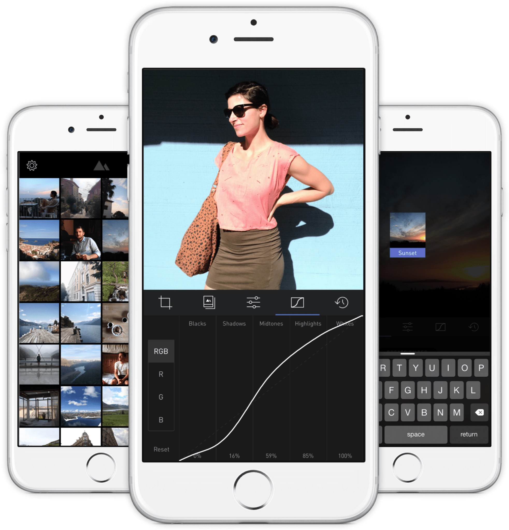
Darkroom’s UI is blissfully open in design. It will likely get more complicated as they add more promised features, but I’m hopeful the team finds a way to keep this incredible simplicity. As you page through its 5 key sections (composition, filters, adjustments, curves, history), you never lose your place in the mental model. Nothing is buried in a submenu or out of sight.
You don’t have to click a checkmark to save an adjustment before tapping another, because everything can be undone to an infinite degree, and one can undo hundreds of minute actions back to the beginning of an edit if necessary. Because that step (so annoying in apps like Afterlight, Faded, and VSCO Cam) has been eliminated, using Darkroom’s tools feels close to direct manipulation of the colors and pixels on your screen. One more nice touch: you can tap to the left or right of a slider knob to nudge it in that direction. Simple, but I can’t remember the last time a photo app let me do that.
Loading up a photo is seamless. The app starts with a view of your entire photo library. Tapping a photo pulls it forward, straight into editing mode. At this point, you can swipe to either side to start editing adjacent photos in your library. Flicking a photo down tosses it back into the pile, and you’re looking at all your photos again. In use, it feels gloriously fast and uncomplicated. As that bullet point on a slide, “Seamless browsing and editing flow” wouldn’t have done it justice. This is the kind of feature that needs to be designed, prototyped, tweaked, and tuned over and over to create something subtle, but innovative. A team rushing their project out would have missed the opportunity.
The difference between Darkroom and apps that require stepping in and out of different editing modes, especially when the placement of those modes is obscured, is like Apple’s own (now discontinued) iPhoto for iOS and the new built-in photo editing options in Photos.app. The former was a confusing mess with plenty of user-undiscoverable gestures and submenus, while the latter gives most users all the power they need in a more approachable UI.

I’ve stopped using half of the other apps I’ve listed above as problematic, and forgotten the names of twice as many more. The ones I remember tend to be the ones I really wanted to succeed; I’ll unfairly single out Mattebox as an app with great technology and features, but suffered from confounding UX design. Countless times, I actually got lost inside the mess of buttons and menus that were hidden at the “back” of its camera mode. Thinking about the Darkroom icon sitting on my homescreen now doesn’t fill me with the same dread. I’m dreaming about using it later tonight, and tomorrow, and anticipating what will be new in the first update. Although its name is generic, I don’t think I’ll be forgetting it soon. I imagine it’s the beginning of a new phase of using my iPhone as a camera, one in which I can send better photos home while still on holiday.
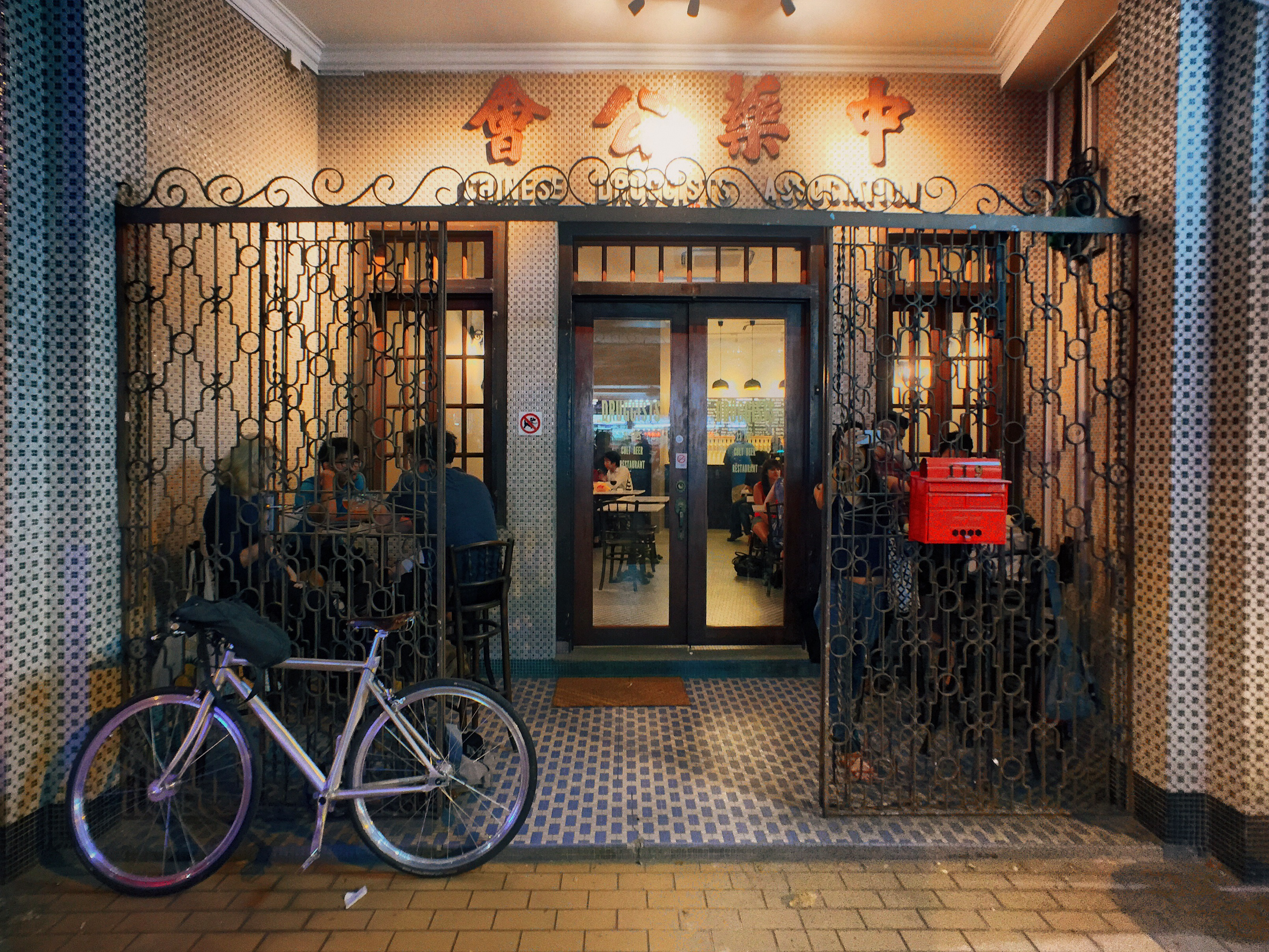
The Lavender/Jalan Besar area has been a little too hip lately, and walking down the streets you’ll see several cafes with all too twee decor, or preserved signboards from the Chinese businesses that were previously there (the new stores incongruently named the same thing; the coffee place named Chye Seng Huat Hardware an obvious example), with many prices on the new menus a few zeroes removed from the hawker stalls they coexist with. Druggists is one such new factor in the gentrification of an area that houses the undertaking facilities of Singapore Casket, a small stadium, Hong Kong-like shophouses with murky windows through which racks of hanging clothes can be seen, and furniture shops where the products are still made on site and spill out onto the road. It is guilty of all the aforementioned crimes: it’s a craft beer joint with an interior made to look like a traditional Chinese diner, complete with marble tabletops and mosaic flooring; the sign above the front door reads “Chinese Druggists Association”, looking straight out of 60s Chinatown; and a pint will run you up to $21 while bottles of Tiger at the kopitiam across the street can’t be more than $5.
 But who cares, because you’re there for 23 taps of craft beers imported from across the globe, and they don’t take your VISA at the hawker centers anyway. There’s no way this stuff was going to come cheap, but I’ll tell you what, they make it easy to try a bunch of them. You can get any beer in a half-pint size that’s reasonably priced at about 53% of a full pint. I never understood those bars where the two sizes are something like $12 and $15, and happily, that’s not a problem at Druggists. (What a name! I can’t stand typing it.)
 If you go to the bathroom, you’ll find the tap over the sink is an actual beer tap, which is a clever touch. The airconditioned interior is enclosed and all hard surfaces, which makes it noisy and difficult to have a conversation, which isn’t so clever. The two tables outside fare much better, and you can enjoy your imported IPAs with the cultural dissonance of a nearby Chinese banner ad (yes, the offline kind) advertising a dodgy sounding sleep/health service for $10-40. It’s delicious.
 119 Tyrwhitt Road
Singapore 207547