Category: Reviews

Reviews of products and services I probably paid for

  • An Old Man Tries Snapchat

    If you have even a passing interest in social media and haven’t seen Casey Neistat’s video on how “Snapchat Murders Facebook”, you should.

    Like my friend Vicki notes in this post, Snapchat wasn’t something that I immediately saw any value in. I installed it once ages ago, didn’t have any friends on it (a combination of age and geography), and promptly left. Then Instagram’s Bolt soft-launched in Singapore and got some interest going around ephemeral photo messaging, but it still isn’t something that friends in their 30s seem to want.

    We’re a generation of digital hoarders; the people who abandoned other providers for Gmail en masse because it promised never having to delete an email again. Cleaning out my harddrive the other day, I found a folder of interesting photos I’d saved off the net in the early 2000s: movie posters, album cover art, photos of global landmarks, and the like, simply because the sight of them were scarce and valuable pre-internet! You have to imagine what it was like to live in that time. I ended up deleting almost all of them because these days, if you can put a name to it, you can find it online.

    So behavior is changing slowly amongst older people, and much faster amongst those in their teens, but photo messaging still wasn’t something I needed Snapchat for. Every messaging app offers it now. The ephemeral twist is a footnote.

    Snapchat’s Stories feature changed the way I look at the product. It turns it into something of a lifelogging and broadcast platform. I can’t name another app (still) on the market that lets you grab video snippets of your life, and share them in a stream that your friends can tune in to. The fact that clips disappear after 24 hours is actually the part I like LEAST. It seems Vicki’s with me on this, as she’s set up a YouTube channel to archive these Stories to after they’ve been erased. I may soon do the same1.

    There are some other nascent thoughts I have on Snapchat’s bizarre UX; the more I think about it, the more brilliant it is — breaking many of the rules we use to design interfaces for users of all ages, in order to create an exclusive, obtuse, game-like experience (inviting the spreading of knowledge by word of mouth) that seems intended to make it a success with a younger crowd. I may be wrong, and it may simply be like this as a result of being designed by a younger team. Additionally, its overall visual clumsiness (check out that ghost icon) encourages you NOT to take it seriously, which makes it totally okay to fire off imperfect, portrait-oriented, poorly-shot, but authentic moments without too much thought.

    If you’d like to follow me, I’m on there as “sangsara”.


    1. Sharing these vertical videos on another platform poses a slight challenge. I tried every video editing app on my iPhone, and just about all of them failed to stitch the short clips together without cropping, unexpectedly rotating, or distorting the videos. Even Apple’s own iMovie produced only a black screen with audio playing, probably because Snapchat’s video encoding/metadata in non-standard in some way. Amusingly, the app that finally managed to do the job perfectly was YouTube’s own Capture app
  • Ten Days with the iPhone 6 Plus

    Ten Days with the iPhone 6 Plus

    Moving from any of the earlier iPhones to the new 6 Plus is challenging, even if you’re acquainted with one of the larger smartphones on the market. In part, this is because it won’t feel like an iPhone when you first start. Of course, I’m talking about the larger screen and the digital gymnastics required to operate it, although the way it fits in your clothing (you actually notice it for once) will also give you pause. My first experience with a larger phone was in 2012 when I bought (and eventually sold off) a Samsung Galaxy S III.

    At the end of that 10-day experiment, I concluded:

    I don’t want to mess with battery settings and tweaks. I don’t want the ‘freedom’ to spend hours scouring the web for ways to make my phone better. I want a phone made by a solid company that I trust, optimized to the best of their ability in a combination of software and hardware design, so that I cannot possibly believe that I could do better myself. Because that frees me to do everything else. But I also want that phone to have a larger screen.

    I went back to my comparatively tiny 4S, and upgraded to the slightly better iPhone 5 when it came out. But now, with the new 2014 iPhones, I’ve finally gotten what I wished for: A great phone. A big screen. And not as two separate things.

    Why the Plus and not the regular 6? Fear of missing out, really. It’s funny how the Samsung’s screen felt gigantic at 4.8” back then, but now Apple’s 4.7” seems so conservative; too small a leap for all the time I’ve waited for them to do this. The iPhone 6 was perfect for 2012, but we live in extreme times, us 2014-ers.

    Handling and Design

    So, the challenges. It’s been an uncertain 10 days. My theory is that the 6 Plus is a polarizing device if you are a smaller person/have smaller hands. You either know whether you’re okay with the compromises or not. I’ve spoken with women who use Galaxy Note phones, and a common sentiment has been “I can’t use most of the other large phones one-handed anyway (or put them in a pocket), so I just went for the biggest one”. It seems that if you have small hands, you either want a really small phone (iPhone 4-5 series), or go all the way with a 5”+ display and hold it all the time or stow it in a bag.

    But if you have larger hands like me (I can just about hold a basketball with one hand), you could technically use the thing one-handed, but that doesn’t mean you should. It’s still a dangerous balancing act each time, and I swear I’m using muscles I haven’t before, causing a slight ache in the forearms. I’ve read laments that you can’t use it one-handed while lying in bed. Untrue; I’ve done it for hours at a time, hence the pain. Deciding whether one should do all the things one technically could is the hard stuff life is made of. Most people aren’t ready for decisions like this until they’ve had a few kids.

    And remember how the iPhone 5 looked “terrible” when it first leaked online, and many wished it wasn’t real? The odd two-toned back, the suboptimal placement of the camera lens against the rounded corner and, later, the broken look of an inevitably dinged-up chamfered edge? Now those same people look back and consider it, all in all, a handsome design. I was one of those people, and this makes me feel unqualified to comment at length on the iPhone 6 family now. But damn if it ain’t ugly with that protruding camera module and those fat, rubbery antenna lines!

    But the phone’s roundness serves a functional purpose that I appreciate. Many sleek, obsidian phones appeal visually, but don’t feel right in the hands. Sony and other manufacturers have put out a bunch of very nice slabs, but nestle their bottom corners into the fleshy pad under your thumb for a 20-minute news reading session and you’ll see. The iPhone 4 was a similarly beautiful device. It felt pretty good too, but that design wouldn’t hold up when enlarged to accommodate a 5.5” screen. I’d say the iPhone 6 and 6 Plus are the “right” shape for what they need to do.

    Nevertheless, I very much disagree with the smoothness of its back, coupled with such a thin body. Once you add one of the Apple leather cases, it becomes much easier to pick up, hold securely, and use comfortably. It’s a case that fixes just about all of the phone’s superficial design flaws. Leather’s tactility and softness actually allows you to feel more of a connection to the device.

    Others have noted Apple’s adherence to the classic iPhone look for the 6 Plus, with thick top and bottom borders despite the larger screen. This of course allows for a large physical Home/TouchID button, and visual balance. Held in the hand, the phone seems comically tall, and if you can only grasp it below the midpoint, its weight distribution wants to tip itself forward and outward. But use the phone in landscape, and the need for symmetrical weight distribution is obvious. The same goes for the borders: many Android phones have a “right” way to hold them in landscape; merely touch the wrong edge and you’ve accidentally hit a hidden capacitive button that takes you back to the Home menu. I much prefer Apple’s grabbable safe zones.

    Give It Time

    In the first week, I was completely undecided. I looked at the smaller iPhones my friends and colleagues had ordered, and wondered if I’d made a mistake I would have to live with for a whole year. #Bendgate/#Bendghazi didn’t help, but that worry passed within a couple of days. It’s a strong phone, my tight jeans from Uniqlo have a bit of stretch to them, and most importantly, I have AppleCare+ and faith in their customer service.

    I found myself fondling other people’s iPhone 6s, and remembering the times when I could enclose an entire phone in my hand. They grow up so fast! And then at some point after the first week, it just clicked. Somewhat unbeknownst to my conscious brain, it became the perfect size for an iPhone. Later that day, I picked up a friend’s iPhone 6 and waited for the regret to kick in. Nada.

    Switching to an inherently inconvenient form factor that prevents you from carrying and interacting with your most-used computer in the ways that you’re accustomed to is bound to be uncomfortable. I figure even if you’ve made rational peace with all the factors you’re well informed about, it takes a little bit of time for the heart to come around. That’s a problem for Apple in the showroom. I wonder how many people immediately chose the 6 when they might have been happier with a 6 Plus. Next year’s 6S Plus sales will tell the story.

    Off-Screen Considerations

    Battery Life

    The second-biggest new feature for many is the 6 Plus’s enhanced battery life. During the final weeks of my old iPhone’s tenure, its inability to stay functional from morning to night was a bigger annoyance than the small screen. Finally, that problem has also been licked.

    So far, it’s been tremendous1. Also, if you imagine that you may someday be unhappy enough with the iPhone 6’s battery that you’ll buy a Mophie battery case or similar, remember that it will essentially make for an overall bigger and heavier device than the iPhone 6 Plus, which probably won’t need one. That makes for a pretty clear choice. My best example to recall is one particularly busy day with lots of messaging, photo sharing, a 20-minute phone call, GPS directions for a short trip, playing a 3D racing game for a bit, and streaming Spotify music at “Extreme” quality over 4G during my commute, and still making it home 12 hours later with 20% to spare.

    Gaming

    If you play games, you’ll find the 6 Plus an amazing machine. Its screen is bigger, brighter, and better than that of any portable on the market, including Sony’s PS Vita and Nintendo’s 3DS XL. There’s a common argument against the smartphone as a challenger to these systems, and it involves the lack of physical controls. I won’t get into that discussion here; suffice it to say I’ve played hours of Real Racing 3 (free) on my phone and never missed the joystick. Also, if you’ve ever squinted at tiny enemies in an FPS on your old iPhone, and struggled with having two thumbs blocking the action, you’ll recognize that the 6 Plus has the potential to help some genres take off on mobile. I’m planning to give X-COM another go now that everything will be more discernible, and keep in mind that was a console game ported over from the Xbox 360.

    As I understand it, iOS 8’s “Metal” graphics architecture also allows game developers to squeeze more of the kind of performance out of Apple’s chips that they’re able to on dedicated gaming machines, which don’t have to worry about accommodating many of the other features that a general purpose ~~phone~~ computer supports. Games are going to look ridiculously good.

    Photography

    It’s better. It’s astoundingly good for a smartphone. Yes, the optical image stabilization gives you an extra f-stop in low light when photographing still scenes, but you shouldn’t be using the default Camera.app for those anyway. The Cortex Camera app takes longer exposures with very good software stabilization, and supersamples/averages out sensor noise in dark scenes almost completely.

    Productivity

    Everybody talks about landscape mode, but the benefits are still questionable to me, 10 days in. Fire up Mail.app and you’ll see that it’s a little too cramped to be more useful. The information density improves if you turn your system-wide dynamic text size down to one of the lowest settings, which takes more advantage of the HD resolution and 400ppi display. But it’s not for everyone, and I suspect that for a good chunk of people (for example, those over 40), the 5.5” display is best employed as a big screen, not a dense screen.

    Typing is a mixed bag because I’d gotten really good at the old iOS keyboard. In apps that haven’t been updated for the new phones, the default keyboard appears larger, which messes with your muscle memory. Since iOS 8 launched, I’ve mostly used SwiftKey (it beat out Swype in accuracy). Its swipe mode helps with one-handed input when that’s necessary — having a thumb in continuous contact with the screen just feels more stable than lifting and tapping.

    I think the most productive thing about the bigger screen will be the ability to sketch things of moderate complexity. In the past, you might get some basic shapes down before having to pinch-zoom around a lot to create anything useful. Usually I’d feel stupid within 20 seconds of trying, and give up. Now, I think you might be able to sketch a decent wireframe on your phone. No more napkins.

    In particular, I can’t wait for a version of Paper by FiftyThree, or Penultimate, that takes advantage of the 6 Plus. I’d love to complement my Evernote and Moleskine notebooks with some quick and editable digital drawings. I have to mention that every time I’ve tried out a Galaxy Note and stylus, the software has been the most terrible part of the experience. Samsung bundles some in-house notes app with an incomprehensible and dated-looking UI when they really should have partnered with an established third-party app to provide one. I don’t know that there are any on Android, though. Seems like a real miss that they’ve had these larger devices on the market for so longer and didn’t nail the sketching use case.

    Conclusion

    After 10 days, I’m definitely bullish on this form factor. It took awhile to get over the hump, and if we enjoyed the generous return policies that customers in the U.S. seem to have, I might have been tempted to trade it in for the more familiar iPhone 6. But quite a few pundits have called the Plus a new kind of device (for Apple), one that asks you to reset your expectations of an iPhone in exchange for a more capable companion, and they’re quite right2.

    In the years between the iPhones 4 and 6, I was often beguiled by larger devices (in spite of the Android OS), and bought the Galaxy S III, Nexus 4, and XiaoMi RedMi and Mi3 phones for research/secondary phone purposes. Each time, I went back to the iPhone in relief — seeing its small screen as the weakest link in a strong Mac and iOS product ecosystem — and cursed the seeming necessity of compromise in every aspect of this mortal coil. Now at last, that itch is dead.


    1. Although iOS is meant to prevent apps from misbehaving and sucking your battery dry, there are exceptions. Some take every opportunity to wake up in the background, using location data for geofencing and refreshing streams. I’ve found Normal: Battery Analytics to be a useful app, even with iOS 8’s new ability to show which apps use the most power. Normal goes a step further, comparing your battery stats with other users to let you know if your problems are in the minority, and predicting how many hours of standby time you’d claw back by forcing those apps to quit instead of just leaving them in the background. I’d always believed that a backgrounded app couldn’t abuse your battery in iOS, but from the sounds of their literature, I might have been wrong. 
    2. Apart from sketching, writing and editing text on the 6 Plus is itself a very different experience. It’s liberating to see a taller expanse of your document rising above the keyboard, especially in full-screen capable apps like iA Writer Pro, which I used for this post, switching between Mac and iPhone. It feels less like you’re wrestling your phrases into place, and more like they can come out and lie anywhere they want on the floor and it’s exactly what you wanted. 
  • Cortex Camera is your best bet for quality iPhone photos

    Cortex Camera is your best bet for quality iPhone photos

    Original iPhone capture
    Original iPhone capture
    IMG_0506
    Cortex Camera capture

    It’s hard to believe that you can get different results from the same hardware—the same smartphone camera—just seconds apart. The first photo was taken with the iPhone 5S’s built-in camera app, which employs some impressive software techniques to improve most photos. In this case, a low-light scene forced an ISO sensitivity of 1000.

    The second photo was taken with Cortex Camera, which takes a series of images over 2 seconds or so (you don’t have to keep your hands perfectly still, but still-as-possible helps). These are then combined for far less noise, more accurate colors, and higher resolution (12mp on the iPhone 5/5S, which normally take 8mp images). The default Camera.app also combines up to four captures for better photos, but is optimized to work for all situations. For any scene without moving subjects and where you have the luxury of time, Cortex delivers better results.

    Camera.app 100% crop
    Camera.app 100% crop
    Cortex Camera 100% crop
    Cortex Camera 100% crop

    The shots above are 100% crops from the same scene. Note that the Cortex Camera version is both larger and more detailed. It has more potential for processing, and beats a fair few prosumer point and shoot cameras at the pixel level.

    The first app to do this “supersampling” was Occipital’s ClearCam, which I used to swear by. However, like their other app 360 Panorama, ClearCam hasn’t received any updates in the wake of iOS 7, and appears to have been abandoned as the company pushes their new Kickstarter-backed project, the Structure Sensor. At this time, ClearCam makes you wait longer and has a cumbersome alignment and enhancement process. Cortex Camera just takes the picture and saves it all in one step. It’s a damn shame, because both Occipital apps were among the first and best of their kind, enabling users to do things with their iPhones that seemingly defied the capabilities of the hardware. They clearly have a knack for clever imaging technology; I just hope they take a longer view of supporting their products some day.

    If you’re in the market for a new app to take and share those 360-degree panoramas, Sphere (formerly Tour Wrist) does a good job and is free. Bubbli is also promising, but captures video instead of photos to stitch a scene together, which means you have to pan slowly to get an even exposure. If you’ve got the cash and a love of new gadgets (mustnotbuymustnotbuy) Ricoh’s new Theta camera does the trick in a single click. It’s the first consumer-ready spherical capture camera and looks like a presentation remote. Simply hold it above your head and hit the button, and it takes in the entire scene. What’s more, the $400 device has built-in wifi and beams photos over to your iPhone for instant sharing. It’s not hard to imagine this feature on an iPhone a decade from now.

  • Of Monsters and Men: Pacific Rim and Man of Taichi

    Two of the movies I’ve been waiting for in one weekend. Pacific Rim in IMAX 3D (found the 3D dull, dim, and uncomfortable), and Keanu Reeves’s directorial debut, Man of Taichi (thankfully in 2D). Both are films I’d like to go see again.

    They are both fascinating in that Pacific Rim is the monster (kaiju) movie that Japan could never make, while Man of Taichi is the martial arts (gongfu) movie that Hong Kong could never make. Both borrow richly from their sources, but add something of their own. In Pacific Rim’s case, wads of special effects money and (unfortunately) Michael Bay’s apocalypse movie template. Andy Baio remarked on Twitter that it’s the worst of Transformers, Armageddon, and Independence Day rolled into one. While that’s a fair assessment of its characterizations and plotting, Del Toro at least executes his material as if he’s seen some anime and knows how to shoot a fight so you can actually see it.

    What it really needed was a tight script and team dynamics you could both enjoy and invest in. Instead of Michael Bay’s template, I wish they’d taken Joss Whedon’s. But no, it falls back on faceless national stereotypes and comically bad romance tropes. Rinko Kikuchi may have an Oscar, but I wouldn’t trust whoever oversaw her doe-eyed scenes with bland Charlie Hunnam to direct traffic on a one-way street. Perhaps the Mako Mori character was just meant to be younger than Kikuchi looks, but her uncertainty and shyness were incongruous with having the coolest/most badass hair in the movie.

    Pacific Rim's leads looking at each other
    Character interaction looks much better in stills than in the film

    Man of Taichi takes the best of Enter The Dragon, Bloodsport, and Ong Bak (fighting tournaments with explosive combat scenes), and adds both directorial and visual restraint to a philosophical story layer that HK films sometimes try to do (Ip Man, much of Jet Li’s period work), but almost always too heavy-handedly. For the genre of film that he’s taken on, I think Keanu Reeves has shown himself to be a good director. Not for an actor, or for a Hollywood man, but a good director, period.

    Man of Taichi’s star is Tiger Chen, a stuntman that Reeves met during the production of The Matrix. I won’t complain about his performance in the film’s non-fight scenes, because it never gets in the way, which is more than I can say for Pacific Rim’s moments of downtime. When he fights, or is seen struggling with the Star Wars-like light vs. dark side moral dilemma of his pugilism, Chen’s placid face conveys exactly the intensity required. In the final moments of the film’s final fight, he uses it as a blank canvas to great effect — much like Keanu Reeves in his portrayal as Neo in The Matrix when we needed to believe a world lay inside a computer. Some see wooden acting, I choose to see inspired detachment.

    Man of Taichi movie poster

    Reeves is in this film too, as the main antagonist. My viewing companion was not impressed. Maybe I’m just a fan, but again, I found his typically one-dimensional portrayal to be perfect for the film. It’s so hard to see what’s going on behind the rigid, mechanical demeanor that it produces an oppressive sense of mystery, fear, and apprehension whenever he enters the room opposite the human, naive, in-over-his-head Chen. You simply don’t know what Reeves is supposed to be capable of, or if he’s even meant to be human. I felt the whole thing could go From Dusk Till Dawn at any point and literally reveal Reeves as Satan with Krav Maga training. Through the stark presentation, voice effects, sleek dark suits and occasional black mask, bloodlessly pale face, and perfunctory short utterances, you are invited to read his existence in the whole scenario as a let-it-all-hang-out metaphor for demonic evil. All villains are, but this one does it without overacting in the face!

    Where Pacific Rim is happy to show great swathes of the world, and then gleefully destroy it, much of Man of Taichi takes place indoors, with only a few establishing skyline shots of Beijing and Hong Kong. Like Hong Kong, the sparse fight arenas are all concrete surfaces and sharp corners for flesh to get caught on, and you are constantly made aware of the combatants’ mortality. In Pacific Rim, the robot Jaegers are virtually invincible except when fighting the Kaijus, which are only flesh, and bleed. You could toss a Jaeger through a skyscraper made of the same metals, but it only malfunctions when punched in the face by a tentacle. Like in Man of Steel, which got flack for Superman allowing awesome amounts of collateral damage, Pacific Rim’s environment is an inconsequential foam that inhabits the fight space, to be ignored by everyone except the audience, whose job it is to be overwhelmed by enjoyable particle effects.

    In both films, there is a man with a knife. One is played to the hilt by Ron Perlman, who talks a lot, wears gold shoes, sunglasses, and flips a flashy butterfly knife around for effect. I can’t remember if he had a cigar in his mouth but there might as well have been. In the other universe, Keanu Reeves pulls the blade out low at the waist, and stabs silently and mercilessly before you know it’s there. It is beautiful and unintentional asymmetry.

    I recommend seeing both. Pacific Rim is a dream come true for many of us who love giant robots and schlocky movies with men in rubber monster suits, but by only improving upon visuals, its clearest future is as an HDTV/4K showcase at your local electronics dealer. I think Man of Taichi might become a cult martial arts classic talked about and recommended to friends for years.

    Pacific Rim is obviously out now, Man of Taichi is out in Asia and is slated to be in the U.S. sometime in 2013.

  • VSCOcam 2.0 — A New High-Water Mark In Mobile Photography

    I’ve been a fan of VSCO products for awhile, and have written about using their VSCO Film presets with JPEGs from consumer compact cameras, and recommended the last version of their VSCOcam iPhone app in my rundown of Essential iPhone Photography Apps.

    In the latter post, I said of version 1 of VSCOcam:

    As flawed as it is capable, this low-priced alternative to the VSCO company’s pricey desktop plugins is pretty good at giving photos a realistic film look; no light leaks and crazy cross-processing here, just subtle color shifts, fade operations, and real grain overlays. Skip the other basic editing tools included; they’re not up to scratch yet, but the package is an easy buy at $0.99.

    The good news this week is that version 2 of VSCOcam [iTunes] greatly improves upon those editing tools (specifically by giving operations such as adjusting brightness more precise ‘steps’ of control, and making them non-destructive within the app; new adjustments like rotation have also been added), and takes the original’s 10 built-in film looks to another level.

    The new version of VSCOcam (a separate download in the App Store) is a free download, and now contains a store with 16 packs of “presets” for download at 99c each. A pack consists of 3 presets, which are really more like filters since their results cannot be accomplished by tweaking any of the editing parameters. Presets is a strange term to carry over from VSCO’s Lightroom and Aperture products, where they really are Presets.

    Owners of the previous paid app can unlock the original 10 legacy filters in the new app, which is a nice touch. And as a launch special, all 16 packs can be bought for the price of 6.

    The new app is essentially a ground-up redesign and rebuild. All operations are significantly faster, the built-in lightbox mode is nearly unrecognizable and has some very nice power-user features like flagging and filtering by flagged/edited states. The camera module is now good enough to use as a camera replacement, with separate focus/exposure locking, a “big shutter button” mode, high ISO boost support for iPhone 5, and other improvements. There’s also a proprietary photo publishing platform called VSCO Grid built in that I haven’t had the chance to try because accounts are being rolled out slowly as they test it.

    In this week’s issue of The Round Down newsletter (subscribe!), I said:

    This is a new high-water mark in mobile photography apps. […] It’s almost too good to be true, and too good to give away for nothing.

    And it really is. At one point on the mobile photography timeline, taptaptap’s Camera+ app was king of the hill as an all-in-one solution because few others did as much as it did, as inoffensively as it did. However, its shortcomings in editing and effects processing have never been addressed, and the pace of development seems to have slowed down considerably in the past year. With VSCOcam 2.0, I think its successor has arrived. It has the power to fix shortcomings in photos as well as or better than Camera+ ever did, and the professional desktop editing pedigree of its filters is unmatched by competitors.

    A few bugs and metadata issues notwithstanding, if I had to delete every photo app on my iPhone bar one, this would be my choice to keep.

    Not the best example, but one photo I took last night.
    Not the best example, but one photo I took last night.
  • Photo: Hong Kong Lingerie Shop

    DSC00102

    A quick word about the Sony RX100 I bought on vacation: best camera I’ve ever owned. Small enough to put in a jeans pocket, amazing quality output, and fast enough to grab shots like this one — I saw it across the street just as Kim managed to hail a taxi; had literally two seconds to shoot blindly while getting in; pleased beyond words that it turned out sharp and captured the look of the lady in the shop. I don’t think you can buy a better compact right now except maybe the larger RX1 which costs five times more.

  • One Week with the Jawbone UP: How its Design Inspires Behavioral Change

    up-by-jawbone-lowres-015

    I bought one of the newly revised Jawbone UP wristbands a week ago. For those not following the rise of wearable activity trackers such as the Nike+ FuelBand, they are essentially pedometers you put on your wrist as you go about your business each day (and wear to sleep at night, in some cases), that connect with your PC or smartphone to give you more insight into your health. The UP was one of the first products on the market, but suffered from design and manufacturing defects that led to a hasty recall and another year on the drawing board before it was finally re-released last Christmas.

    It all started with using the free Moves iPhone app (by the Finnish company ProtoGeo) for about a week, during which I got a taste for recording and quantifying my movements. When I saw the UP on sale locally, it was an easy purchase. It’s only been a week, but it has been a behavior-altering experience for me so far. Along with its companion app, the UP provides a couple of key features.

    • Activity reports
    • Food logging
    • Sleep quality tracking
    • Social network awareness
    • Fiddle-free design
    • Comfort and style

    Activity reports

    carousel-2-3

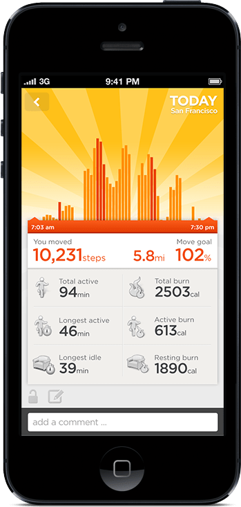
    Open up the app and you’ll see at a glance how you’re doing against your set objectives. A healthy target is 10,000 steps a day, but few sedentary workers can meet that. Because UP is an internet-connected service, it’s able to tell you what others like you (in age, gender, height, and weight) are averaging. In my case, the average most do is about 5,500 steps a day. I decided to set myself a high but achievable goal of 8,000 steps.

    What’s happened since? I’ve found myself striving to reach that by alighting one bus stop ahead of my destinations, taking the long way around the office, and going for more short walks whenever I can.

    It translates your activity into calories burnt, which it shows you alongside an estimate of how many calories you burn just resting, and a total for each day. Every now and then, the application shows you “Insights”; pre-written facts and advice tailored to your own performance. Examples include deciphering hidden patterns in your behavior and mood, and helping you understand terms like “you walked 8,000 steps” with statements such as “equivalent to walking across the Golden Gate Bridge and back”.

    Food logging

    This part is optional, but you can enter your meals (or just photos of them) to keep a record of what you’ve eaten. If they’re available in the online database, nutritional information is attached. It has the same effect as using an expense tracking app: it makes you acutely aware of every little bit you put into your body, and alerts your conscience to the unnecessary.

    In practice, having a vague idea of how many calories I’m consuming, coupled with the knowledge of how much I’m burning (or NOT burning, on idle days) has been powerful. If I know that I’ve only moved a minimal amount all afternoon, any random urge to snack quickly meets a mental roadblock — “Why would I need more calories?”

    Sleep quality tracking

    Like the popular Sleep Cycle app, the UP band can monitor your movements in the middle of the night, and map out your light vs. deep periods of sleep on a graph. And then at the best possible time close to your intended waking hour, it will silently vibrate in the morning.

    You are asked to set a sleep goal for yourself, and along with all the other data it collects, this is plotted over a timeline of days, weeks, and months, which illustrates how good you’ve been at getting the sleep and exercise you need.

    Social network awareness

    carousel-2-1
    This is easily one of the best features of the UP. Other people can be added as “teammates” and their activities populate your Home screen, turning it into an Instagram of physical activity. You’re encouraged to inspect their details, leave comments, or react with a small selection of emoticons. You might see that a friend had a healthier lunch, or walked far more than you, or slept better than you. These events nudge you into behavior change.

    When I started, one of the only people it found for me to add to my “team” was someone living in Japan that I only follow on Twitter and YouTube. I asked, she said ‘Sure’. I don’t know her personally at all, but I’ve found that reading UP’s activity feed is a unique interaction different from regular status updates. Being able to correlate your own physical state with another person’s through shared metrics, leads to a different sense of awareness; any encouragement you receive resonates that much more. Her most active day blew me away at over 24,000 steps, followed by 11 hours of sleep. It really spurred me on to try and find the time for activity. Multiply that by the number of people you follow, and the social features become an extremely compelling component.

    On my second day, two more people I interact with online bought their own. On the third, my girlfriend joined in.

    Fiddle-free Design

    While the UP is not designed to be worn and forgotten — its constant presence serves to remind you of your goals — it is designed to be worn and left alone. Its long battery life (about 7-10 days) is one of the ways in which this is obvious. Charging via USB only takes about 80 mins, which you can easily do while idle.

    In chasing this long battery life, the UP eschews Bluetooth syncing, which other products like the Fitbit and Nike+ FuelBand have. To sync the UP, one must remove it and plug one end into a smartphone’s headphone jack. Jawbone recommends doing this about twice a day to keep up with your own stats and update your team. On the other wristbands, one only has to start the app, and they sync wirelessly.

    I actually think this omission is a strength.

    Like how shooting on film frees you from constantly checking how the photo came out on the little digital screen, thereby letting you take more photos and experience the scene you’re in, not continuously syncing the UP creates mystery, anticipation, and actually lets you get on with it and not fiddle with tracking apparatus every spare minute.

    In his excellent essay about using a FitBit, Paris and the Data Mind, Craig Mod described looking at the LED display and seeing that he had climbed 96 flights of stairs one day. The next thing he did was walk halfway across the flat town of Palo Alto to the nearest flight of stairs he knew of, so that he could shift that number to read 100. It sounds like great exercise, but I don’t want to obsess over live numbers or end up conducting accuracy tests each day over how many steps it’s counting.

    The UP way, you’re wondering things like “will I break my record today?”, and if you’re extra competitive, “I hope I don’t lose to so-and-so,” as you go about your business. Sometimes, by not knowing, you exceed your targets. And then you sync at the end of the day, and it’s like waiting for lottery numbers to be called out. It’s its own kind of fun.

    Comfort and style

    up-by-jawbone-lowres-016

    The UP is available in 8 colors, of which 3 are available here in Singapore right now. I got the Black (sorry, Onyx), and it’s pretty nondescript and unlikely to draw attention. The brighter colors pop more, and show off a subtle zig-zag texture that identifies it as part of the company’s product range under design chief Yves Béhar. None of them are what you’d expect a “wearable computing device” to look like. The only button is cleverly hidden, looking like an integrated design feature. Two LED lights are embedded beneath the hypoallergenic rubber surface, and only visible when lit. It’s much thinner than the FuelBand, and could easily be mistaken for one of those Livestrong-type charity support wristbands from a few feet away.

    These things help with making the UP an invisible part of daily life, which gives it potential to succeed at being adopted by more. But as the wearer, I always feel its presence (at least in this first week). The routines I’m developing around the app, around thinking about moving more, burning more, eating less, around how my teammates improve themselves, are the very definition of behavior change.

    If having visualized, connected, and actionable data on your own body and movements sounds interesting to you, the UP will probably be a great addition to your life.

  • Finding a Home for Your Copywriting Portfolio or: How I Learned to Stop Channeling an Art Director and Love the Words

    Finding a Home for Your Copywriting Portfolio or: How I Learned to Stop Channeling an Art Director and Love the Words

    Lots of portfolio tools advertise the ability to create a gorgeous website online within minutes, but how many are suited to showcasing a copywriter’s work? This post covers getting a basic presence up for a handful of your projects. More comprehensive site builders are only briefly mentioned.

    It’s often said that people only look into their CVs between jobs, but taking stock of what you’ve accomplished on a regular basis is a really good practice. But with a standard resumé, updating a paragraph about your current employment several times a year isn’t attractive. Fortunately for people in the creative industries, there’s the portfolio, which can be very satisfying to compile, if only to remind ourselves how little victories on a project tend to make up a bigger result.

    Not Your Creative Director’s Portfolio

    Over the last few years, I’ve seen a fair few creative portfolios, and increasingly, when one asks to see some work, a URL gets sent instead of a PDF. When I was starting out in advertising about 8 years ago, we routinely brought physical folders of printouts to interviews. If you wanted the job, you might make an extra copy to leave behind. If you’ve heard some creatives calling their folios “books”, it’s because that’s what they really were.

    Another thing that’s changed since the mid-noughties is how the presentation of a copywriter’s work has gone from showing a few ads and/or documents with long-form writing samples, to being very close to how the art guys do it. Big, colorful pictures that would reel even an illiterate eye in. Some writers’ books now haven’t got a word in them.

    Carbonmade
    Carbonmade: Your online portfolio, the door to a bright future in children’s illustrations

    Most of the people I’ve met showed off work on portfolio cum social networking sites for creatives. Places with start-uppy Web 2.x names like Carbonmade, Krop, the Behance Network, Cargo, Coroflot, and to some extent, Dribbble. Some respectable, shirt-wearing creatives had portfolio sites on their own domains, and the ones who didn’t return their pencils used blogging services like Tumblr.

    What I’ve noticed is that very few of these solutions are suited to the needs of creatives who self-identify as copywriters.

    Copywriters Are A Needy Bunch

    Designers, illustrators, and art directors are well served by the many visual portfolio tools out there. Flip through a few examples and you’ll notice a tendency to not explain the images — when it comes to showing off craft, the work often speaks for itself. Maybe it’s because most tools just don’t allow text at all, but I’ll come to that later.

    I think a writer needs a little room to take his viewer through the work. So much of what we do is problem solving and just not visible in the finished consumer-facing work (nor should it be). Some of the things a writer could supply to complement a piece of work are: some background info, a project or team story, the strategic line between proposition and product, an elucidation of the idea (if one exists), how the piece works with a wider campaign or positioning that the brand has pursued, and any measured results that came out of it. Touching on just a little of the above, versus a caption reading “Banner Execution #2” on a photo of a toothpaste tube telling a joke, can help explain yourself come Judgement Day.

    Five Steps to Happier Portfolioing

    The more I saw, the more I started to wonder, where should a copywriter put their work online? To answer that question, I signed up for a bunch and put them through their paces, and also asked colleagues and industry friends for their (possibly subjective) opinions on the leading ones. Here’s what I know, filtered through what I didn’t like.

    1. Keep Good Company

    Maybe this won’t apply where you are, but Cargo (or CargoCollective) ostensibly carries a reputation for being full of student work. I don’t know where that comes from; too many cans of Heinz baked beans styled like Warhol prints? That said, there’s probably nothing wrong with using Cargo if you ARE a student. Coroflot seems to be another good place for junior creatives to get their work in front of recruiters and large brands. DeviantArt was ranked below the two, because your application will disappear into an HR drawer labeled ‘Slashfic Writers’.

    Krop
    Krop: Your killer headlines will need killer headlines

    For professionalism, I was advised to try Krop. It charges a not-insignificant monthly price of US$10, in the league of premium site-building services like Squarespace. I didn’t see anything that justified the price against Krop’s drawbacks. Amongst those I asked, Behance enjoys a neutral to positive reputation that will not stand in the way of your looking righteous.

    As far as domains and URLs are concerned, it’s also about the right associations. If you’re on a site built for creative work, then piggybacking on their domain isn’t an issue. For example, having “behance.net/name” is okay, but “name.tumblr.com” looks like a collection of meme gifs. Using a “name.com” is great as long it’s not the “best-name-online.com” that GoDaddy recommends when your name of choice is taken.

    2. Know the Tools You’ll Need

    Behance
    Behance: Owned by Adobe now, so you’ll have to hit refresh for minor HTML updates every 10 minutes

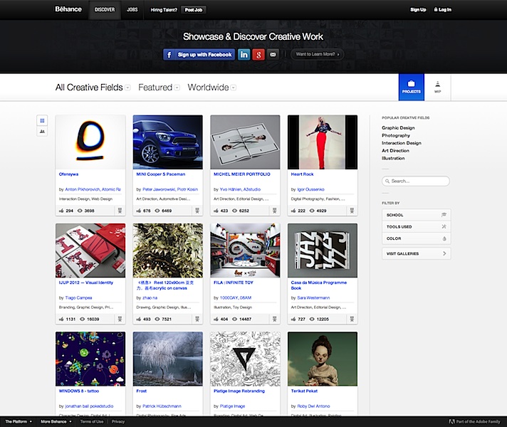
    Plenty of sites simply don’t let you annotate or supply a paragraph of text beside your large and beautiful images. It’s practically textist. Krop is a major offender. And since we’re talking your garden-variety copywriter here, and not those mystical hybrid writer-designers who can tastefully superimpose text within their images, an ideal tool would allow writers to enter text on the page itself. In that regard, Behance trumps Krop, which only allows a short caption for each image. Not only is Behance free, it allows the mixing of as many images, embedded videos, and text blocks on a project page as needed.

    Most importantly, if you’re going to be uploading work where you’re especially proud of the writing, make sure it can be read! Being able to click and zoom in (or load the original image) is table stakes, but plenty of sites I’ve seen don’t do it. This is the point where your portfolio’s tab gets closed and your reader goes back to a ‘Hunger Games Wedding Ideas’ board on Pinterest.

    For this reason, I do not recommend using ‘free’ services that reserve this ability for paying customers, e.g. Carbonmade. Behance won’t zoom either, but you can at least reproduce your copy on the page using a text block.

    3. Create a Gallery, Not a Blog

    Your Tumblr should look like this
    If you must Tumblr, your portfolio should look a lil’ sumthin like this wicka wicka

    When a portfolio site is built on a blogging CMS, and looks like a linear blog, expectations are set for a diary of constantly evolving works-in-progress. Visitors will be less impressed by your last post being 18 months old, even if it was ahead of its time.

    Of the sites I’ve seen built on simplistic platforms like Posterous, Tumblr, Blogger, Pinterest (you gotta see this Hunger Games wedding), too few employ themes with a static front page serving as a table of contents. If your platform of choice doesn’t let you do that, find a new one. A scrolling page of entries without proper navigation is counterintuitive to your purpose: showing your recent work at a glance, and putting more details one click away.

    Some sites will also format and present a version of your resumé in addition to your portfolio. Behance and Coroflot are two that stood out for me.

    4. Decide If You Want Feedback with That

    Socially enabled sites like Behance are proud of their communities. You can follow people doing interesting work, and browse a stream of their recent work right from your front page. Gold stars, comments, resharing; all that stuff. But there’s a real need for portfolios that don’t talk back, and if you’re familiar with the teen movie trope of parents embarrassing their sons with baby stories whenever a girl comes over, you’ll understand not letting a potential mentor or employer see the “helpful” suggestions you’ve been given by others. Or your witty mom-centric replies.

    Moreover, as we’ve already covered, many of these sites are for designers and not copywriters. I’ve heard this sentiment several times: “Designers have Dribbble, but where do copywriters go to share their work and get constructive feedback from peers?” It’s a gap that no one has filled. Until then, my advice would be to keep the two as separate as you can. Find an avenue for copy feedback that works for you, and display your work on a pedestal where it belongs.

    5. Keep Open Secrets

    Another feature that’s rather important but not always available: the ability to secure projects with a password. Some client work can never be fully public, but if there’s a story in there worth telling, you might open it up to select viewers. Please don’t set your password to “password” or your first name, or have no password at all and instruct the HR person to ‘just press Enter’, because that just makes it look like passwords are a new concept to you.

    Choose Your Own Ad Venture

    The first conclusion I drew is that you’ll want to spend some money to get this right, although it doesn’t have to be a lot. Whatever your choice, make sure it looks good on mobile devices and doesn’t rely on Flash.

    Squarespace theming
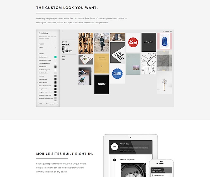
    Squarespace: Can you handle this much customization? Find out with a free 14-day trial.

    My preferred solution has always been to create pages on a personal site, using whatever CMS you’re comfortable with, but that involves a fair amount of set-up and manual work. In contrast, the allure of these modern portfolio services is undeniable. Most come with the promise of page views from fellow creatives baked in, and who doesn’t like getting ‘Liked’? The drag-and-drop features and professionally designed templates are also particularly good for copywriters. Uploading a bunch of comps and artwork almost always results in a presentable page.

    Of all these services I evaluated, the only free one that would meet the needs outlined was Behance. Their paid option is called ProSite, but its fancy templates frustratingly strip away the extra text that makes their free pages compelling for writers. If that gets fixed, it would be a complete winner.

    If you’re willing to get your hands a little dirty, then Squarespace, Breezi, Virb, and WordPress are sound bets. The first two have no free options and start at around $8/mo for a standards-compliant, responsive design site. With templates as starting points and pixel-level control over every detail, they are suited to people with knowledge of web design but who don’t want to code.

    Virb
    Virb: If it’s good enough for a coffee bar in Portland, why not your portfolio?

    Virb is another all-in-one hosted site & blog solution that costs the same as Krop ($10/mo) but lets you do more. There are templates that let you bundle images and text together quite simply and beautifully.

    The open-source WordPress.org software is pretty much the gold standard for consumer CMS on the web, and if you don’t want the hassle of installing it on your own servers, WordPress.com has an ad-supported “hosted service” that takes care of everything for you, with few compromises. A number of portfolio-ready themes are available, but do pay for the domain mapping upgrade, because “name.wordpress.com” looks almost as bad as it would if it said Tumblr. Almost.