I bought one of the newly revised Jawbone UP wristbands a week ago. For those not following the rise of wearable activity trackers such as the Nike+ FuelBand, they are essentially pedometers you put on your wrist as you go about your business each day (and wear to sleep at night, in some cases), that connect with your PC or smartphone to give you more insight into your health. The UP was one of the first products on the market, but suffered from design and manufacturing defects that led to a hasty recall and another year on the drawing board before it was finally re-released last Christmas.
It all started with using the free Moves iPhone app (by the Finnish company ProtoGeo) for about a week, during which I got a taste for recording and quantifying my movements. When I saw the UP on sale locally, it was an easy purchase. It’s only been a week, but it has been a behavior-altering experience for me so far. Along with its companion app, the UP provides a couple of key features.
- Activity reports
- Food logging
- Sleep quality tracking
- Social network awareness
- Fiddle-free design
- Comfort and style
Activity reports
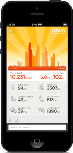
Open up the app and you’ll see at a glance how you’re doing against your set objectives. A healthy target is 10,000 steps a day, but few sedentary workers can meet that. Because UP is an internet-connected service, it’s able to tell you what others like you (in age, gender, height, and weight) are averaging. In my case, the average most do is about 5,500 steps a day. I decided to set myself a high but achievable goal of 8,000 steps.
What’s happened since? I’ve found myself striving to reach that by alighting one bus stop ahead of my destinations, taking the long way around the office, and going for more short walks whenever I can.
It translates your activity into calories burnt, which it shows you alongside an estimate of how many calories you burn just resting, and a total for each day. Every now and then, the application shows you “Insights”; pre-written facts and advice tailored to your own performance. Examples include deciphering hidden patterns in your behavior and mood, and helping you understand terms like “you walked 8,000 steps” with statements such as “equivalent to walking across the Golden Gate Bridge and back”.
Food logging
This part is optional, but you can enter your meals (or just photos of them) to keep a record of what you’ve eaten. If they’re available in the online database, nutritional information is attached. It has the same effect as using an expense tracking app: it makes you acutely aware of every little bit you put into your body, and alerts your conscience to the unnecessary.
In practice, having a vague idea of how many calories I’m consuming, coupled with the knowledge of how much I’m burning (or NOT burning, on idle days) has been powerful. If I know that I’ve only moved a minimal amount all afternoon, any random urge to snack quickly meets a mental roadblock — “Why would I need more calories?”
Sleep quality tracking
Like the popular Sleep Cycle app, the UP band can monitor your movements in the middle of the night, and map out your light vs. deep periods of sleep on a graph. And then at the best possible time close to your intended waking hour, it will silently vibrate in the morning.
You are asked to set a sleep goal for yourself, and along with all the other data it collects, this is plotted over a timeline of days, weeks, and months, which illustrates how good you’ve been at getting the sleep and exercise you need.
Social network awareness
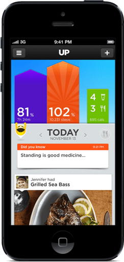
This is easily one of the best features of the UP. Other people can be added as “teammates” and their activities populate your Home screen, turning it into an Instagram of physical activity. You’re encouraged to inspect their details, leave comments, or react with a small selection of emoticons. You might see that a friend had a healthier lunch, or walked far more than you, or slept better than you. These events nudge you into behavior change.
When I started, one of the only people it found for me to add to my “team” was someone living in Japan that I only follow on Twitter and YouTube. I asked, she said ‘Sure’. I don’t know her personally at all, but I’ve found that reading UP’s activity feed is a unique interaction different from regular status updates. Being able to correlate your own physical state with another person’s through shared metrics, leads to a different sense of awareness; any encouragement you receive resonates that much more. Her most active day blew me away at over 24,000 steps, followed by 11 hours of sleep. It really spurred me on to try and find the time for activity. Multiply that by the number of people you follow, and the social features become an extremely compelling component.
On my second day, two more people I interact with online bought their own. On the third, my girlfriend joined in.
Fiddle-free Design
While the UP is not designed to be worn and forgotten — its constant presence serves to remind you of your goals — it is designed to be worn and left alone. Its long battery life (about 7-10 days) is one of the ways in which this is obvious. Charging via USB only takes about 80 mins, which you can easily do while idle.
In chasing this long battery life, the UP eschews Bluetooth syncing, which other products like the Fitbit and Nike+ FuelBand have. To sync the UP, one must remove it and plug one end into a smartphone’s headphone jack. Jawbone recommends doing this about twice a day to keep up with your own stats and update your team. On the other wristbands, one only has to start the app, and they sync wirelessly.
I actually think this omission is a strength.
Like how shooting on film frees you from constantly checking how the photo came out on the little digital screen, thereby letting you take more photos and experience the scene you’re in, not continuously syncing the UP creates mystery, anticipation, and actually lets you get on with it and not fiddle with tracking apparatus every spare minute.
In his excellent essay about using a FitBit, Paris and the Data Mind, Craig Mod described looking at the LED display and seeing that he had climbed 96 flights of stairs one day. The next thing he did was walk halfway across the flat town of Palo Alto to the nearest flight of stairs he knew of, so that he could shift that number to read 100. It sounds like great exercise, but I don’t want to obsess over live numbers or end up conducting accuracy tests each day over how many steps it’s counting.
The UP way, you’re wondering things like “will I break my record today?”, and if you’re extra competitive, “I hope I don’t lose to so-and-so,” as you go about your business. Sometimes, by not knowing, you exceed your targets. And then you sync at the end of the day, and it’s like waiting for lottery numbers to be called out. It’s its own kind of fun.
Comfort and style

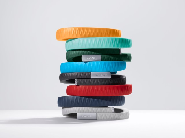
The UP is available in 8 colors, of which 3 are available here in Singapore right now. I got the Black (sorry, Onyx), and it’s pretty nondescript and unlikely to draw attention. The brighter colors pop more, and show off a subtle zig-zag texture that identifies it as part of the company’s product range under design chief Yves Béhar. None of them are what you’d expect a “wearable computing device” to look like. The only button is cleverly hidden, looking like an integrated design feature. Two LED lights are embedded beneath the hypoallergenic rubber surface, and only visible when lit. It’s much thinner than the FuelBand, and could easily be mistaken for one of those Livestrong-type charity support wristbands from a few feet away.
These things help with making the UP an invisible part of daily life, which gives it potential to succeed at being adopted by more. But as the wearer, I always feel its presence (at least in this first week). The routines I’m developing around the app, around thinking about moving more, burning more, eating less, around how my teammates improve themselves, are the very definition of behavior change.
If having visualized, connected, and actionable data on your own body and movements sounds interesting to you, the UP will probably be a great addition to your life.

 The Woman Who Figured Out How To 3-D Print Makeup Explains How It Works