Tag: Photo Editing

  • Week 38.22: iPhone 14 Pro, Apple Watch Series 8, etc.

    My new iPhone 14 Pro arrived. This year’s Space Black is definitely the darkest shade of gray they’ve done in years. Fitting, because while Apple’s been calling their camera systems “pro” quality since the iPhone 11 Pro, it’s only with the ability to capture 48mp RAW files now that the label may finally be justified, and everyone knows a “pro” camera should be black and draw little attention to itself. Just look at Leica’s stealthy “-P” models without their red logo. So the 14 Pro looks the part, at least it did until I slapped a bright Succulent green case on it.

    I took it out to a concert the same day it arrived — after a few snafus during set up and migration; probably related to the bugs already addressed in iOS 16.01. Low light performance seems improved as promised, and if it’s dark enough to call for Night Mode, those shots are taken more quickly than they were before. However, I’ve noticed some gritty artifacts when using the 3x lens in low light, possibly due to moving objects across several frames being merged. Ideally these would look like motion blur, but they have gross sharp outlines and very digital-looking noise. This is new, and I hope it’s an issue that will be fixed in software.

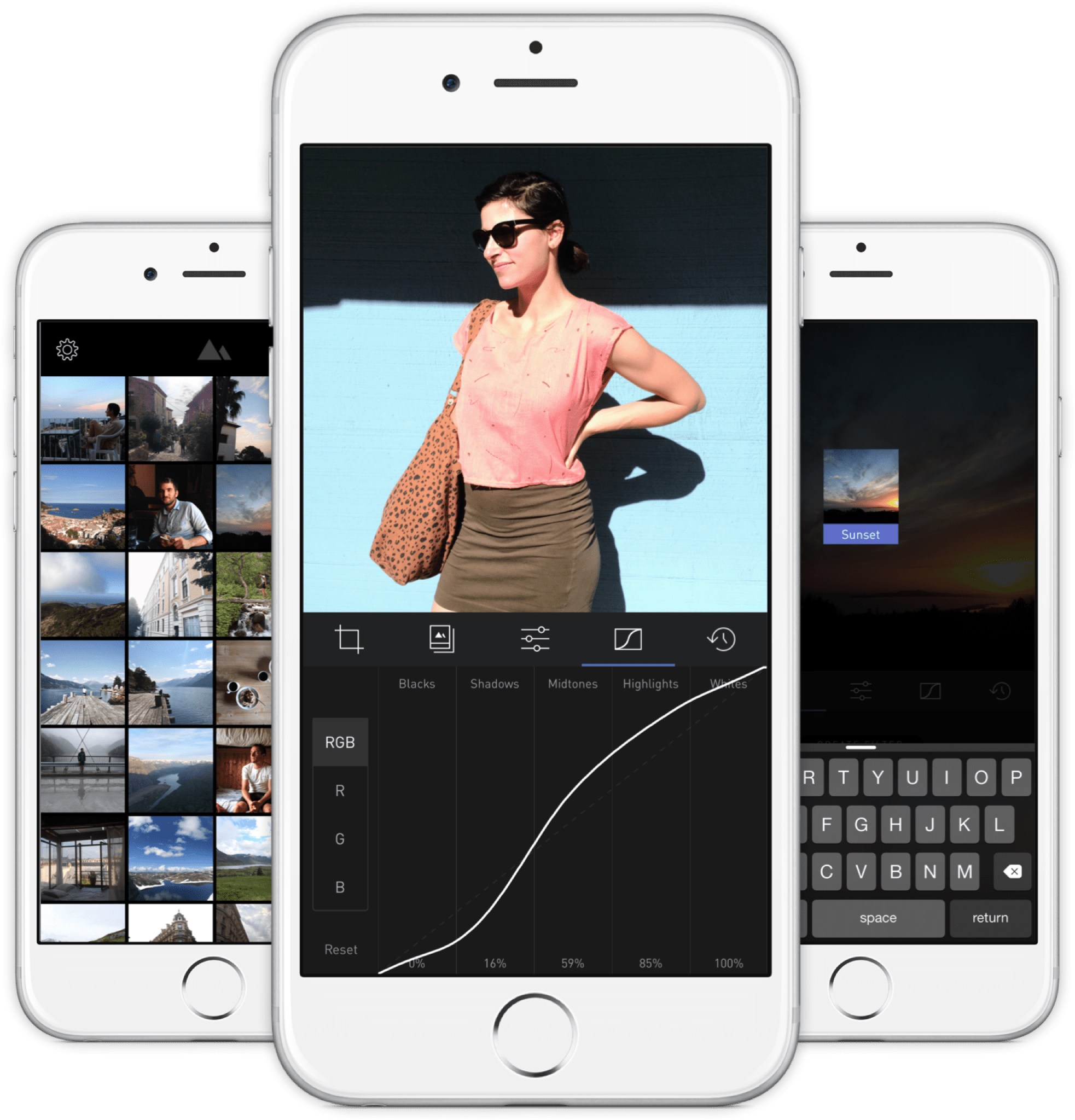
    48mp ProRAW files are not snappy to edit, and VSCO doesn’t seem to like them at all. Load any RAW file in the app and all the filters come out looking wrong. I’ve been bouncing between RAW Power, Darkroom, and Pixelmator Photo, unable to decide which makes processing files least painful. But should one shoot in 48mp at all? The post-shot cropping latitude you get is fantastic, but at up to 90MB a file, I’ll probably use it sparingly, on occasions where it’s better to just grab a quick shot and make decisions later. But for everyday use, I’ve set mine up to save 12mp ProRAW files, and will simply try to get the composition right from the start with the new 2x “zoom” mode if needed (essentially an in-camera 12mp crop into the 48mp image).

    Tyler Stalman and SuperSaf have good reviews of the cameras’ performance on their YouTube channels. I’m slightly annoyed by Stalman’s discovery that RAW files have a much more natural look than Apple’s default processing for JPEG/HEIF files. The amount of sharpening and clarity and HDR effect has been turned up with each passing year, and where iPhones were once known for taking true to life photos, they’re more social media-ready and Samsung-y today. And consequently these photos are not the neutral starting points for post-processing that they once were. On hindsight, it was inevitable. A lot of casual editing today is hitting an Auto-Enhance button or loading up an AI filter in Prequel, Meitu, or some app I haven’t heard of yet. Sitting down to process photos is now a “pro” thing, and pros presumably want to shoot and edit in RAW while they’re at it. ¯\_(ツ)_/¯

    All in all, a nice upgrade to still photos this year. You get more separation and background blur in regular shots on the main camera because of the larger sensor. The new image processing engine also takes advantage of said larger sensor and gives impressive sharpness and detail when shooting in some specific instances. And the return of a 48mm 2x mode is very welcome, but then you don’t get the benefits of pixel binning in that mode so it’s a little worse for low light environments.

    A final word on cameras: the bump must not be allowed to grow any larger. As customers, we need to hold this line. It’s simply too much.

    Really nice fur detail on this closeup (full size, sorry)

    The Dynamic Island is very cool, but not something you really need to think about too often. Buyers expecting a fun new toy they can tap and fidget with a hundred times a day will be disappointed. For me, the notch was a non-issue; it just faded from notice in normal use. The Island is similarly invisible to me until it springs into use for some multitasking. At present, it’s only shown up when I was listening to music or doing some navigation in Apple Maps. The latter is especially nice (as a passenger), I can be texting with someone but still keep an eye on the next instruction, e.g. it shows an arrow saying to turn right in 2km. It’s an improvement that you get used to very quickly, and the animations are nowhere as distracting as critics wanted to believe. After a couple of days, it reveals itself to be the best kind of improvement: one you can simply take for granted while it quietly improves your life in the background.

    The third and final major feature in this year’s iPhone is its always-on display. No, the new A16 chip doesn’t make the Top 3 for me. The A15 in last year’s iPhone 13 Pro was still zippy as hell, and the improvements here are somewhat minor. It’s testament to the A15’s power that Apple can reuse it for this year’s basic iPhone 14 and most people are just like ¯\_(ツ)_/¯.

    The always-on display gave me battery anxiety. I’d turned on the new/old battery percentage indicator in iOS 16’s Settings and was convinced that my available power was dropping faster than usual for a new phone. But hiding the percentage was probably one of the best unpopular things that Apple did with the introduction of the iPhone X. Nobody needs to see that number drop. I turned it off and stopped worrying for the time being. If you want to give it a break, just turn your phone face down on your desk (this doesn’t work on glass tables, FYI).

    It’s certainly nice, but nowhere as necessary as an always-on display on a watch, because seeing the time and other info without overtly turning your wrist towards you is a real use case. Being able to glance over and see a weather update or the price of bitcoin without tapping my phone’s screen is alright. But maybe not 10% less battery life alright? I need my phone’s battery for playing games and calling cabs and other things my watch doesn’t have to worry about. Time will tell if it’s a keeper or a feature we all turn off and forget about.

    ===

    I also replaced my Series 4 watch with a new Series 8, but apart from the always-on display and non-degraded battery life, there’s not a lot here to write home about for someone who isn’t into the athletic life. It’s just the most refined and capable version of a four-year-old design, and I expect it to last me for quite awhile. The Apple Watch Ultra is simply not for me, and it would take a radical redesign of the regular watch line to make the Series 8 feel obsolete (note: foreshadowing).

    My last one was an Hermés model, and I’m really missing their classic analog watchface with the Cape Cod typeface (see below). There is simply nothing in the standard Apple Watch catalog of watchfaces that compares. If you want an elegant, full-screen analog face with attractive Arabic numerals and maybe just a date display, you’re shit out of luck.

    My old Hermés Series 4, grabbed from a video I made in 2018
    Series 8 with the California watchface, close but no cigar

    One interesting thing that’s new this year, but is actually available to all Apple Watches from Series 4 and up, is advanced sleep stage tracking in watchOS 9. I’ve been using the Autosleep app to do the same thing for the last couple of years, but it’s always been a bit of a faith/novelty thing: there was just no way of knowing how accurate it really was.

    Well, it seems Apple invested proper resources into their machine learning approach, which uses your motion and heart rate to probabilistically determine what state of sleep you’re in at any point in the night, and it comes very close to what high-end, specialized equipment with lots of sensors on your body can do. So Autosleep has been Sherlocked and deleted from my phone, and you don’t need any other apps to analyze your sleep quality; just look in Health.app.

    ===

    One “local” artist I came away from Friday night’s showcase concert quite impressed with was Dru Chen, who played a couple of songs featuring some funky guitar work and a lovely musicality reminiscent of His Purpleness. I have nothing against people inspired by Prince. Everyone should be. Dru’s debut album is on Apple Music, so I’ll be listening to it some over the next week.

    But for live music, it probably doesn’t get any better than this newly remastered 1985 show by Prince and The Revolution playing in Syracuse, now available in goddamn Dolby Atmos spatial audio. What an absolute treat to be transported right into the audience for this. I’ve only heard a few moments so far. It really calls for a fully charged pair of AirPods Max and a clear afternoon.

  • Week 17.22

    A quiet few days, in which I was mostly left to my own devices (namely iPhone, MacBook Air, Nintendo Switch) on account of a traveling wife. Owing to her absence and one particular event to be celebrated, I had a massive number of calories in the form of curry rice, duck ramen, pasta, pizza, Indian takeout, cocktails, and then more cocktails.

    It’s all media activity this week:

    1. Apps

    If you edit photos on your iPhone or iPad at all, you’ll know the Darkroom app. I think I even wrote some primitive thoughts on it way back when it first came out. Let me see… here we go, from seven years ago (ugh). They moved to a subscription model awhile back, as all good apps are fated to, but I’ve been grandfathered into a legacy license all this time on account of old in-app purchases.

    Their latest major update is the first with features that require having a subscription, namely a set of very handy AI-powered masks. I mean the kind that automatically selects segments of the image, not animated face filters or anything like that. To be fair, other apps like Polarr have already had this, and Snapseed has always had a method for making very intuitive selective adjustments via touch gestures. But Darkroom has them now, and they are implemented logically and quite well. So with a few taps, you can select the background in a photo to darken it and allow subjects to stand out, or cast light on faces in shadow, and so on.

    I played around with it and was quite happy to subscribe, because I don’t actually want to use Polarr (cumbersome UI, too many features I don’t use, no P3 color space support) or Snapseed (just about completely abandoned by Google, surprise!) as my main photo editors. Darkroom, VSCO, and Pixelmator Photo are now all I need when iOS’s built-in tools aren’t enough.

    2. Games

    I went back to play Disco Elysium and was shocked to see my last save game dated back in mid-January; where did the time go? Fortunately, it was easy to get back into, and I eventually finished my (first) playthrough the next day — a total of about 25 hours. My thoughts from before still stand: it’s a magnificent achievement in writing, voice acting, ludonarrative design, whatever. Good jokes. A great cast of characters. If Baldur’s Gate was a noir-inspired political-philosophical tragicomedy.

    13 Sentinels: Aegis Rim has also been hard to put down. I think I’ve got a handle on what’s really going on in its bizarre Greatest Tropes of SF story, but since I’m only halfway through, there are probably a few more twists ahead. Beautiful art direction, like raster art from a world where 64-bit consoles never made the move to 3D.

    3. Films

    Saw The Batman in a single sitting. Like most citizens of Earth, I’m mostly tired of this franchise but I found the first third or so quite enthralling because Robert Pattinson’s brooding emo version is like an odd mashup of Robin/Nightwing and Batman. The vulnerability and inexperience he portrays does do something different. As an attempt to cast the Batman into a realistic world like our own, it surpasses all of Nolan’s soulless movies, because here you truly observe the weirdness of a man in a rubber suit moving through the city, talking to cops, fighting in nightclubs — he’s just a cosplayer with a death wish. When a cop spits the word “freak” at him, it makes more sense than ever before.

    Unfortunately, the second half of the film lets itself down, and by the time you get to the scene where Bruce uses a spray can to draw a giant but very basic mind-map on the floor of his own apartment, something a child could have done mentally, it’s too late. It ends unintentionally funny and a bit cringey.

    ===

    We also saw Everything Everywhere All At Once and I don’t have much to say except it’s possibly perfect. When I went to log it in Letterboxd, I couldn’t do any less than 5 stars. And this is coming from someone who’s not really a fan of Michelle Yeoh’s recent work either. But she’s perfect, as is the whole cast, every frame, all of it. It’s more film than should fit under a single banner. It’s also an unexpectedly sincere and authentic expression of how family works for much of the modern Chinese diaspora. It’s worth supporting with your depreciating dollars.

  • Week 1.22

    It’s another year, and the start of a new series of weekly notes to myself and anyone who might be eavesdropping. I don’t believe in new year’s resolutions, but maybe I should change up how I do these. They could stand to drop some words or look a little sharper.

    I sometimes end the year with a post about the music I enjoyed and a playlist of my favorite songs released over the year, as an indirect means of reflecting on what happened. I didn’t do that in 2021, because… well, despite having had a few months of rest, I just didn’t have the energy to do a good job of it.

    Scrolling back in my Apple Music history, however, I made a mental selection of albums I remember enjoying enough to say I enjoyed them, and here they are in no particular order apart from the top spot. Any playlist I made would have involved one song from each of these anyway.

    The Best (tied)

    The Rest

    Reissues


    It was the week after Christmas… woof. A lot more eating amidst the tiredness that tends to follow so much social interaction. I spent my downtime trying to draw a little bit, which I wrote about in this post a couple of days ago.

    I also slayed the dragon called the Goodreads Annual Reading Challenge, with a paltry-by-some-standards-but-still-alright-if-you-ask-me 24 books read. Like most challenges, it’s unfortunately turned into a stupid online performance metric that doesn’t reflect any actual value, with some people I see setting goals that go into the triple digits. Outside of a literature degree program, it seems a little much. I’ve set my 2022 goal to 24 books again, because I plan to get on some novels that are about as thick as three regular ones, so a simple count doesn’t really serve to quantify the effort or resultant thoughtfulness, if any.

    Nintendo sent out their version of Spotify’s Unwrapped awhile back, and I was shocked to see my total gaming hours on the Switch quite low at only 71 hours. It was over 200 hours in 2020, mostly due to Animal Crossing New Horizons. To try and remedy that, I’ve bought a bunch of new games on sale but haven’t gotten around to any of them yet. Instead, I’ve been grinding NEO: The World Ends With You, which has been mentioned before as the sequel to a Nintendo DS game I loved.

    Disco Elysium came by way of a tweet that recommended it. Pretty sure I glanced at it before but decided it wasn’t my thing. Couldn’t have been more wrong, going by the very strong first four hours I’ve experienced. I suppose it’s an RPG game like classic Fallout was, but your vault survivor is an alcoholic noir detective and there’s no combat at all. I picked it up for my Mac in the Steam sale; reviews of the Switch version warn of very long loading times.


    Some friends brought their kids over and I helped take photographs. Pixelmator recently released a free update that adds iPhone support to their previously iPad-only Pixelmator Photo editor, in addition to some new tools. I wanted to see how it would do with the DNGs out of my CL.

    After some experimenting, I am sad to report that their ML-powered Auto Enhance corrections tend toward overexposure, and when paired with the built-in presets, the results are almost always garishly colored with too much contrast. You always have to adjust the intensity of the recommended changes and disable auto white balance altogether, and after all that it just didn’t work for me with the portraits. I finally crawled back into the arms of Lightroom whose Auto mode is at least designed to recover details and provide a neutral starting point for edits.

    I have to say though, for iPhone photos (HEIF/JPEG), Pixelmator Photo is not half bad, provided you tone things down as mentioned. Here’s an example I took on a walk earlier today. I’ll keep trying to use it because I like some of the UI changes they’ve made, but tbh if Darkroom ever adds a good Auto mode, it’d be my go-to editor for life.

  • Week 40.21

    • The mooncake festival is over, but I finally got my hands on a bunch of double-salted-yolk ones, which are now being slowly savored out of the refrigerator on a daily basis. I haven’t weighed myself in several months and don’t want to.
    • I started reading David Mitchell’s Number9Dream and will probably take it in slowly over a couple of weeks. So far it’s intriguing, different, quite brilliant.
    • Like everyone else in the world, we saw the Squid Game series on Netflix. Most of it at 1.25x speed, because it’s unnecessarily slow moving at times, dragged out for god knows what reasons. It could have been done in fewer episodes, but that doesn’t help Netflix I suppose. Most of it was watched in the English dub, because we heard the subs aren’t entirely accurate and the dub script differs in places (so at least we get two incorrect signals to triangulate rather than just one), and also because the original performances are a little… whiny? I’ve seen takes proclaiming it the ‘most disturbing show ever’, going on about its hellish vision, saying it’s given people nightmares, and so on. I can’t understand why. There’s not much new in its rehashed survival contest/psychological horror tropes, and they even appear often in comics and anime. I remember being disturbed by videos of awful bum fights back in the early days of the internet. The real world is the most disturbing show ever.
    • Covid cases here exploded-ed-ed even further, nearly touching 3,000 cases a day at one point. Despite that, I went out a couple of times and had coffee with an old friend I mentioned here back in June. We hadn’t properly talked in about two decades, but have reconnected now thanks to Twitter and Telegram. She lives elsewhere but came back to town on some unexpected business, and I’m glad we had the chance to meet.
    • We also had a couple of friends over, and all of this irl activity hasn’t been as bad as I might have once felt. Don’t get me wrong, I still love being alone, but maybe not having to interact with people daily for work has recharged my social battery. But it’s still a broken one with <80% battery health, though. Don’t make me go to things. Especially if I have to dress up. <— Note to wife.
    • My iPhone 13 Pro arrived earlier than estimated, which prompted discussion of whether Apple and its delivery partners are deliberately underpromising and overdelivering, and whether they should stop this because it’s inconvenient for people who’ve made plans to be home on a certain date only to be suddenly told “it’s coming tomorrow”. It worked out fine for me this time. I am satisfied to have it, but haven’t had much occasion to test the new camera out much. More to come.
    • Inspired by a Twitter account I started following for its vibrant and vibey film photography, I made a preset in Darkroom that tries to get at the look: faded green shadows, soft magenta tones, lots of grain, and a steep ramp up into blown-out highlights. I also separately recreated the look of the “Positive Film” effect on my first-gen Ricoh GR, and I think I got quite close by shooting a color chart with both cameras for reference. Sadly, Darkroom removed the ability to share presets quite awhile back when they rebuilt the app, and we’re still waiting for that feature to be reintroduced.

    Filter test, shot on iPhone 13 Pro
    Filter test, shot on iPhone 12 Pro
    • Kanye updated Donda with a few subtle changes, so I re-added the album to my Apple Music library and put it on several times over. I haven’t been playing it much since it came out, but the music has had time to sit in my subconscious and open up. Now after this booster shot, I’m beginning to see it’s a better album than I first gave it credit for. It might be my favorite of the year in a couple of months.
  • HEIFer — iOS Shortcut for Batch-Converting Photos to HEIF/HEIC

    HEIFer — iOS Shortcut for Batch-Converting Photos to HEIF/HEIC

    Changelog:

    v1.01 (Jan 30, 2020) — iOS 13.3.1 fixes a bug that affected the way Share Sheet imports had to take you out of the Photos app and into Shortcuts. So this is now simplified. Also added emoji graphics to make the main menu fancier.

    v1.02 (Sep 5, 2020) — Updated to fix the shortcut stalling at deletion of original photos after processing. Apple changed some behavior in the Shortcuts.app.

    Summary

    HEIFer is a shortcut for iPhones and iPads (you can import and run it in the Shortcuts app that is part of iOS 13) that automates the batch conversion of photo to HEIF/HEIC formats. This has the benefit of making their files dramatically smaller without any visible loss of image quality.

    HEIF stands for High Efficiency Image Format, and Apple introduced support for it in 2017. You can find out more about the format here.

    HEIFer has three modes:

    • Converting a manual selection of photos
    • Scanning the newest 100 photos in your library, and converting any JPEG/PNG/TIFF images it finds
    • Converting the last imported batch of photos (from a camera or SD card, using an adapter)

    Add HEIFer to your Shortcuts.app here (v1.02)

    Why Did I Make This?

    This is my first proper iOS Shortcut and I made it to learn the ropes.

    I’m kinda all-in on the HEIF format, and if your iPhone is set to save at “High Efficiency” in the Camera section of Settings.app, then you’re already using it for every photo you take. The quality is great, and you can store twice as many photos in the same amount of storage space.

    But… I also shoot photos with other cameras, and every manufacturer, from Canon and Nikon to Sony and Leica, seems to be years behind in the software game, and the only options they offer are usually JPEG and RAW. What’s more, the CPUs in these cameras are usually very underpowered compared to what’s in your iPhone, so they don’t try very hard to compress the images efficiently. You can typically turn a 10MB JPEG from your camera into a 3–4MB HEIF file in less than a second. It’s a tremendous waste of space, both on device and in your cloud backups, to keep the JPEGs.

    When you save an edited photo out of VSCO, you’re turning a HEIF file into a JPEG

    I also edit my photos with iOS apps like VSCO and Lightroom, and almost all of them save the finished photos in JPEG. So if you’re regularly editing your iPhone photos, those small .heic files are still ending up as fat .jpg files at the end of the day. It’s nuts!

    So HEIFer is a way to quickly take those old-ass files, bring them into the present, and then dump the originals. For instance, if I’m shooting directly to JPEG on my cameras (why not RAW? That’s a topic for another day), all I have to do is plug in the SD card, select “Import All”, run HEIFer, and I’m done in three taps.

    If your photos have proper timestamps, then you will still see them in chronological order in the “Photos” tab. However, if you go into the “Recents” photo album, it will reflect the process of converting and deleting them, i.e. it’ll be as out of order as your recollection of a big night out.

    Usage

    (more…)
  • Really Nice Images (RNI) Photo App for iOS


    I came across this app a couple of weeks ago but can’t remember how, and since then it’s struck me as somewhat criminal that more people aren’t talking about it. So this is just a quick post to help you, my reader, discover a new app that brings realistic analog film simulation to your iPhone photos.

    Sure, we already have VSCO, Rebelsauce, Faded, Afterlight, Litely, Priime… but there’s always room for one more if it does the job really well; the job being accurate reproduction of film characteristics. Then it’s a much shorter list. Mattebox (when it was for sale and updated) did a marvellous job of handling exposure adjustments in a very film-like way, VSCO Film in their desktop products are designed to emulate certain classic stocks, and a couple others like PicTapGo come from companies that also produce pro-grade Lightroom presets for a day job.

    RNI Films falls into this general category easily. Their Lightroom presets are based on close study of classic films, they use real film grain scans and simulate old lenses with blurring, individual packs retail for $49 each (there are 5?), and online chatter from professionals indicate that their work is well-regarded as being competitive with and maybe even better than VSCO Film, now the biggest player thanks to the profile of their iOS app.

    Unlike VSCOcam, which intentionally avoids naming its iPhone filters to match/cannibalize their more expensive Lightroom presets, RNI’s new app offers the same film simulations by name: Kodak Gold 200, Fuji Velvia 100, etc. I haven’t compared them, but I’ll guess that the iOS app produces results very close to the desktop product, at a fraction of the cost. Perhaps they have been tuned to the qualities of the iPhone’s camera for best results. At about $3 per in-app purchase pack, they are more expensive than those in most other filter apps on smartphones, but come on. In comparison to $49, we’re talking about a near giveaway.

    I’ve been very pleased with the presets, and they look the way I expect them to. The app could use a few more features and a streamlined editing UX that allows for people who’d want to save versions, for example, but as of right now it gets the basics done about as well as the earlier generations of iPhone filter apps. Load > Stage 1 Edits > Stage 2 Edits > Save as new copy. It’s still faster at this workflow than VSCOcam! Hopefully the team at RNI are still iterating on it right now, although I sort of doubt it.


    RNI Films by RNI (Free, with IAP)

    https://appsto.re/sg/Wg7N8.i

  • Darkroom Photo App Shows Why UX Details Are Everything

    Darkroom Photo App Shows Why UX Details Are Everything

    A new photo editor for iOS launched today, and it’s called Darkroom (free, with a $2.99 in-app purchase to unlock Curves).

    “Another photo editing app? What does this one bring to the table?” I’ve seen a few early reviews of Darkroom begin along those lines. It seems a sense of fatigue has set in amongst people watching this space, and it interests me to find that I don’t feel the same way. I’ve dived into every new release with optimism, because there are still so many ways to improve upon what we can currently do on our mobile devices.

    The Verge mentions Darkroom in the same breath as VSCO Cam, suggesting that the latter has a new challenger. That’s somewhat wrong-headed; they aren’t anymore alike than, say, how Super Mario Bros. and The Legend of Zelda are as ways of passing time. Both apps allow you to tune the look of a photo, and apply presets, but it’s how they’ve been engineered to do it that counts.

    Darkroom’s most exciting development, if you listen to what people are saying, is that it allows you to edit photos by adjusting RGB curves. Except that’s not especially new in the iPhone app space — Photoforge did it years ago, Filterstorm has that and much more in the way of professional tools, and there are others. The next feature to get attention is that you can save any of your adjustments as a custom preset, ready for future photos, and it’s like making your own filters. Again, this is territory that Mattebox, PicTapGo, Mextures, et al pioneered awhile ago.

    The reason Darkroom is exciting, is that it seems to have absolutely nailed the UX of these features, and made them feel manageable, comfortable, and pleasurable to use as a whole. I want to emphasize that this is hard, and that their solutions are so subtle and executional, they might not have convinced anyone of their worth if presented as bullet points on a slide at some early point in the process.

    Using other apps with curves and pro adjustments can feel claustrophobic and stressful on a small screen. I’ve hated almost every single one (Adobe’s own Photoshop Touch is so awful at it) and keep them on my phone as last resorts. If I’m on holiday and take a problematic photo with potential, I’m more likely to wait till I get home just so I can do it on a Mac than try to fiddle with it on the go. Snapseed is one powerful exception, but that uses its own control metaphors, not curves.

    Darkroom’s UI is blissfully open in design. It will likely get more complicated as they add more promised features, but I’m hopeful the team finds a way to keep this incredible simplicity. As you page through its 5 key sections (composition, filters, adjustments, curves, history), you never lose your place in the mental model. Nothing is buried in a submenu or out of sight.

    You don’t have to click a checkmark to save an adjustment before tapping another, because everything can be undone to an infinite degree, and one can undo hundreds of minute actions back to the beginning of an edit if necessary. Because that step (so annoying in apps like Afterlight, Faded, and VSCO Cam) has been eliminated, using Darkroom’s tools feels close to direct manipulation of the colors and pixels on your screen. One more nice touch: you can tap to the left or right of a slider knob to nudge it in that direction. Simple, but I can’t remember the last time a photo app let me do that.

    Loading up a photo is seamless. The app starts with a view of your entire photo library. Tapping a photo pulls it forward, straight into editing mode. At this point, you can swipe to either side to start editing adjacent photos in your library. Flicking a photo down tosses it back into the pile, and you’re looking at all your photos again. In use, it feels gloriously fast and uncomplicated. As that bullet point on a slide, “Seamless browsing and editing flow” wouldn’t have done it justice. This is the kind of feature that needs to be designed, prototyped, tweaked, and tuned over and over to create something subtle, but innovative. A team rushing their project out would have missed the opportunity.

    The difference between Darkroom and apps that require stepping in and out of different editing modes, especially when the placement of those modes is obscured, is like Apple’s own (now discontinued) iPhoto for iOS and the new built-in photo editing options in Photos.app. The former was a confusing mess with plenty of user-undiscoverable gestures and submenus, while the latter gives most users all the power they need in a more approachable UI.

    iPhoto Photos

    I’ve stopped using half of the other apps I’ve listed above as problematic, and forgotten the names of twice as many more. The ones I remember tend to be the ones I really wanted to succeed; I’ll unfairly single out Mattebox as an app with great technology and features, but suffered from confounding UX design. Countless times, I actually got lost inside the mess of buttons and menus that were hidden at the “back” of its camera mode. Thinking about the Darkroom icon sitting on my homescreen now doesn’t fill me with the same dread. I’m dreaming about using it later tonight, and tomorrow, and anticipating what will be new in the first update. Although its name is generic, I don’t think I’ll be forgetting it soon. I imagine it’s the beginning of a new phase of using my iPhone as a camera, one in which I can send better photos home while still on holiday.