It was with some dismay that I read Apple Arcade is looking to change up their curatorial strategy, and cancelled some games in the process. Hopefully the affected developers will be able to fund and continue their projects via Kickstarter or something.
What made the service so refreshing at the start was its dedication to art and quality, stickiness and engagement metrics be damned. You paid a subscription fee, and got access to a peaceful library of games that didn’t try to milk wallet-attached endorphins out of your brain. We got delightful little experiences like Assemble with Care and WHAT THE GOLF?, and I stuck around on the promise that we’d get a steady stream of those. Well, it seems that train has stopped because somebody upstairs wants more addictive games that will keep people subscribed past the free trial.
One example of what Apple wants, according to Bloomberg, is Grindstone. I personally love it; a fun pick-up-and-play puzzler, and an evergreen game you could easily be playing years from now. But not every game needs to be a Grindstone, and there’s only room for one or two Grindstones in my life at any time. These are games you use to soak up free time, go-to icons for when a moment appears while in line for something, or on the bus. There are plenty of them already on the App Store, so Apple Arcade should supply a breadth of other experiences.
I see the potential of Apple Arcade as analogous to the Apple TV+ strategy : quality over quantity, unique visions only. A change of course so soon comes across as a lack of courage. It’s a long game, so to speak. If people aren’t staying past the trial, maybe they’re not reaching enough of the right people who’ll be their early adopters. Even Airpods didn’t take off immediately.
About 7 years ago, I wrote a post about how the ebook library management app Calibre can contribute to problems with Amazon Kindle e-readers: it basically screws their battery life. I detailed a workaround for it, and to this day, I still get visits to that page, so neither Calibre nor Amazon must have gotten around to fixing it.
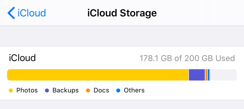
At one point, I had a large orange chunk on the bar above dedicated to “Documents” that weren’t actually there.
I now have a suspicion that Calibre also causes problems with iCloud Drive, so I’m leaving this here for anyone it might affect. Some scenarios for the search engines below:
If you store your Calibre Library folder on iCloud Drive, and have noticed that your remaining space does not reflect the storage you’re using, this is for you.
If you have deleted files on iCloud Drive but find that the free space reported by iCloud.com or your device does not immediately update to reflect the deletion, or…
If you have removed everything on iCloud Drive but still find space allocated to “Documents” in the “Manage Storage” section of iCloud settings on your iPhone/iPad — in other words, if you expect to have free space, and have done everything including a check of the “Recently Deleted” area and emptied your Recycle Bin, but the amount of free space is still inaccurate, I know that feeling.
This seems to happen to a lot of people, perhaps for other reasons, but it happens. Skip ahead to “Is it you, Calibre?” if you just want my conclusion.
So here’s my experience. A couple of years ago, I had this issue, and had to call Apple Support. It took several calls to resolve, because they wanted me to sign out of iCloud on every device (not an insignificant hassle with multiple devices), and when that established that the issue was on their servers, it had to be escalated to Engineering, and the eventual fix was they wiped everything on my Drive and reset it. I had to backup all my files locally (requires a Mac!) first. I believe I still suffered some data loss.
After that, it was all good, but my confidence in iCloud Drive was shaken, and I didn’t want to use it as storage for anything important. Every year since then, they’ve made enhancements to iCloud Drive, and to the Files.app on iOS, which has made me slowly more willing to embrace it again as a cloud file system worthy of My Stuff.
And then this happened again. 13GB of space just wouldn’t come back after I’d deleted files. The files were gone, the space was not reclaimed. After putting it off for two weeks, I got on the phone with Apple again, and two calls later, they managed to “repair” my Drive using some standard tools they have (Engineering was not involved this time). So, a slightly better experience than before.
Is it you, Calibre?
I’ll say upfront that this is a hunch. I don’t have the strength anymore to experiment on my iCloud account and conclusively prove anything.
Both times this happened to my iCloud Drive, I was using it quite “normally”. Nothing fancy, except that my Calibre Library folder was on it, and I knew that the Calibre app was actively updating files on it whenever I added/removed ebooks. This last time, the problem appeared after I’d deleted a ton of files THROUGH Calibre, and as best I can recall, a similar situation took place years ago.
With the Amazon Kindle problem, there’s something about the way that Calibre writes files to the Kindle’s drive that causes it. In other words, Calibre (which is a sluggish cross-platform app that behaves in a very non-Maclike way) may have some non-standard ways of interacting with the OS and filesystem. I think the way that it writes/deletes files isn’t the same as if you manually dragged files around yourself via the Finder. It might be through some low-level UNIX operations, but this is where I’m out of my depth.
So it’s not a stretch to imagine that when you delete ebooks in Calibre, it deletes them from your drive in a way that may cause issues. Deletes them in a way that is invisible to iCloud, so it doesn’t know that the files are gone and it should give you the space back. On a local drive? It works fine, and that’s how it’s used by millions anyway. But on a weird aliased virtual cloud drive that Apple hacked together inside a folder called “Mobile Documents”? Maybe not fine!
Here’s what I’d suggest trying if you have this problem: move your Calibre Library off iCloud Drive. I’ve put mine on Dropbox and it seems fine. Do NOT put it on Google Drive. Call Apple, and have them repair or reset your drive. Some luck is required here, but they’re your only hope. Once you get your missing space back, don’t use Calibre with it again.
I’ll be here with crossed fingers too, waiting to see if this happens again.
In my last update here, three long months ago, I’d just set up a new WiFi system with enough reach to connect our largely neglected study, which gave me a new place to hang out and play music too loudly.
Shortly thereafter, I decided the acoustics of that room were too boomy for the Beolit speaker I’d put in, and picked up a little Sonos which can be tuned to suit the space (it’s much better).
Shortly thereafter, a measure of hell broke loose everywhere, which I don’t need to explain. In the tiny window before nationwide lockdown was called, my wife and I decided to celebrate our anniversary with a staycation since getting away was impossible. We booked ourselves in for a weekend, visited the buffets, had cocktails in the lounge, and sat by the pool that first day reading more news and feeling something in the wind.
Literally overnight, we saw the hotel reconfigure their club lounge for social distancing, cutting the capacity in half. With not much else to do but eat canapés and drink while watching the news, I distinctly recall the numbers then: 380,000 infections worldwide. Yesterday, I saw that number in the news again, for global deaths.
According to the log my teammates have been keeping, we started working from home in the third week of March, later than our other colleagues not attached to client projects at the time. For that period of about a week, showing up at a reduced occupancy office building/mall was surreal, recalling Ling Ma’s novel Severance, where the protagonist keeps going to work at her Manhattan office long after the city stops working, and we were glad when the call was made to not take any more chances.
Clockwise from top-left: These stickers went up around the office shortly before a general WFH policy was declared; the last time we had a drink together at the bar after work, March 24; nobody thinks about staycations until you can’t have one
That move to make our home study more usable/livable/enjoyable just before this hit, which on hindsight was just down to luck and the High Fidelity TV series, was probably the most well-timed decision I’ll make all year. It’s given me a separate workspace from my wife who’s taken to occupying the living room’s solar-facing counter. Given that we’re both on calls a lot now, if I had to be nearby for WiFi purposes, I think there’d be trouble.
A lot of what we do with clients and their customers in the business of design used to happen in person. Speaking with people, watching them at work, communicating ideas — it takes a lot of channels to supply the necessary bandwidth, from spoken words and scribblings on a board to body language and moving things around in space. It’s also true for many other professions, and is probably why many fantasize that VR will be the long-term answer in the event that there won’t be a vaccine, if we agree that plexiglass shields in the office aren’t a solution for getting back to work.
We started working from home on a Wednesday and had to figure out how we’d start interviewing people the very next day; interviews that were originally planned to be in-person conversations. For a bunch of reasons, it wasn’t as easy as sending a Zoom meeting link. We ended up keeping those sessions simple and voice only; better to get the basics right and extract some good data than get fancy and fuck it all up.
Two months later, between us and other teams across the studio, I think we’re beginning to see how many of the old activities can be done virtually. The next step will be to devise new activities that aren’t constrained by assumptions about how work should be done. Maybe we’ll go back, maybe we won’t. One thing about remote work of this sort, technology constraints (including literacy) have a huge impact on who you can involve and co-create with. Almost anyone can pick up a pen or gesture at a thing. Now try to get them to manipulate content on a Miro or Mural board using an aging laptop. Now try to get them doing it in VR. What’s the equivalent of a Post-It note for virtual work: the simplest, most flexible atom of a tool for thinking aloud with anyone? Texting in a group chat?
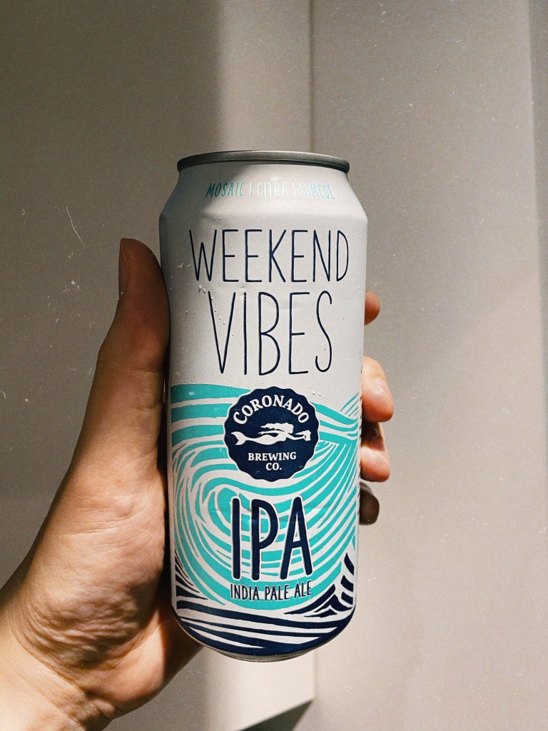
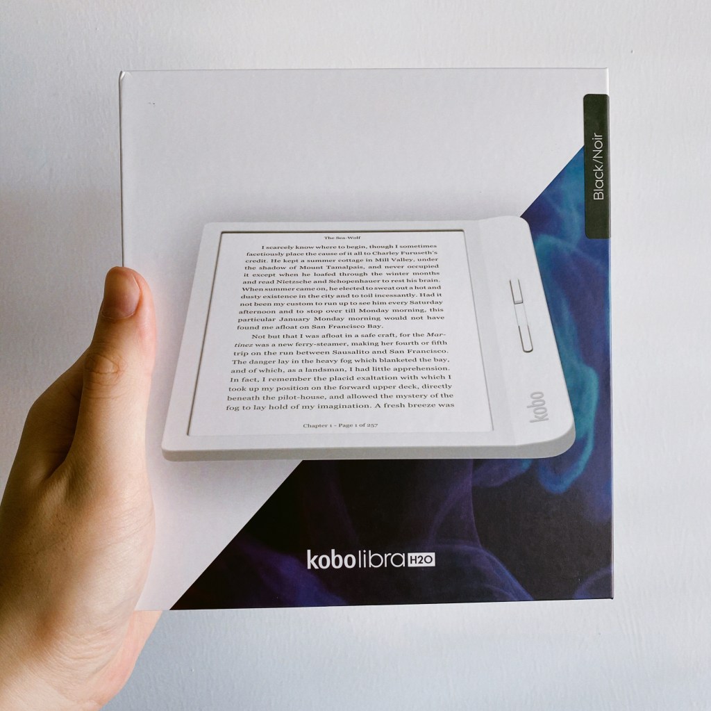
Otherwise, I’ve done some of the usual quarantine things. I’ve tried cutting my own hair (bought some clippers for it). I’ve been making cold brew coffee (bought a Hario bottle for it). We made that dalgona coffee one time but it was foul (already had turns out we actually bought the apocalypse-ready instant coffee for it). I’ve been making more cocktails and drinking IPAs at home instead of at the bar (bought the ingredients and ordered the cases, respectively). I’ve put on weight (bought a lot of takeout for it). I’ve been reading more (bought a Kobo reader for it). I’ve played upwards of 110 hours of Animal Crossing New Horizons (bought the game day one for it). Uh… having made that list, I am a little disgusted. Clearly, if life gives me lemons, I buy a juicer.
Clockwise from top-left: Meeting colleagues in Animal Crossing during our lunch break; that one time we whipped instant coffee and made a mess; pandemics tend to overshadow birthdays (no complaints); the Kobo Libra H2O can wirelessly borrow ebooks from the National Library; drinking the same beers but at home
The national lockdown here in Singapore ends in name next Monday, but the cautious re-opening will surely take more than a couple of months. The first people to be allowed back into office buildings at first will be those who haven’t been able to do their jobs from home for legal or technical reasons, and I think it’ll be September before most white-collared types find out what their leaders think about ending the great WFH experiment vs. saving a ton on commercial rent.
Note: This post contains a couple of Amazon affiliate links, which I’m trying out… again? I have a vague memory of using them on a couple of my sites before.
Thanks to that bit of time off earlier in the month, I’m ahead of my reading goals. Nick Harkaway’s Gnomon was probably twice the length of a standard novel, and five times as elaborate. I was lured in by the SF premise — a murder in a panopticonic dystopian near future (it first occurs to me that it’s not unlike the one in the anime Psycho-Pass), where a governing AI and its human agents are stymied by an encounter with a mind they can’t read — and ended up staying for a literary mindfuck of Pynchonesque proportions. Recommended, but don’t be in a hurry.
I’ve now started reading Mike Monteiro’s Ruined by Design, and can’t wait to get started on the new William Gibson novel, Agency. I think my favorite Gibsons are Pattern Recognition and The Peripheral, and this seems to be along similar lines.
===
It’s now a few days later and I’ve quit reading Ruined by Design. It’s not that I disagree with the central premise; maybe the opposite. There are certainly designers in the world who don’t think or yet know that changing their organizations from the inside-out to be more ethical and responsible is part of the job, and maybe it takes a couple hundred pages of hitting the point over and over to get them onboard. I just stopped getting anything else out of it past the opening, and stuck around until the 70% mark to be sure. The author mentions structuring your presentations like an inverted pyramid, the way journalists are trained to do, leading with your best bits to get your audience’s precious attention, so I guess the book itself puts that into practice.
===
This year’s Chinese New Year celebrations have been a little muted, both at home and abroad. Putting aside the nCoV outbreak in the headlines, it just feels different now, like an idea that has almost run its course. The build up to this has taken place over a few years, but it’s certainly palpable now.
My parents’ generation is getting tired of organizing everything, and mine doesn’t care about observing traditions in the same way. The virus has provided a reason for canceling some of the get-togethers, but they were being scaled down anyway. Even Apple’s annual CNY shot-on-iPhone film/ad lacks its usual artistry this time around. I don’t know if it’s the 60fps look, the fact that they shot many scenes handheld, or the Smart HDR effect, but it feels more on the cheap side rather than cinematic.
Speaking of change and the fading of old ways, over at my workplace, we’ve just put out our annual trends report. It’s compiled with the input of some 1,200 employees in 33 studios, so the results should be a nearly fair representation of the global design climate. The running theme across all seven trends? Many of the fundamentals underlying daily life are being put on notice as we ponder the definition of value as consumers and consumed in an increasingly turbulent world.
One trend, called Digital Doubles, touches upon the idea of personal datasets so rich that we’ll appoint them as digital proxies for our own choices and behaviors, sort of like how you can tell a robo-advisor how much risk you’d happily tolerate before letting them go trade and rebalance your portfolios. At this point, I’m several chapters into Gibson’s Agency and one of its main threads concerns an AI product designed to do exactly that.
“but he described the product, that’s you, as a cross-platform, individually user-based, autonomous avatar. Target demographic power-uses VR, AR, gaming, next-level social media. Idea’s to sell a single unique super-avatar. Kind of a digital mini-self, able to fill in when the user can’t be online.”
v1.01 (Jan 30, 2020) — iOS 13.3.1 fixes a bug that affected the way Share Sheet imports had to take you out of the Photos app and into Shortcuts. So this is now simplified. Also added emoji graphics to make the main menu fancier.
v1.02 (Sep 5, 2020) — Updated to fix the shortcut stalling at deletion of original photos after processing. Apple changed some behavior in the Shortcuts.app.
Summary
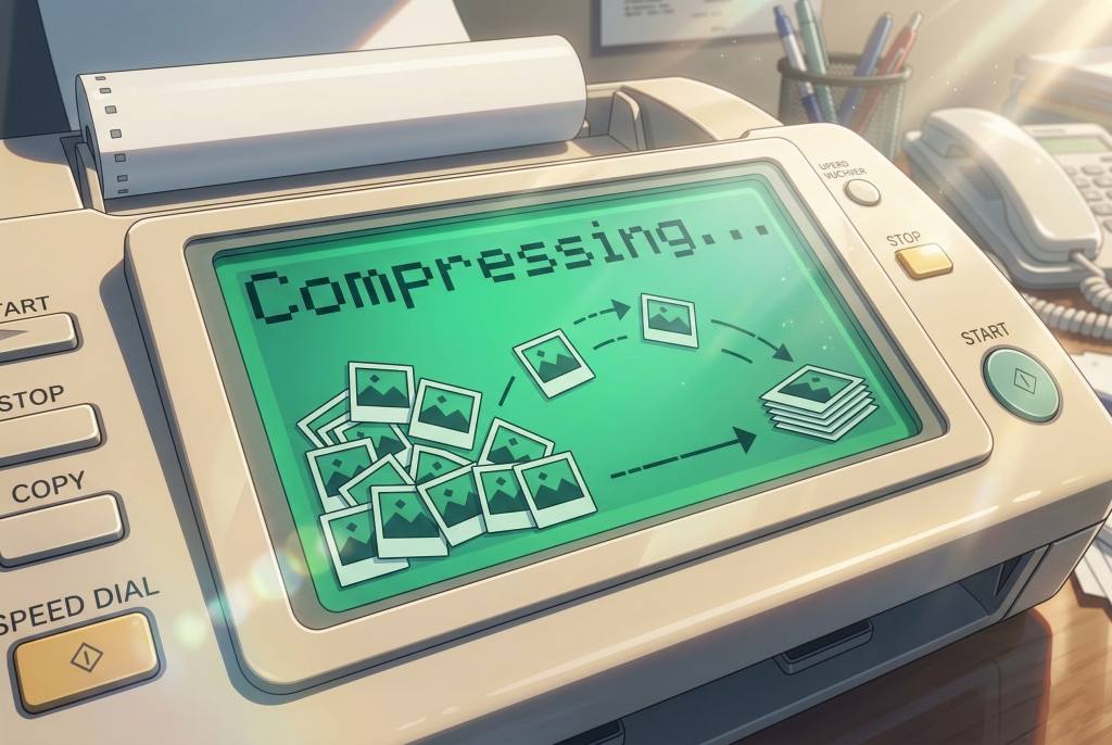
HEIFer is a shortcut for iPhones and iPads (you can import and run it in the Shortcuts app that is part of iOS 13) that automates the batch conversion of photo to HEIF/HEIC formats. This has the benefit of making their files dramatically smaller without any visible loss of image quality.
HEIF stands for High Efficiency Image Format, and Apple introduced support for it in 2017. You can find out more about the format here.
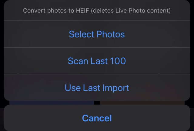
HEIFer has three modes:
Converting a manual selection of photos
Scanning the newest 100 photos in your library, and converting any JPEG/PNG/TIFF images it finds
Converting the last imported batch of photos (from a camera or SD card, using an adapter)
This is my first proper iOS Shortcut and I made it to learn the ropes.
I’m kinda all-in on the HEIF format, and if your iPhone is set to save at “High Efficiency” in the Camera section of Settings.app, then you’re already using it for every photo you take. The quality is great, and you can store twice as many photos in the same amount of storage space.
But… I also shoot photos with other cameras, and every manufacturer, from Canon and Nikon to Sony and Leica, seems to be years behind in the software game, and the only options they offer are usually JPEG and RAW. What’s more, the CPUs in these cameras are usually very underpowered compared to what’s in your iPhone, so they don’t try very hard to compress the images efficiently. You can typically turn a 10MB JPEG from your camera into a 3–4MB HEIF file in less than a second. It’s a tremendous waste of space, both on device and in your cloud backups, to keep the JPEGs.
When you save an edited photo out of VSCO, you’re turning a HEIF file into a JPEG
I also edit my photos with iOS apps like VSCO and Lightroom, and almost all of them save the finished photos in JPEG. So if you’re regularly editing your iPhone photos, those small .heic files are still ending up as fat .jpg files at the end of the day. It’s nuts!
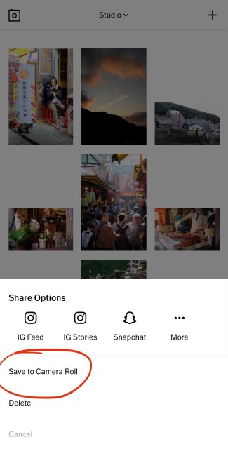
So HEIFer is a way to quickly take those old-ass files, bring them into the present, and then dump the originals. For instance, if I’m shooting directly to JPEG on my cameras (why not RAW? That’s a topic for another day), all I have to do is plug in the SD card, select “Import All”, run HEIFer, and I’m done in three taps.
If your photos have proper timestamps, then you will still see them in chronological order in the “Photos” tab. However, if you go into the “Recents” photo album, it will reflect the process of converting and deleting them, i.e. it’ll be as out of order as your recollection of a big night out.
The Dec–Jan self-examination train just keeps rolling, which, for someone who usually sniffs at those sad people religiously making New Year’s resolutions, is a very strange development indeed. I don’t think this has anything to do with my turning 40 next year, I mean, it can’t… because I only just realized that fact right now. Oh shit?
Whenever I somehow have the time or feel inspired to reflect on how things are going, they usually boil down to the same few things I should be doing:
Reading more often, and more widely, than just 5 non-fiction titles a year plus the occasional junk SF
Writing regularly, if only to put aside time to think
Watching less junk, especially when I haven’t even seen The Essentials (I haven’t seen Schindler’s List, but I’ve watched 240 episodes of Terrace House)
Not wasting time on video games that are just repetitive endorphin loops
Having fewer possessions to lose in a fire, getting more comfortable with the idea of being mobile (decluttering the house, relying more on digital content, living in the cloud, etc.)
Contradictorily, keeping a few superfluous physical things around purely for the hell of them: a short stack of interesting but commercially doomed magazines, a well-built camera, buttery soft notebooks that deserve better than my handwriting, the Game Boy I never had.
I haven’t done my research by asking anyone else yet, but I’m sure these are universal in that most people will agree their time–activity distribution in daily life is incorrectly optimized for quality. Whenever I daydream about being retired, it’s mostly the things above that I see myself getting right first, binging on my book backlog for weeks before contemplating the trip around the world or whatever.
Why is it so hard to spend our valuable and limited time on things that are more Criterion Collection than Netflix? Okay, you might want a balance, but surely that’s like 90:10 or 80:20. Random idea: if the reason is because modern life and the 9-to-5 takes so much out of you, maybe we should wake up early and watch a good film each morning before going to work? I might actually try that.
Speaking of cameras and Game Boys, there’s a cottage industry springing up around the repair and upkeep of devices that, by modern standards, have no right to be hanging around this long. Did you know you can get a Walkman repaired and still actually buy a DVD in some parts of the USA? I haven’t seen either of those things around these parts in quite awhile.
I’m all for it, but it’s quite a lot to process when I already find it odd that Apple still operates the iTunes STORE alongside Apple Music, Apple TV+, Netflix, etc. I’d love to see the sales graphs across geographies to see where people are still trying to “own” their digital media — and how that maps against demographics, aging populations, and so on. Probably safe to assume that physical media sales are just a totally different animal and consumer group even further removed from that.
This reminds me of articles from yeeearrrs back when streaming services were looming, all warning of the massive energy and ecological cost they implied versus the plain ol’ manufacturing, distribution, and playing of CDs. I don’t know if even green-leaning Apple is interested in doing something about it, because subscription services are kind of The Strategy these days. It’s only going to get worse for us down here on the equator before it gets better (colder).
I came across this pair of stories about apps/services offering “nonexistent” fashion for your IRL self (Photoshopped onto a portrait you send in) or avatars (trying on 3D models of real clothes and accessories in a proprietary [what!] app), and within days of each other no less.
What I don’t get is whether everyone has collective amnesia around virtual goods and brands in the mainstream? Because how do you explain that I was on Tencent’s Chinese instant messaging app QQ in 2002, with a penguin avatar that wore sweaters you could buy for the Chinese equivalent of a US dollar? Or that I lost many friends to World of Warcraft in the next few years, many of them selling their leveled-up characters off on eBay? Maybe they put some of that money towards buying hats in Team Fortress 2. Red Bull and Adidas and all the automobile brands have been advertising and licensing themselves in the gaming space forever. Is this just about being able to buy virtual Gucci and Off-White shit?
The question isn’t “will anyone pay for virtual goods”, but “what does it mean that we’re now starting to virtually put them on ourselves?” — primitive Photoshopping today, invisibly through AR lenses tomorrow? Imagine a parallel fashion industry that deals entirely in virtual fashion for the real world. You’d make statements by pairing real and virtual clothes; flick the glasses on and off to see how your date flexes a pair of Hermès sneakers in the metaverse but keeps it simple IRL with New Balances. Maybe you could just leave the house naked someday and no one would notice.
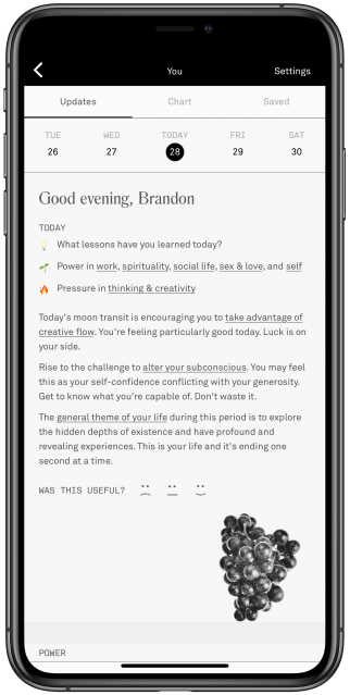
I was surprised to learn that astrology is experiencing a comeback amongst millennials, thanks to an app called Co–Star that has been steadily growing beneath my radar. When a decade-younger friend sold it to me over drinks last week, the most interesting thing about it to me was its inexplicable use of an n-dash in the name. I installed it for a look, saw a personality trait in the natal chart* that didn’t quite match my self-image, and promptly forgot about it until the push notifications started arriving.
These nudges are titled “Your day at a glance”, and are so iconic to this audience that the Instagram filter creator known as autonommy has made one that superimposes Co–Star notifications over your head. They’re usually a single mysterious line or proverb that you’re meant to contemplate as things happen to you.
Yesterday (an uneventful day), I was assured, “You don’t have to be afraid.” Today, it asked, “What lessons have you learned today?” Tapping into the app unleashes a torrent of AI-assembled advice that tells you how to deal with the challenges of existence as per the day’s astral alignment. The tone of voice is often surprising: acerbic, blunt, even dark.
Instead of deleting the app as I meant to do, I discussed it with some people around me and shared a Verge article about the team behind it, and now I’ve got irl friends on this astrology social network, and we can see each other’s fates and compatibility, and I think I’m keeping it? It’s not like I’ve suddenly taken horoscopes at face value, but perhaps it fills a gap — I need someone to regularly kick my ass on personal development, and whether I agree with the “advice” or not, these prompts might get me to work a little harder at things. They’re challenges.
Coincidentally, I spent much of yesterday reading through the backlog of email newsletters I subscribed to and then got overwhelmed by. When someone’s thoughts on screen are a year old, making reference to events that you and the internet are so over by now, but the words remain productive, insightful, and capable of inspiring you to look back at your old email newsletter project from 6(!) years ago and maybe start writing on your blog again, they can have all the paid subscription money. If you’re in need of a couple recommendations: try Dan Hon and Craig Mod’s.
There’s always a voice gently suggesting I “write more”. Sometimes I think I write enough at work as it is. As the activities that make up my day job changed over the last few years, so did the emphasis on actual writing as a vehicle for Client Value Delivery. It took awhile to join the dots between the kind of writing I did in advertising, publishing, side projects, and now in a design/consulting context, but that still leaves out the “pleasure writing”, as one acquaintance recently called it.
Right now, I’m feeling out of practice and clumsy when it comes to this stuff. I don’t know how to write to you anymore. Maybe I cut down on tweeting and blogging because we all entered a digital privacy crisis, but the net result was falling out of the public writing habit altogether. I lost imaginary friends.
So. Why not try again? What do I have to be afraid of? What lessons am I learning today?
*Those natal charts: You plug in your date/time/location of birth, and it pulls historical NASA data to see where celestial bodies were when you were born, and interprets their deviations in space each day to produce your horoscope. Are these even called horoscopes? I don’t know; that word seems dated and quacky, like something in a crinkled copy of Reader’s Digest, whereas Co–Star feels like something new — a bit of not entirely serious millennial wellness — dressed up in ancient clothes.
A couple of years ago, we had a colleague from Hong Kong in town who would do the exact same thing as a party trick, except she manually read and interpreted the natal charts which she generated using a Chinese app. Co–Star has simply scaled this with technology and a content team.
We paid Tokyo and Osaka a visit last fall, following up on my life’s goal of visiting Japan at least once every two years, and nothing disappointed — not the food, people, weather, galleries, nor multi-storey complexes designed to make me buy media and electronics. As Craig Mod alluded to recently on Twitter, Tokyo is a place that fulfills the city’s promise as a tool for human life.
The thing I love about its density and intensity is how that translates into support for all manner of subcultures and obscure hobbies. Today, you can barely find a functioning and interesting bookstore in Singapore, while in Tokyo it’s not just bookstores that thrive. One can wander into massive stores selling model train and forest diorama-building supplies, or records curated from a specific period, or vintage camera parts emporiums. We’re not large enough to incubate that kind of diversity, and the city dweller’s life suffers for it.
The retail industry in Singapore is in decline, or so the news outlets tell us every day. I wonder if they ring the same alarm bells in Japan. Online shopping and its infinite inventory can fill the gap a brick & mortar apocalypse would leave behind, but digital ~~replaces~~ overwrites our collective memory of browsing and inspecting these items in a physical space. I think it’s really important we don’t lose that, because, as one of my company’s founders is fond of saying, technology might change fast but people fundamentally don’t.