Tag: Technology

  • Unboxing: Moment Case for iPhone 6S Plus

    Unboxing: Moment Case for iPhone 6S Plus

    Today I received my new Moment Case (Dark Walnut Kickstarter edition) for iPhone 6 Plus after a long wait following the Kickstarter campaign. They hit a snag with manufacturing, and the release of the slightly thicker 6S series of phones necessitated holding back to make sure the original designs fit.

    It works as advertised and is very easy to hold; slips into my jeans pocket comfortably enough too. Here’s a quick unboxing and look at the startup photo taking workflow. Note that you must use the Moment Camera app if you want to use the shutter button. It does NOT function as a regular Bluetooth remote shutter like the kind you use with a selfie stick.

  • Pebble Time Steel: First Impressions

    Pebble Time Steel: First Impressions

    As a user of the first-generation Pebble since last December, I eagerly ordered the new Time Steel model when it hit Kickstarter earlier this year. And then the Apple Watch went on sale in Singapore earlier than I’d expected it to, and that’s a whole other story about my irrational spending.

    Fast forward to the present, and my new Pebble has arrived! But I’m probably selling it!

      
    Let’s open this shipping box up.

      
    There’s the Pebble Time Steel (which ships on a genuine Italian leather band, this one’s a gunmetal gray body, so the band is a matching gray/black), and a separate box containing the steel link bracelet in gunmetal. As a Kickstarter edition, it comes with both. With the retail model, the steel bracelet will be sold separately for US$50.

      
    Previous Pebble watches have had pretty lackluster packaging, so this is quite a step up. Look at that display box; it’s good enough to be sold on the accessory shelves of an Apple Store, except they won’t be.

      
    Here’s the back of the box with a list of standout features. Of course, the main improvement to the hardware is a new color e-ink/e-paper display. It’s always on, unlike the Apple Watch’s, so you can glance at it any time over the 10 DAYS that its battery will last, and know the time or your latest notification, without having to raise your wrist or press any buttons. It’s got a microphone now, which is useful for Android users who can dictate responses to messages and emails. It’s slightly less useful for iPhone users. And of course, it’s still waterproof to 30M. I don’t think anything else is.


    Here it is next to my Apple Watch on the right. The watch case is very slightly smaller than the Apple one, and is also gently curved on the underside to sit neatly on your wrist. In that regard, it’s very nice and possibly more comfortable and natural looking on the wrist.


    Here it is all set up and charging via a magnetic cable attached to the back. Nothing as sexy as Apple’s inductive charger; this one only uses magnets to draw two magnetic points to their respective spots. It works.

    As you can see, the e-paper display shows colors even when not lit, although they’re not as vibrant as you’d see on a printed page. The sun icon has a mild yellow to it, and blue shows up very well. In direct sunlight, it looks crisp and strong, and is easy to read. Indoors, it can be a little muddy and dark, perhaps a touch dimmer looking than even the original Pebble. A backlight comes on when you press a button or flick your wrist. This also looks dimmer than I remember the original Pebble being, but perhaps I’ve just been spoilt by the Apple Watch’s super bright and colorful OLED display (which wantonly consumes more power in a day than the Pebble Time Steel does in 2 weeks).


    Here’s what it looks like on the wrist (thanks to my dumb use of a wide-angle lens, the watch looks larger here than it is). I wear a 42mm Apple Watch and it looks smaller than this, and as shown above, the Pebble is even smaller than Apple’s. So if you normally wear a 38mm Apple Watch, this is probably what the Pebble Time Steel will look like on you.

      
    Here’s a more accurate shot, this time with an imitation Casio watchface complete with Timex Indiglo color scheme. That statement alone tells you who the Pebble is aimed at; you have so much opportunity to customise the face of this. Many of the color faces I saw let you specify the color of every element and make your own themes. It strikes me as the sort of thing some people jailbreak iPhones or choose Android smartphones to be able to do. I’ve decided I’m not that person these days, so I’m probably going to sell it. But the build quality is solid and the leather strap is really quite soft and lovely. It’s a real improvement from Pebble, and if they can get the cost down, it might work out.

    Oh, the new software works as advertised, but without using it for a few days, it’s hard to say how useful seeing your apps and events laid out on a timeline is. On paper it sounds like a great idea and it was one of the main reasons I ordered this at the time. Apple’s watchOS 2 is also going to have something along the same lines with its Time Travel feature, so I guess it doesn’t matter what platform you eventually choose — we will all soon be consuming time-sensitive content on our timepieces using contextual timeline interfaces.*

    *Did it strike anyone else as odd that after Pebble showed their hand with Timeline on Kickstarter, Jonny Ive or someone on his team dropped a casual interview comment that they had tried a similar concept in an earlier prototype of the Apple Watch, but it didn’t work out? And then a few months later we see Time Travel as one of the key new features of the next watchOS?

  • Beats Solo2 Headphones (Space Gray) Unboxing

    I haven’t made a video in ages and wasn’t planning to, but my colleague Jose suggested today that since I was about to open my new headphones, we make an unboxing video of it. The coolest thing was that I was able to make the whole thing from start to publish without leaving my iPhone 6 Plus (okay, I looked for music while on my MacBook Pro).

    The headphones themselves sound about as good as my Beats Studio 2 (2013), which is to say good enough for daily listening and most modern music types. But they’re nowhere near as comfortable as those, which along with the Beoplay H6, are my favorite pair of headphones to wear for hours at a time. Granted, those are both over-ears, and I guess that’s my personal preference. Still, the clamping force is significant, and is probably best for smaller, non-glasses-wearing heads.

    Disappointingly for the price these go for, my pair also has a defective hinge on one side, so I’ll be returning these to Apple next week. These new colorways are interesting though. It reminds me of Nintendo putting out new shades on an old handheld before they launch the next generation. Here’s hoping we’ll see a new Jony-designed model in June alongside the new Beats Music service.

  • Apple Watch Numbers and Ive’s Materials

    Back in December, I wrote a bit of a rambly post about what I thought might happen with the Apple Watch, and the possibility of it having hardware you could actually upgrade to preserve your precious metals investment. I’ve since changed my mind on that, and think they’ll be replaced like any other Apple product: buy a whole new one if you want it. I also had a prediction about how many they’d make:

    In terms of mix, I’d wager an approximate 60% Sport, 30% Apple Watch, and a maximum of 10% Edition in the first year. At the prices above, the 10% sales of Edition watches will probably drive half the overall revenue.

    The Wall Street Journal (paywall) has just reported some numbers, and my guess was pretty close. They’re saying Apple will have up to 6 million units ready at launch. iMore has reprinted the breakdown:

    The report suggests that half of the production run is for the entry-level Apple Watch Sport, which will be priced at $349. One third will be the stainless steel Apple Watch. That would leave the remaining one-sixth of the production run — which comes out to around 850,000 units — for the gold Apple Watch Edition.

    If you’ve been active online today, you would have seen (and hopefully made time for) the New Yorker’s epic profile of Jony Ive. Many of the insights are new, and the writing is kinetic and marvelous, with gems like this one about Ive having an opinion about iOS’s skeuomorphic design, and eventually becoming involved in making it over:

    He’d had that conversation with Jobs. “He knew, absolutely, my views,” Ive recalled. “I’m not going to second-guess what he would have done if—had he been well.” I asked Cook if, after he became C.E.O., Ive had pressed for a software role. “We clearly spent a lot of time talking about it,” Cook said. “And I think it became clear to him that he could add a lot.” Ive’s career sometimes suggests the movements of a man who, engrossed in a furrowed, deferential conversation, somehow backs onto a throne.

    Or this one, which credits Ive with suggesting the new sputtering lightsaber effect in Star Wars: The Force Awakens to JJ Abrams at a dinner party. For the record, I think it’s a brilliant update which gives the business end of the weapon more heft, more fire and laser menace. Ars Technica has a debate in the comments section.

    After the release of the film’s first trailer—which featured a fiery new lightsabre, with a cross guard, and a resemblance to a burning crucifix—I asked Ive about his contribution. “It was just a conversation,” he said, then explained that, although he’d said nothing about cross guards, he had made a case for unevenness: “I thought it would be interesting if it were less precise, and just a little bit more spitty.” A redesigned weapon could be “more analog and more primitive, and I think, in that way, somehow more ominous.”

    If I wasn’t already sold on the standard Apple Watch (as opposed to the Sport and Edition versions) as my choice this coming April, this paragraph of remarks by two members of Ive’s design team present at the unveiling event would have done it:

    “The materials in this thing are insane,” Howarth said. People, he noted, were saying that the watch’s face was made of “sapphire glass”: “It’s not glass, it’s sapphire crystal—completely different structure. And then the stainless steel is super-hardened. And the zirconia ceramic on the back is co-finished with sapphire as well.” He added, “This would cost so much money if a different company was making it—Rolex or something. It would be a hundred grand or something.”

    “We sell it for just fifty thousand,” Hönig said, joking.

  • Darkroom Photo App Shows Why UX Details Are Everything

    Darkroom Photo App Shows Why UX Details Are Everything

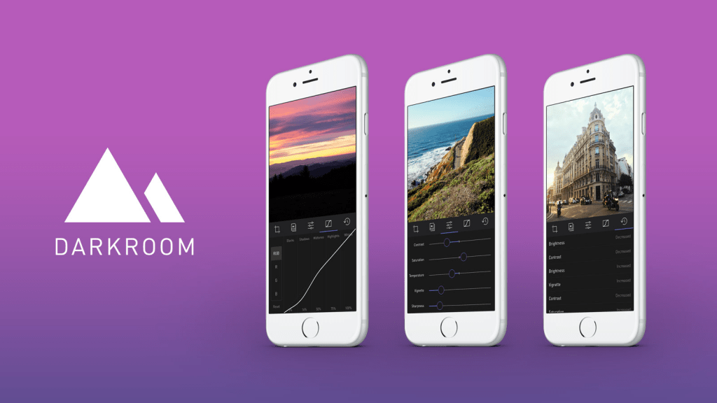
    A new photo editor for iOS launched today, and it’s called Darkroom (free, with a $2.99 in-app purchase to unlock Curves).

    “Another photo editing app? What does this one bring to the table?” I’ve seen a few early reviews of Darkroom begin along those lines. It seems a sense of fatigue has set in amongst people watching this space, and it interests me to find that I don’t feel the same way. I’ve dived into every new release with optimism, because there are still so many ways to improve upon what we can currently do on our mobile devices.

    The Verge mentions Darkroom in the same breath as VSCO Cam, suggesting that the latter has a new challenger. That’s somewhat wrong-headed; they aren’t anymore alike than, say, how Super Mario Bros. and The Legend of Zelda are as ways of passing time. Both apps allow you to tune the look of a photo, and apply presets, but it’s how they’ve been engineered to do it that counts.

    Darkroom’s most exciting development, if you listen to what people are saying, is that it allows you to edit photos by adjusting RGB curves. Except that’s not especially new in the iPhone app space — Photoforge did it years ago, Filterstorm has that and much more in the way of professional tools, and there are others. The next feature to get attention is that you can save any of your adjustments as a custom preset, ready for future photos, and it’s like making your own filters. Again, this is territory that Mattebox, PicTapGo, Mextures, et al pioneered awhile ago.

    The reason Darkroom is exciting, is that it seems to have absolutely nailed the UX of these features, and made them feel manageable, comfortable, and pleasurable to use as a whole. I want to emphasize that this is hard, and that their solutions are so subtle and executional, they might not have convinced anyone of their worth if presented as bullet points on a slide at some early point in the process.

    Using other apps with curves and pro adjustments can feel claustrophobic and stressful on a small screen. I’ve hated almost every single one (Adobe’s own Photoshop Touch is so awful at it) and keep them on my phone as last resorts. If I’m on holiday and take a problematic photo with potential, I’m more likely to wait till I get home just so I can do it on a Mac than try to fiddle with it on the go. Snapseed is one powerful exception, but that uses its own control metaphors, not curves.

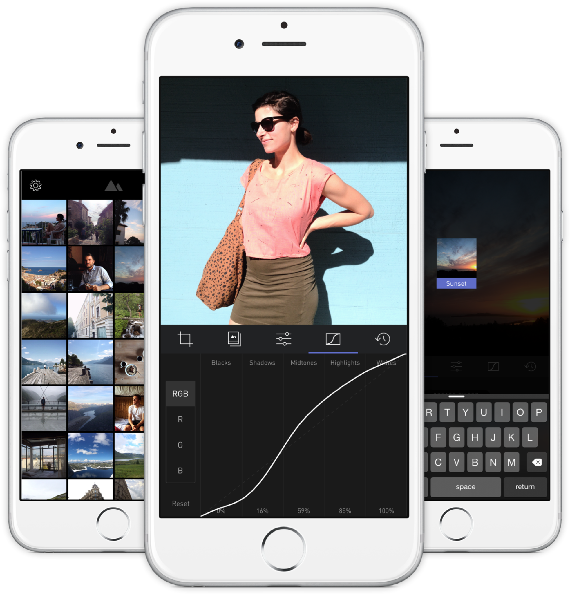
    Darkroom’s UI is blissfully open in design. It will likely get more complicated as they add more promised features, but I’m hopeful the team finds a way to keep this incredible simplicity. As you page through its 5 key sections (composition, filters, adjustments, curves, history), you never lose your place in the mental model. Nothing is buried in a submenu or out of sight.

    You don’t have to click a checkmark to save an adjustment before tapping another, because everything can be undone to an infinite degree, and one can undo hundreds of minute actions back to the beginning of an edit if necessary. Because that step (so annoying in apps like Afterlight, Faded, and VSCO Cam) has been eliminated, using Darkroom’s tools feels close to direct manipulation of the colors and pixels on your screen. One more nice touch: you can tap to the left or right of a slider knob to nudge it in that direction. Simple, but I can’t remember the last time a photo app let me do that.

    Loading up a photo is seamless. The app starts with a view of your entire photo library. Tapping a photo pulls it forward, straight into editing mode. At this point, you can swipe to either side to start editing adjacent photos in your library. Flicking a photo down tosses it back into the pile, and you’re looking at all your photos again. In use, it feels gloriously fast and uncomplicated. As that bullet point on a slide, “Seamless browsing and editing flow” wouldn’t have done it justice. This is the kind of feature that needs to be designed, prototyped, tweaked, and tuned over and over to create something subtle, but innovative. A team rushing their project out would have missed the opportunity.

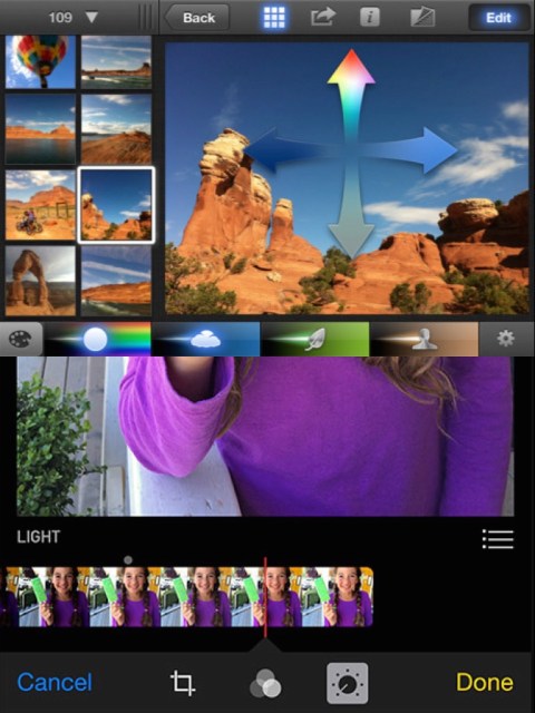
    The difference between Darkroom and apps that require stepping in and out of different editing modes, especially when the placement of those modes is obscured, is like Apple’s own (now discontinued) iPhoto for iOS and the new built-in photo editing options in Photos.app. The former was a confusing mess with plenty of user-undiscoverable gestures and submenus, while the latter gives most users all the power they need in a more approachable UI.

    iPhoto Photos

    I’ve stopped using half of the other apps I’ve listed above as problematic, and forgotten the names of twice as many more. The ones I remember tend to be the ones I really wanted to succeed; I’ll unfairly single out Mattebox as an app with great technology and features, but suffered from confounding UX design. Countless times, I actually got lost inside the mess of buttons and menus that were hidden at the “back” of its camera mode. Thinking about the Darkroom icon sitting on my homescreen now doesn’t fill me with the same dread. I’m dreaming about using it later tonight, and tomorrow, and anticipating what will be new in the first update. Although its name is generic, I don’t think I’ll be forgetting it soon. I imagine it’s the beginning of a new phase of using my iPhone as a camera, one in which I can send better photos home while still on holiday.

  • Singaporean Telcos and Their Chinese Mobile Gambit

    One of the immutable truths of living in Singapore and reading our national broadsheet, The Straits Times, is that your Saturday morning news will be interrupted by three large and distinctly color-coded blocks of full-page advertising taken out by the major telcos: red for Singtel, green for StarHub, and orange for M1.

    In the late 90s, the brands advertised consisted mainly of Nokia, Motorola, Alcatel, Sony-Ericsson, with a few models from minor players like Sharp, HTC, and Panasonic. You’ve probably recognized the ones still around. Apart from a few new entrants like Apple, Samsung, and LG, the Saturday ad landscape was quite stable for over a decade.

    Something started happening this year, around the time Xiaomi launched local operations — their first market outside of the Chinese territories. New brands have started to share space alongside the established premium brands. Oppo/OnePlus. Huawei. Asus. ZTE. All very competitive spec for spec, dollar for dollar.

    It’s significant that these Chinese-designed products now share equal space with the Samsungs and LGs in expensive telco media buys, in one of the world’s most saturated and advanced smartphone markets.1 There are similar products coming out of other Asian countries2, but the Chinese brands have far more visibility here.

    I won’t go into how Xiaomi employs a differentiated, social media-driven sales model, but I will say that they got a lot of positive press at the start, driving home the idea that they offered comparable quality and reliability at a fraction of the cost. But they’ve been the only ones to get such an image in the mainstream mind, to my knowledge.

    The rest are coming into town aggressively — Oppo opened a flagship store at Suntec City, a central mall, and I swear I’ve seen a Huawei store along Orchard Road — but their cachet seems strongest amongst the small group of tech and Android enthusiasts attracted to low-cost, high-value devices, which are replaced frequently.3 These are not mass market items yet, and I wonder when their moment will come, if at all.

    What interests me is why the telcos are throwing their weight behind these entrants. Are they a bargaining chip to negotiate better hardware prices with the others, regardless of sales? Or do the postpaid 4 margins on selling already-cheap Chinese phones to consumers just look that much better? Or could it be driven by actual market demand?

    My leading theory is that it’s simply a reactionary move that doesn’t consider the longer-term effects of promoting these price-disruptive products. Why? Because telcos are instinctively programmed to serve products at every available price point.

    But the low price, contract-free nature of how consumers can otherwise obtain these devices is a threat to the lucrative business of locking people into contracts. Including such devices alongside premium devices in weekly advertising validates them. In the past, doing the same with a $50 Alcatel featurephone and a $500 Nokia “multimedia computer” was apples and oranges. Now, the products at both price points are much more similar, and one of them doesn’t need to be paid off in monthly installments. Legitimising cheaper smartphones inspires potential postpaid customers to simply buy a contract-free phone online (or pick one up in a store), and then save with a prepaid mobile line instead. At least that explains why Oppo is paying downtown rent on a flagship store. The telco strategy, though, that isn’t so clear.


    1. As of January 2014, Singapore had 87% smartphone penetration, with 29% of people owning more than one device. Anecdotally, the vast majority are on subsidized/contracted premium devices: iPhones, Galaxy S and Note models, etc. 
    2.  Joi Ito has a post about visiting Shenzhen that may be enlightening. 
    3. I think of this one friend as an edge case, but it’d be interesting if there were more like her: a former iPhone user, she found herself too clumsy to trust with expensive phones (they were smashed, stolen, or fell into toilets), and now uses Xiaomis because they are pretty much disposable at around USD$140 a pop. 
    4. Singapore has a bit in common with the U.S. phone market, in that only a minority pay full price or even know what the actual prices of their phones are. Everyone else pays a smaller sum upfront, with the rest of the device cost bundled into monthly fees. Some of the new Chinese phones are free/virtually free at their subsidized prices, but so are older iPhones and Samsungs, and it’s hard to see the price advantage lasting. For any brand that doesn’t enjoy the recognition of a Xiaomi, that window may close when current large-screened iPhones get priced down. 
  • New Power Generation

    New Power Generation

    The rumors about Apple switching from MagSafe to USB-C as a charging port standard are starting lots of conversations, and my own reaction to hearing that was “What? Why?”. But when I think about it, I really like that I can charge almost everything in my bag via microUSB these days, regardless of brand and manufacturer. My Sony camera and PS VitaBeats noise-canceling headphonesJawbone Bluetooth headsetLogitech UE portable speaker. Last I remember reading, the EU had mandated mobile phone makers use a common charging standard, and Apple got around it by supplying a microUSB-to-Lightning adapter for iPhones.

    And while Lightning is a great improvement upon microUSB that no one else would have made, the benefits of keeping just one cable in your bag for your power bank can’t be overstated. Less to lose, less to keep organized in a pouch or whatever, and less clutter on your desk when plugged into a charger. The main exceptions in my daily life apart from Apple devices are my wearables (UP24 and Pebble); for obvious waterproofing and form factor reasons they went with proprietary designs. The Apple Watch will probably replace both of them for me, but I’m not looking forward to buying and carrying a second conductive charging thing for it. They don’t look small, cheap, or durable.

    Disclaimer: This somehow became a gear post, so I’ve added Amazon affiliate links to see what happens. These are all great things to buy!

  • Thoughts on Apple Watch’s Pricing, Upgradability, and Luxury Positioning

    Thoughts on Apple Watch’s Pricing, Upgradability, and Luxury Positioning

    Neil Cybart, at Above Avalon on Apple Watch’s Secret Weapon:

    Several luxury watchmakers have given hints that they think a smartwatch’s lack of timelessness guarantees traditional luxury watches will not be threatened by this new crop of wrist gadgets. I’m not so sure that logic will stand the test of time.

    The discussions to come after the Apple Watch arrives and sells in numbers (and at prices) alarming to existing watch brands will be focused on luxury as a notion in flux, affected for the first time by technological utility in the form of personalization. Valuing features over the intangible lies in opposition to the definition of luxury, but the wrist may be where the two worlds come together. After all, you can only wear one watch at a time, and a smartwatch’s absence from one day to the next is glaring once its features have become habit. Apart from providing large margins for Apple, the Edition watch exists to allow luxury watch customers the  benefits of a smartwatch. It opens the door of their resistance a crack, but won’t debut in a position to steal meaningful profit share, which is the real danger to a complacent luxury watch industry — it’s a time bomb with years on the clock.

    The post concludes with the suggestion that a hypothetical $7,500 Apple Watch Edition will not be designed to last long; predicting that it will not be upgradable as some have suggested it needs to be. In other words, its class of buyers (inference: rich, Chinese, digitally savvy, all of the above) will get a new one every few years despite the price. Despite being made of solid gold, you will not buy one as an investment or potential heirloom.

    I don’t think Cybart backs up this assumption very well, leaning largely on the cottage industry that has sprung up around customized gold and wood iPhone 6es, but I am inclined to believe in the same outcome: success whether Apple Watches are upgradable or not, although my personal preference would be for upgradable, owing to the size of my wallet.1

    That they’ve announced the opening price of an Apple Watch Sport at $349 signals a belief that it will be a significant mass market seller, regardless of its sporty positioning. A large group of people will choose the Sport version because they want an Apple Watch/are curious, and it’s simply the one within their reach. If the price difference between the Sport and the standard model were relatively insignificant (say, $349 vs. $499), they would probably have announced the standard pricing too. That they didn’t, could suggest a belief that pricing is less relevant in the decision making of Apple Watch and Apple Watch Edition customers.

    My guess is that the standard model will be in the range of $800-1200, possibly upgradable for at least one future generation, and the Edition model will be easily upwards of $8000 and upgradable as well. As a point of differentiation, I expect the Sport models will not be upgradable.

    I’d like to believe that the straps and their locking mechanisms are also designed to be used for many generations of Apple Watch, which would mean dimensions such as the thickness of the case will be stable for years, but we’ve seen Apple revise accessories/standards without hesitation if it means allowing a better product to come to market. Hence, I wouldn’t be surprised if a third-generation Apple Watch mandated all new straps.

    In terms of mix, I’d wager an approximate 60% Sport, 30% Apple Watch, and a maximum of 10% Edition in the first year. At the prices above, the 10% sales of Edition watches will probably drive half the overall revenue.

    But I could be wrong about upgrades. In conversation about this a few months ago, as part of an office podcast we’re still trying to get off the ground, I recall speculating that the Chinese luxury factor could be bigger than anyone expects right now. It’s well known that tens of thousands of dollars are nonchalantly dropped on leather bags and other so-called Veblen goods on a regular basis by Chinese customers, and this no doubt includes timepieces costing 10x more than Apple would ever charge for an Edition watch. If the Edition series was expressly designed to take advantage of conspicuous consumption in China (in volume, followed by the rest of the world), then we’ll see it when they announce that the watch cannot be upgraded, and is inherently disposable. What’s flashier than wearing a gold watch that says you can afford to get a new one every year or two?


    1. As I understand it, the recent release of WatchKit details suggested that almost all processing in Watch apps will take place in the CPU of the companion iPhone, not the Watch’s S1 processor. But in a release of the software scheduled for late 2015, the Watch will gain the ability to run native apps. The delay may be down to the software not being ready now, although the shipping hardware may already be equipped to handle it. But it’s hard to believe this later update won’t lead to a degraded experience such as shorter battery life. Having the option of bringing a new and expensive Apple Watch in for a relatively low-cost hardware upgrade in early 2016 seems like a fair proposition. This could mean an annual tech refresh cycle, but a biennial hardware (body) cycle.