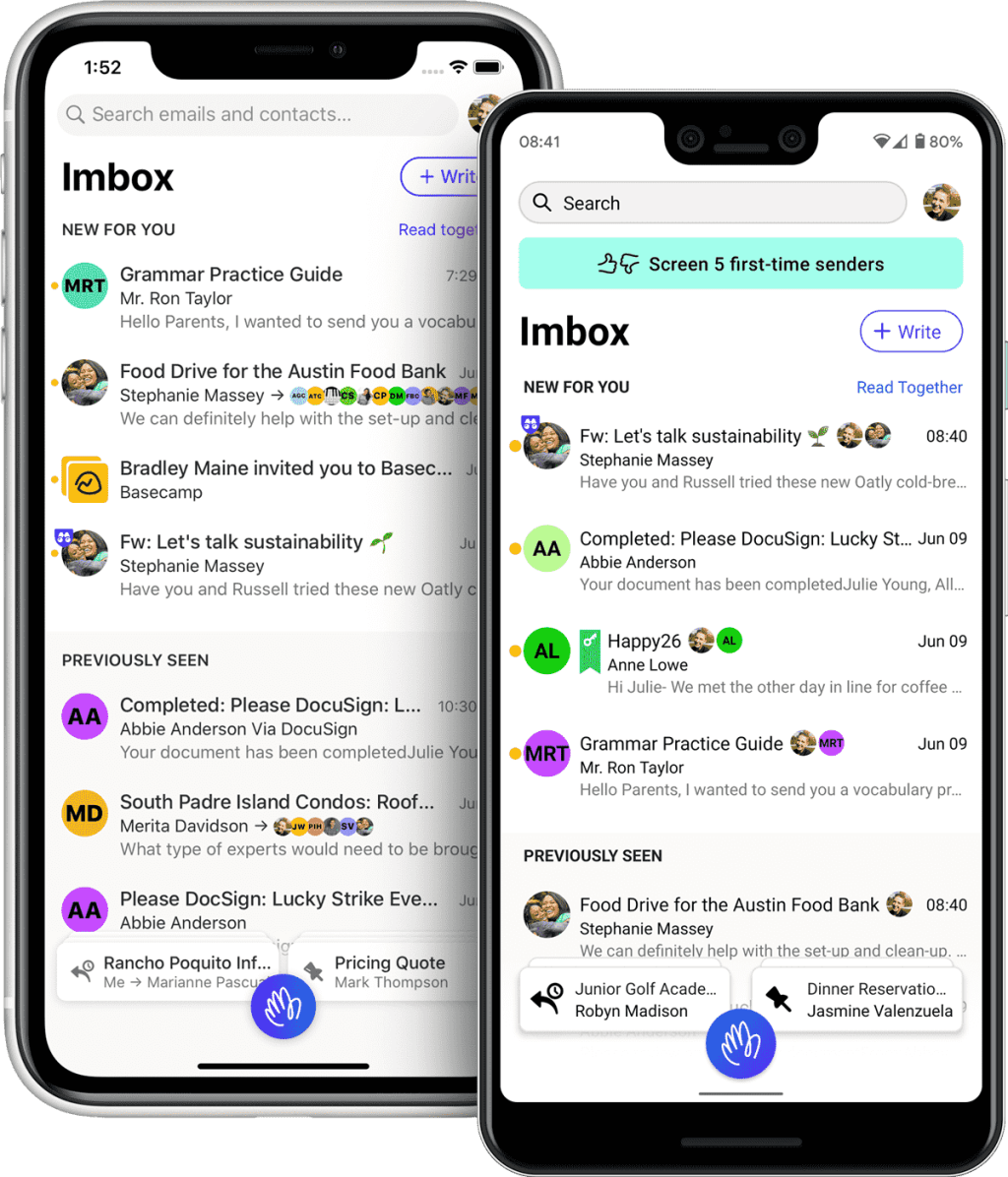
(For Part 2 of this review, check out: Hold up, HEY)
I’ve been pretty keen to see HEY’s rethinking of email, and just got my early access invitation this week (I joined the queue back in February, perhaps on Day 2 of their recruitment drive). I was also an early adopter of Gmail back in 2004, and as they say on the manifesto page, there’s not been much innovation in the world of personal email since. If anything, email has been in decline and most of its use cases now belong to chat platforms (keeping up with friends), workplace project management/collaboration suites (enterprise communications), and services’ own portals (seeing account and order histories). The resurgence of newsletters is one bright spot, and displaying them is one of the main jobs of my email account.
Anyway, I get excited about new things quite easily. When the invitations started rolling out, I was obsessively checking my inbox, and I kid you not, literally dreaming about getting mine to the point where I was waking up in the middle of the night with the urge to check my mail! Part of the anxiety probably came from wanting needing to secure my address of choice, like I was lucky enough to do back in 2004 with Gmail. Just try getting your name now without adding random numbers; I don’t know how the poor kids today deal with the scarcity. My wife also wants any readers to know that she’s heard enough about my two username options, the pros and cons of both, and never wants to discuss email addresses again.
So now that I’ve used it for a little bit, I’m undecided if I should make this my primary email service. On one hand, everything they promise is true. The workflows are elegant, the way it puts you at the center of the experience is refreshing (no stranger can disturb your peace, OCD freaks can bundle threads together, etc.), and the emphasis on privacy and business model transparency is way better than any free alternative. On the other hand, it’s not entirely how I’d like to use email, and some edges are rough to the touch.
There’s an area they call The Feed, which is where you’re meant to put newsletters, marketing emails, and things that aren’t super important. There’s no concept of read or unread here because it borrows the eponymous concept underpinning most social networks. It’s a feed and you just scroll through it when you have the time, and it doesn’t matter if you miss something. I have no problem with this approach for ads and promos, but I’d personally elevate most newsletters above this. Especially the ones you might have a paid subscription to, from platforms such as Substack. I want to make sure I see them. I guess if they’re that IMportant to me, I should put them in the IMbox? But that’s not very neat, tidy, or OCD friendly. Gmail’s new-ish default inbox style separates Updates and Newsletters, and I kind of like that better.
Unlike Gmail, there’s also no concept of archiving, and therefore no tools to wade through an archive. Yes, it might be you’re just not meant to. But I believe everything in your Imbox just collects in an infinite scroll on the first page. So what happens after years of using HEY? Without pagination and controls to move through the lot, is search the only solution? I can’t be sure because I don’t have that many mails yet, but that’s how it looks to me in the 37-minute video demo they’ve posted.
The rough edges: the iOS app feels and performs like a web app. But oddly, it’s less capable and beautiful than the actual mobile web app, which has the same animated, fan-open stacks floating over content that you get on the desktop web. When you use the “Reply Later” and “Set Aside” stacks in the iOS app, they don’t animate or open over the Imbox, and instead take you to a separate list view of items. Load a new email, and the icons in the floating action bar take a second to appear. The macOS app is also not a true native job (apparently an Electron app). Not a dealbreaker for me, but not very nice.
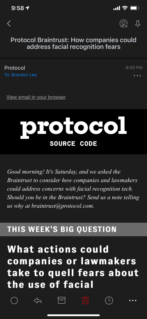
Here’s how a newsletter is rendered when the app is in dark mode. The white background is rendered in a frame, with wasted space and black bars along the sides.

Now here’s the same newsletter in the Spark email app by Readdle. It renders the text properly, reversed to match the system’s dark mode. Spark is a really good client for Gmail, by the way, and I like how it tries to intelligently sort your email into Personal, Notifications, and Newsletters. However, it’s free for personal use and it seems they route all your Gmail through their own servers to do the Smart Inbox stuff and send push notifications, so you may have some concerns there. HEY is at least run by Basecamp, and you’re paying them for it.

HEY may get there with the polish over time; it’s only their first release after all, but there’s a couple of things to be said about that.
One. I’ve seen complaints online that the asking price of $99 USD a year is too high. That’s really up to each person to evaluate. I like the way it’s explained on their Pricing page: “You always pay for email”, just that it’s usually with your privacy. You can decide if $99 is a small price to pay for not having the content of your private correspondence contribute to a richer profile of you as a consumer, and following you around the internet. For comparison’s sake, it’s still less money than running a blog on Squarespace. I’m just here to suggest that $99 might be a high price to pay for a service that comes with janky hybrid apps. They’ve apparently been working on HEY for two years, so maybe it’s not realistic to expect a great native app rewrite soon.
Two. If you haven’t been reading the news, then you may have missed the drama on Twitter this week. This business with Apple is an unfortunate and distracting one. It makes me seriously question whether HEY will be around long enough to polish its mail rendering to the level that Spark has, and whether I’ll still be able to use it on my iPhone via an app from the App Store. I’ve been an Apple customer for 16 years, doing a lot of unrecognized tech support and evangelizing for them in the process. I’ll admit I’m often a bit of an Apple apologist when they do things that don’t look so good. Not this time. Their poor handling of this developer relations issue is embarrassing from a PR standpoint, and doesn’t inspire confidence. All it’s done is draw attention to the fact that some rules need to change if the iOS ecosystem is going to have a future as the best place for innovation and customer experience.
In summary, if I could feel more secure in moving to HEY, if I knew that they’d be able to release app updates unhindered by the App Review team, I might be continuing with a paid subscription after the trial. Besides that, the security and privacy promises are also strong motivating factors. The central concept of having three filing buckets of descending importance (Imbox > The Feed > Paper Trail) is a nice one but imperfect — no workflow is ever going to work for everybody, but hey, I can accept that. Overall, I’m leaning in favor of sticking with it.
Updates:
- 22 Jun 2020: I discovered that the timestamps in quoted replies are off by about 8 hours. E.g. if I reply to someone, it will say at the bottom of my response “On Mon, Jun 22, 2020 at 12:11 AM Other Person wrote”, when it really happened at 8:11 AM. Minus 8 hours is GMT time, and I could not find a timezone setting option anywhere in HEY. I’m not sure how they’re determining your timezone (or if they are at all), but it’s not working for at least two users in Asia. I’ve submitted the bug to HEY’s support team.
- The @thinko team made a funny parody site: bye.fyi
- HEY found a clever way to comply with Apple’s guidelines, basically offering new, free, temporary functionality for users without accounts, so that the app no longer “does nothing after being downloaded”. Apple then approved v1.02, and v1.03 with the new features is being reviewed (a rare working weekend for the Basecamp team).
- 23 Jun 2020: After WWDC (where App Store policies were not mentioned), Apple put out a press release making good on some aspects of this case. For one, bug fix releases will no longer be held back due to policy issues such as HEY’s lack of IAPs.
- HEY has issued a quick, pragmatic fix to the timestamp bug I found (via the temporary removal of them completely).
- 26 June 2020: Apple approved v1.03 with the temporary email feature, and it would appear that this case is closed and the app can stay in the store without offering IAP.

Leave a comment